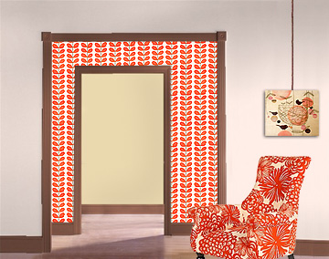
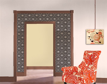
I’ve been playing around with a photo that I pulled from Benjamin Moore’s “personal color viewer”. The wall color for the living room (wild aster) and the kitchen (bronzed beige) are there, and then I’ve been swapping out different wallpapers for the dining room. Photoshop + me = true love 4ever.
Yes, I sort of love this. Is it too much?
wallpaper by Orla Keily
Of course that isn’t my house, but it’s a pretty good representation. I do have my orange chair in that same position and you would see the wallpaper behind it like that.
This is another strong contender:
wallpaper by Romo
I have a tendency to come up with some nutso ideas for the house. I don’t usually follow through. I have been planning to wallpaper the dining room from the start, but I’m not sure if I should tone it down and stay within the style of the house or just go for it. I want to just go for it and be bold! Brandon is actually really good at reining me in (but um, he’s asleep right now, so…).


25 comments
allecia
I have the Romo wallpaper in my second bathroom. I must say, I love it–I often just pop into the bathroom to admire the walls. The dark brown is unexpected and makes other details pop, while the metallic of the flower pattern keeps it from being too gloomy.
Nicole
Oh, Marivi… I didn’t even think of that! I was thinking of it from Orla Keily but of course Anthropologie is carrying it too.
blushing apples
i love orla kiely designs and of course PHOTOSHOP!
Marivi
I like the first one…though you risk looking like an Anthropologie showroom ;-)
casapinka
I’m going to be a rare dark horse and say go for the Orla. It’s stunning. I agree that the Romo contrast is neat but it’s a bit predictable. What good is being safe when you only live once? It’s in a dining room which is contained and it seems like your gut wants to use the Orla paper. If you put a prep down (can’t remember what it’s called) then it will just pull off when the time comes. Carpe ORLA!
drey
(and I LOVE that chair! wish anthropologie was sold (for the same price!!) in australia!)
drey
wow ok… i immediately went for the first pic! i love how the view from where one is standing looking in gives you a real sense of “i’m not afraid of colour and i’m not afraid to give you BIG colour”.
definitely the first…
Kat
oooh go for the romo!!!! that kenzan pattern is gorgeous, I drooled over the entire line they put out!
Lakshmi
I definitely like the romo better. Great photoshopping!
decor8
romo is my pick out of the two. ;)
A COLLAGE A DAY
the second one works much better.
r.
Anonymous
I’ll be the lone dissenter here and say that while I prefer the second (black?) version in Photoshop, I think that in real life, with real lighting, the red Orla Kiely paper would look much better! The pattern is softer, more organic, and red is such an appetizing color for a dining room. I also think the pattern won’t appear to compete so much with your red chair when you are physically in the space.
I also think the red pattern brings out the color of all that gorgeous wood trim.
deerseason87
I think using a dark, warm color like chocolate brown is a good idea (it really makes all your whites and pinks and oranges pop), but what about something with a less busy pattern?
Peggy
Of the two, I definitely like the second better, but… I am not really a fan of wall paper. Nicole, dear, have you ever had the opportunity to tear down wallpaper? I have and it is a very, very horrible experience. It scared me for life, and I will never wallpaper. Never.
If you are a person who likes to change things, or who gets bored, don’t wallpaper. Better to get a large canvas and wallpaper it to see if you enjoy living with it. Or, frame a piece of it. There are so many cute ways you can paint, and paint can be changed easily.
I am not a purist when it comes to wood, and I would love to see the inside of your cabinet painted.
I am really enjoying seeing your home shape up, I’m sure whatever you decide it will be adorable.
Wish I had your photoshop skills!
Nicole
Wow, overwhelmingly it would be the second wallpaper! I did edit a photo of my actual dining room too: the Orla Keily version and the Romo version
Audrey
I really love the second choice too. I wish I was as good with Photoshop!
lsaspacey
I love both wallpapers and still like the one you originally wanted so long ago. But I think you should Photoshop your picture from last post too, with the buffet. I could maybe see it with the second paper but not with the first.
Oh, but your question. The second one works better.
kerflop
Okay so I have as much design aesthetic in my entire body as you have in half of your pinkie toe, but I like the second one best. I dig the contrast. :)
Valerie
I don’t know. While I really love them both design wise, I think they would distract the eye over your collection of lovely objects… I would go with a more subtile hue… but then again, if you’re going for BOLD, then go with your gut instinct ^_^
casacaudill
While I think the first print would look good in small doses, I love the second and think it would be perfect for a foyer or adjacent room.
Twospace
i also love orla, but i think for your space, i really prefer the second one. i think you should fly to LA and redo our place next!
Anonymous
while I ADORE Orla prints, the second is better in your space. Have fun!
becoming-home
Is that the Astrid chair?? I’m so jealous.
I like the second one too :)
DawnMarie
Out of the two, I like the second. I like the contrast of the two bold colors. The first seems to just blend to much.
Maryam in Marrakesh
I personally say go for it! Why have ordinary and safe?
Comments are closed.