
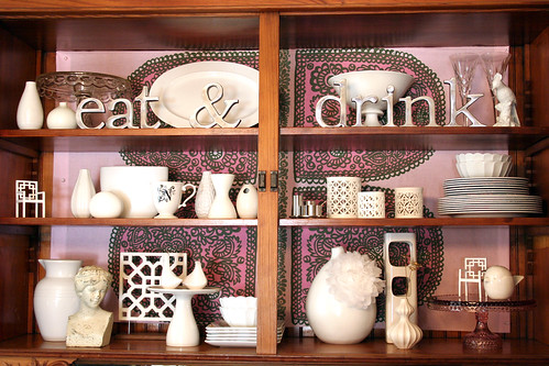
This is what the hutch looks like right now:
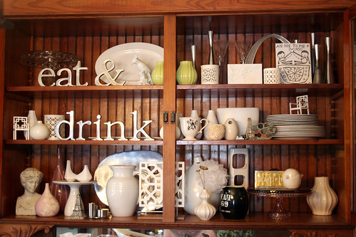
And this was it before:
When I took everything out and laid it all on the table, it looked a little like my own personal flea market. It was fun to choose what would make it back in.

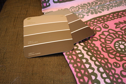
The fabric that I tacked to the back of the hutch doesn’t quite reach all the way from top to bottom, but Reprodepot sells Marimekko’s Satula by the repeat (32″) instead of by the yard, and I only bought one repeat.

I painted the little section of the wall between the buffet and the door with Behr’s “Butternut Wood”. What do you think? I like the color, but what do I paint the ceiling? The only colors in the fabric to play off of are pink and green, so pink? Or maybe a lighter shade of the green wall color?
I might go with something else… I’m not sure yet. I have some of the Amy Butler fabric that I posted here on the way, and there are still lots of other fabrics I’m considering. I do like the idea of pinning the fabric to the back of the hutch though – I think that turned out well!

78 comments
M
Much better w/ the background; it anchors all the pieces & unifies the collection. Bravo!
afgail
Everybody is being so polite here. And I will try to be too, but the busy pattern behind the collection of white items competes with the shapes of the collection. On the assumption that the collection is the star of the show, I think a shocking pink SOLID color would add zing to the collection and play up the interesting shapes of the varied items. I’m assuming you could get a piece of cloth that would cover the entire back of hutch and give a more polished/finished look.
Christina
Hi Nicole…
I wanted to say how much I love this. I was reading through and I know it was posted in 2008, and I think it’s great it’s still drawing debate and commentary.
I think this should be viewed as a little work of art, like a quilt. I think the POINT is that your eye moves around and settles on different things. There are elements of texture within and yet a sense of harmony.
I always enjoy your blog and style and wish you could come to England to decorate my house. When I do redecorate our next house, I will be keeping your style in mind. You’ve also made me aspire to wear more dresses. Thanks :O)
PS …. adore the carrot top.
Christina
Gail
OMG it’s TDF!!! Great job!
jessisca
I really like this! I don’t see it as too busy, I think all the white really pops against the fabric. Much more so than before)
Morgan
I had to comment! I love the look and have been saving up my own stash of all-white vases, goblets, cake plates and the like for a similar project – wonderful job!
ColeB
This is fabulous! I have been struggling with this very project! I have been contemplating painting the back of our shelves but was afraid I wouldn’t like it. I am going to try some fabric and see how that works out! Is there an online source you prefer over others to buy fabric? All the ones I have been using are so hard to navigate!
Yours Truly,
Cole B
Tray
I think it looks AMAZING !! I’ve taken a few design classes and its perfect. You dont want everything all matchy matchy. The design is a powerful element but doesnt overpower the beauty of your collectables. I think you should go with pale pink for ceiling or white. Both with compliment the room and the design in the hutch. BEAUTIFUL job !
Malynn
I think it’s great that you have a defined style. I haven’t found mine yet:( It seems I love most of the style I see…
elle chaney
I love what you’ve done and hope you keep doing it again, and again. I too have a hutch that I redo with each season or when I score a great piece of fabric or even wrapping paper. I cover styrofoam panels that are cut to fit snugly inside the back of the cabinet. At Christmas I cover them with copies of the sheet music for “jingle bells” Makes for a great vintage backdrop for whiteware at the holidays.
Enjoy!
Violeta Romero
Your site has an excellent design, congratulations!
Violeta Romero
I really love the new look!
Love the objects too!
Tiffany
I love the fabric. I think it is funky and not too much. You have great taste. I’d love to have something like this in our kitchen.
T
Erica
I think it looks great! I especially love the words. :)
Thanks for sharing all of your delightful ideas with us.
christina in nh
i love that fabric but i don’t like it in the hutch. the fact that it alllllmost fills up the space but nooooot quite bugs me to death lol. i’ve been reading your site a long time and it seems like something that would bug you to death too! plus there is something about it that makes it look like a flag behind there. i would pick a fabric with a smaller repeating pattern. i also liked how you had the eat and drink placed in the before picture. you have lovely things and i wish i could go shopping in your house. :)
Doreen Kirby
Sorry, too too much.
Making it Lovely
The glass cake plate in the very top left is an old one that’s been in Brandon’s family, the white one on the bottom left was from Pottery Barn, and the pink one on the bottom right was a gift.
Sacha
Where did you get those adorable eat & drink signs (words)!Love both looks, curious what it looks like now?
Chesa
I’m just reading this, I realize it’s older but I love the Marimekko and everything about your home. Where is the cake plate from?
Wrist Corsage
Hi,
I like that two small chair which is white in color. It looks soooo cute. Is it a gist as well? Hehe.
Cheers.
p/s: Lovely arrangement!
Making it Lovely
The letters were a gift.
tina
Hi, I love your “Eat & Drink” letters. Where did you get that? :)
M&Co
Amazing! I LOVE what you did here!!
Making it Lovely
Janet, Brandon doesn’t mind the pink too much. He defers to my judgement (most of the time) on what looks good, so I’m lucky. He only really says no to my crazier ideas, and that’s rare. ;) Also, the ‘wild aster’ color isn’t baby pink, so it’s more grown up, for lack of a better term.
Peggy, I’m keeping the vases that I didn’t put back in! Everything goes in and out of rotation, you know.
The Dept
I LOVE what you’ve done with the fabric, personally. I didn’t even notice that it didn’t reach quite to the edges until you mentioned it.
Gorgeous.
Jackie
Wow! I love everything about this…the hutch, the fabric, your “white collection”. I have a white pottery collection going myself, but somehow it isn’t anywhere near as cool as yours is :)Thanks for the inspiration!
Danish girl
I disagree with the people who think that the fabric is too busy. To me the whole setup is calming to the eye now, but interesting at the same time. The pattern in the fabric is so beautiful and looks really good as a background for all your white pieces, much nicer than a solid colour would be.
star
i love it! it’s gorgeous! i love the arrangement of everything and i don’t really think that the fabric is too busy. but it’s great that you can change it up!
also, where did you get that bird that’s on the bottom right? i love him!
Brie
Chiming in to tell you I love it! It is really cool! And if YOU love it that is all that matters :)
Modern Crush
I think that the bare vertical wood works against all the delicate details of the pieces on the shelves. When you look at the ‘before’ picture the first thing my eye lands on is not what is on the shelves, but rather the dark vertical lines of the wood backing. At first look of the ‘after’ picture, the first thing that my eyes land on are the white pieces and their details, because their contrast is so much more noticeable and pleasing to the eye with the fabric behind it, whether that be the fabric you go with or not.
Princess of Power
Is that the Arch representin’ in the before picture?! I love it!
Michelle
….oops can I also add….the only pity is that the fabric didn’t fit all the way – but I still love it…….I have your holey vase on the bottom right of the photo….except mine is in a sandy colour….maybe I do have a little bit of taste after all :)
Michelle
I think you have made a wonderful improvement !!!
Anjanette
I agree with Ada – the fun Merrimekko fabric makes things pop and you edited the pieces very well. Kudos!
Chee Ann
Wow, that’s an awesome transformation! I love all the white.
phoenix
I love your collection! I wouldn’t have thought to use block letters like that…I’ll have to remember for when I decorate mine…
Ada
I disagree. I don’t think its too busy. Actually i think the fabric ties it all together. the darkness of the wood maked all the object kind of fade into the background. but with the fabric the things really pop. i have to also add my love for the cute collection. where did you find the little white vases?
Sommer
I really like the fabric background. It seems busy at first, but the elements you have in front of the fabric are all very clean and white, and well staged. I love it, I wouldn’t change a thing.
Also, I have those little lacy white candle holders in my bathroom! I got them at Target too.
Peggy
I really love it. That fabric is gorgeous. Now you will need to stick to all white accessories, but that is your plan right? Isn’t it fun rearranging the accessories? I think you need some white teapots.
Speaking of your own flea market – any chance you will be selling the pink and the brown vases from Target?
Julie
I have the same square white lattice thingy attached to a wooden base thingy from Target. I’m going to pretend that means my sense of style is as evolved as yours. :)
drey
wow i absolutely love it nic!! it’s soooooo gorgeous! makes it now look like a jewellery display :)
K T G
I like the fabric, but I think to pop your white groupings, a solid bright color would be ideal, and find another place to show off the fabric. I think things are arranged nicer now than they were before, only because you offered to show the direct comparison. I also liked the deer from Christmas, not that you should keep them year-round, but I think it was a lucky find that they fit your theme of white. The wood background of the hutch is too dark for making the most of this display. Seeing your plates on the table, are they good china? They look like a stack of white plates. I know that makes them more theme-like, but it might make sense to change things up by showing them off. That little chair on the left is too far away from the other things.
Other than that, isn’t it fun to rearrange things? It always makes me wonder what I was thinking when I previously arranged things upon a shelf, why I didn’t make it as good-looking before, but the mind gets tired of looking at the same objects arranged in perpetuity. Everything looks newer when you move it.
Zee
Thanks Nicole! I was hoping it was a crafty invention of your own which I could copy -yay!
janet
I love the fabric backing.
May I ask a related (somewhat sexist, I apologize) question? Does your husband ever feel like the house is too pink? I mean, I adore your home, but I just don’t think my husband would go for me bringing so much pink and femininity in. I’m sorry if this is a stupid question. I am inspired to paint my guest bedroom in wild aster.
Maria
I love your blog and I love you home! I really, really like the fabric, I especially love how you grouped your white pieces.
Brett
Hiya,
LOVE your blog its so gorgeous and inspirational.
I must say though i am not a big fan of the fabric. it looks gorgeous but i think it is a bit busy.
I love love love all your white bits and peices though just gorgeous.
xxoo
Jen
Love the fabric, but not sure I love the way it’s used here…I think it might be too busy for all your little flea market finds. That’s just my two cents :) That fabric is too gorgeous to put in the back, as they say, nobody puts Baby in the corner! Heh…
Can I ask, where did you get your Eat & Drink letters? I’m perusing your flickr and archives and can’t seem to find it mentioned where you got them. I think I remember you blogging they were a gift, do you know where I can find metal letters to place on a shelf just as you have done? I keep finding those to put on a wall, but I am really looking for something metal loooking that will stand on its own. Thanks in advance! I love all your hutch treasures!
rachel
well done!
we have lots of the same white pieces. i had not thought to group them. i am inspired. thanks!
mary
You have given me a great idea with the fabric. I use my grandmother’s hutch to display my collection of white pitchers and it’s got the same back as yours. I’m doin’ it!
Hayley
I think its amazing! Because it’s only a small area in a room its not too much colour. I’m sure it makes it stand out when you walk through the door, drawing your eye into your amazing collection of white flea market beauties!
Patricia
What a glorious collection and the fabric as a back drop sets a wonderful stage-
I would love to see the ceiling a pale pink and perhaps some free-hand painted little shapes as in the print in a brown. Just light and airy little shapes. perhaps in the center coming around the light fixture.
v-dub
I love it!! I think the fabric and all the items you chose to back in are all FAB!! The fabric really gives it a hip, young feel. I also really like the way that the section of the wall you painted and the part of the wall above the picture rail go together. I just really like that you can have the pink up top and that goes with the fabric, but then you have the lower part of the wall a darker color.
I will be honest, that I don’t love ButtnutWood color, but I think it might just look a little too green in the pic? Looks kinda like a dark moss to me.
stephanerd
Aside from the fact that I love your collection of small objects and am convinced we have the same mind, I’m so intrigued by your idea of hanging up fabric back there. I’m already mulling over in my mind whether or not I’m too lazy to take down all the five trillion wine glasses in my china cabinet so that I can take down the shelves and do this too.
Be-yoooo-tiful!
Making it Lovely
I just used clear pushpins.
Mrslimestone
I like it looks great!
Can you share how you got the fabric to stay up and tight?
Theresa
I have those same Eiffel Tower salt and pepper shakers! Woo hoo!
Sherry
I’m with girlysmack. Crazy-obsessed-enamored with the whole thing. Love your collection. Love your arrangement. Love that you switch things up. And sweet mother of Marimekko I love that fabric.
Stay strong.
xo,
Sherry
http://www.thisyounghouse.com
Making it Lovely
Zee, that’s a tissue paper poof! I just attached some fishing line and looped it around the top of the vase. Martha has instructions here.
Wanderluster, the little chairs were Christmas ornaments from west elm.
LeeAnn
I love your collections of white objects. Placing the fabric in the hutch was a great idea. You can change the mood of the display in minutes! I’ll keep this idea in the back of my head for future reference.
zee
I think it looks good either way, but the fabric adds some real funky personality, plus I think when the rest of the elments of the room tie in with it, it will make more “sense” to those who don’t dig it right now. And heck, if you change your mind, you can take it down or switch it out. I just ADORE that fabric by the way – Marimekko freaking RULE. All your vases and ornaments are of course beautiful, but one has caught my eye that I must ask about – the vase on the lower shelf with what looks like a corsage? I’m all about wearing big corsages at the moment, and am now thinking I could add some corsages to my home decor too…
girlysmack
Um, gotta go with my heart on this one and admit that I lovelovelove the fabric. I want to marry it and have 10,000 of its babies. I think everyone is wrong when they say it is too busy. I think it is perfect.
Sigh. Can I come live in your gorgeous home? Just askin.’
Wanderluster
I like how you’ve edited the pieces and I like the fabric, but the pattern on the fabric is a little distracting. I love the pop of colour from the fabric though; it definitely makes your pieces stand out more than just the wood. And where did you get those miniature trellis-back chairs? They’re adorable!
amy purple
I kinda preferred the wood! I just really like the thin strips of wood with their stripe pattern. I love all the white pieces though.
amanda
and by delurkting, i meant delurking:)
amanda
Delurkting to say, I like the idea but the fabric is too much. Great fabric, great stuff, but majorly competing with each other. My eyes are going everywhere.
Jennifer
I definitely like the unification of the elements in the after shot… I like that they are all white, but all different and funky and cool!
I might go with a different fabric that isn’t as busy, but has just as much color?
Then again, you should SEE my house. I am QUEEN of bland. :)
Making it Lovely
Two of them were from Target, and one was from Anthropologie.
sjb
PS: I LOVE the lattice-y round votive holder things… where’d you find those?
sjb
I really like the idea of a color in back instead of the wood, the white pieces stand out really well against the pink and you did a great job of editing/organizing…. but yeah, I think the pattern distracts from the pieces and vice versa. Try it with a solid?
Mandy Ford
LOVE it! What a great background for all of your white pieces! :)
seven
I like it a lot… it is a little more busy, because of the patterned background rather than a plain one, but I think you did a good job of paring back on what you put back in there, so it looks more unified.
katie
i have to say, i’m kinda jealous of your personal flea market! it all looks great together. I actually like the fabric better than the wood paneling. I think editting the collection helps it to not look too busy.
Making it Lovely
Really? I thought it looked so much better! The way I had it before looked especially jumbled and busy to me.
Maybe a solid color in the background would look better?
Andrea
Ummmm. I think it looks way too busy. My eyes get all confused when I look at the picture. Don’t hate me, I’m just being honest…
Comments are closed.