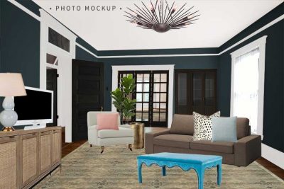
It’s time to see the final look in the sixth edition of Making it Yours (MiY)! Lia was pretty happy with the look of her dining room last time, so she refined the color palette and made a few upgrades, but kept the overall look the same.
The Napa dining table has of course remained the same throughout this edition. Lia has also kept her woven chairs, gray rug, glass chandelier, and mirror. The dresser she had been using has been moved to her bedroom and she has replaced it with a proper console. The white lamp has been joined by a wire blackbird, which picks up on the woven texture of the chairs, and the wall has been wallpapered in a modern floral pattern. Lia’s blue plates still work in the room, but she has gotten sleek new glasses to go with them. It’s her dining room as it was, just stepped up a bit.
That concludes this edition of Making it Yours! We saw the dining table start out with Ann in her country style and then more traditional dining room, before it was passed down to Lia with her quirky sense of style. Then as Lia’s taste and budget changed, she added more texture and pattern before arriving at the style you see above. And remember, you can always see all of the archived Making it Yours editions if you’re looking for more inspiration!


14 comments
orangesugar
Your mood boards are my favorite. Love the glass link chandelier from West Elm and I have that table lamp from target, although mine came from Amazon. But I also love the tufted dining chair and fork and spoon art.
Margaret
I’m totally loving that wallpaper. That flower pattern is my obsession. I have many things like rugs, towels and pillows in that type of pattern. I can’t get enough.
Stephanie: I just did my guest bathroom in an amazing Candice Olson patter that is to die for. She has a few wallpaper books out that are just beautiful. I found them at my local hardware store. I find that I like to touch and see a wallpaper in person rather than just going by what is online because color and textures can be different.
Victoria
Love the textures, they work so great together and that blue is just fabulous!
emily
I just ordered that mirror! Love it! Thank you!
stephanie
HELP!! wallpaper! wallpaper! i need wallpaper help! i want something modern but am having a hard time finding good sources. help!
Jessica at Lavender and Lilies
I love the console!
HollowSquirrel
I wish you were my best neighbor friend…I LOVE the looks you created!
Allison
Oooh, this is chic. I LOVE it.
Jules
I’m with Lila, except I don’t love the lantern. The “More Traditional” board is my favorite by far. You’re shocked. I can feel it.
Becka @ life as an artistpreneur
I have those chairs at our dining table (as the head chairs) ;)
Rebecca
I love love love this palette. It’t feels fresh and crisp and airy without being even remotely sterile. Nothing is jarring, everything is harmonious and I want to move in.
Lila Ferraro
I do love the last option but, the option with the fork and spoon pictures is by far my favorite. I love that lantern and I’m crazy over the candles!
xoxo
Lila Ferraro
Beth
This is soooo my style – from the color palette (I’m addicted to the robin’s egg hues) to the wire bird to the wall paper- I love it all!
Do you have any suggestions for curtain material that is similar in style and color the wall paper? Because if I could make bedroom curtains out of the wall paper I would, but I haven’t found anything like it.
Comments are closed.