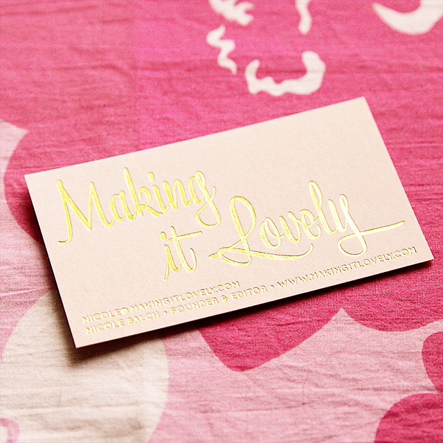
I have my new business cards, just in the nick of time for Alt Summit! My old cards were cute, but it was time for something new.
Shiny gold foil printing on thick pink card stock. I designed them, then redesigned them, then overdesigned them, and in the end I redid the whole thing and ended up with this simple layout. I had them printed by Eagle Printing, here in Chicago.
And that’s my new logo on the cards. I think it’s a nice update, and not a radical departure from the logo I’ve had for the first five years. The cards will match the blog once I launch the redesign next month.
p.s. I rounded up 10 of my favorite business card designs right over here.


40 comments
Bilash Ray
So nice……………..
Which fonts have been used
Joy
Excuse me if I’m drooling just a little bit, but those cards are just scrumptious. So perfectly balanced in every way.
Joy
I know I’m a bit late to the game in replying to this, but I love these cards! They’re so beautifully balanced in every way. Excuse me if I’m drooling just a little bit.
Bonnie
Gorgeous! So unique and catchy-as!
Sarah Jane
Oooo…pretty and glammy! (yep, just made up a word!)
kathleen
ohhh i LOVE these! is the font lavanderia?
Sophie
Love love love this blog! Im glad I discovered this :)
Rachel
These are so beautiful, I’d want to frame it if you gave one to me!
Amanda Joy
The. gold. is. gorgeous.
And I love how gracefully your design taste is “maturing”, the transition is so well done.
Small House Life
Love the new cards!
Girly and pretty..yet very professional.
Dee :)
Rosie
I think these are so beautiful! I was wondering if you would be willing to share what font you used?
Stephanie
Love the gold foil and light pink!
Taylor
I got married this past October and pink and gold were the colors I used throughout (who says I have to use brown and green because it’s the fall?!). Absolutely gorgeous combination. Always classy and just a bit feminine and sweet.
Caitlin B
i LOVE them.
That logo is perfect and the colors could not be better. They made me giddy. So giddy, I had to comment!
bink & boo
Simply lovely.
Ashley @ sunnysideshlee.com
Cute!! Love the font/new logo!
Lauren@BaylorSays...
Oh these are so pretty pretty! What a little thing that will boost your confidence by a thousand cool points. Super lovely.
online parenting class
that IS lovely!
Sarah van Loon
Fabulous new design! I love it! Super, super gorgeous and chic.
jenn aka the picky girl
Those are gorgeous! I love the gold foil.
Donaville
They look smashing!
Ingrid@{Houndstooth and Nail}
I love them!! They are super cute and girly. Simply beautiful.
Ingrid
;)
Nic
Lovely indeed!
Meg
These look awesome! The gold on pale pink is perfect!
Lindsey @ arkadian belle woods
These are so gorgeous! I saw your instagram pic of them yesterday I think, and I was dying! They are truly amazing everything from the shiny gold and the logo type! Totally brilliant!
Johanna
These are so beautiful…I absolutely love them and it looks like the good, thick cardstock, too!
ABC-Designs
Nice work, and combination of colors. The foiling gives it a ‘de-bossed’ look as well.
Jillian@TheHumbleGourmet
So simple and pretty and very fitting to the site. Love them!
jan
love them – that font is so pretty!
Jessica @shimmerkai
So pretty! Hope I can get one at Alt :)
Jessica at Lavender and Lilies
I loved them! They are perfect!
Diana @ Boy + Girl
Love these. Simple and pretty!
-Diana
Cecilia
Beautiful in their simplicity. Love.
Beth
Lovely. They remind me of lipstick and convertibles.
Giulia
I love it. It’s got a cool glamorous retro feel to it.
Nikki
I love it. What is that font? It’s gorgeous.
Melissa
Those are really pretty! I need new business cards maybe I should do something fun to help mine stand out from the rest.
my honest answer
Oooh, love the new font! Have a great time at Alt.
Comments are closed.