
I’ve been feeling a little better (finally, five months into this pregnancy), and so with increased energy and mobility comes more decorating gusto! I’ve been on a sample kick lately, getting test paints and wallpaper swatches.
I’ve been testing colors for the front parlor (the library), and was interested in Pink Ground by Farrow & Ball after seeing it in action here. I ordered two new paint swatch books because I like to have a backup for showing to clients (p.s. Working with clients again! Contact me if you’re interested.), and I received five in the mail. Eleanor and August were both interested, so I told them they could each have one. The next morning, they personalized them while I was getting breakfast ready.
August was especially proud. “See mommy? I made it nice for you!”

Well, they can tell their swatch books apart now.
I looked at samples from Farrow & Ball, Glidden, Behr, Benjamin Moore, and Sherwin-Williams, and with each color, I would think ‘I wish it were a little less lilac/more peach/more muted/less intense, etc.’ Pink Ground was that perfect color that none of the others quite were. The lone wallpaper sample up there is from Hygge & West and I love it, but I think paint is the way to go in that room. Let the dining room get some crazy wallpaper instead.
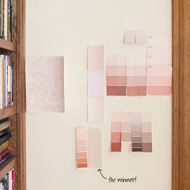
Benjamin Moore’s Queen Anne Pink was a close runner up — and so perfectly named for use in our Queen Anne — but it was slightly too peach. So now I either have to head over to the Merchandise Mart to pick up a gallon, or just order it online. I’m heading into the city for a haircut today, so maybe a quick detour before coming home is in order. Plus, you know, I might need a few more wallpaper samples…


15 comments
Hollie @ Stuck on Hue
I’ve been considering painting a room or two of or main floor a pale pink, since we have so much dark woodwork in our 1916 four square. Pink looks so great with brown. Then I remembered that your library is pink, so I looked up some old posts to see what color. F&B’s Pink Ground is one I’ve been considering. I especially appreciate seeing a photo of all your swatches on the wall together, because I can see how much more muted Pink Ground is in swatch form, compared to some of the others.
I had painted my work studio at our last house a light pink, and I remember that some of the swatches I liked best would have been toooo pink had I chosen that color and put it on all the walls. I kept telling my mom when we were recently looking for a pale blue for her living and dining room that you need to go paler and more muted than you think, because paint gets more intense when you’re surrounded by it.
I’ve got to figure out my entry, living room, and dining room congruently because they flow into each other. We’ve lived here almost a year and I’m finally making some progress, so here’s hoping by the end of the summer I’ll have wallpaper(s) picked out, drapery fabrics, and paint colors.
theveryflowers
If I could ‘be’ a color, I think this would be it.
Joanna
Great choice for the colour :) Glad you’re feeling better, pregnancy could be painful.
Saval
I love that wallpaper. We ended up painting our downstairs family room pink, to go with the preexisting tile. I was definitely disappointed with the pink available. We ended up choosing a sherwin williams color (Vesper or something). I wish there were more blushes.
allysha
Benjamin Moore’s Opal is pretty awesome. It’s in our bedroom.
Christine Dovey
Thanks so much for linking to my reveal:))) As you know, I LOVE Pink Ground…it’s the absolute perfect pink in my books. If you’re looking for something cooler ever, FB Calamine is another gorgeous one with a hint of lilac in it.
Katie @ Red House West
Beautiful! I love the direction you’re taking this house!
Sarah
I love all the colors you are choosing! What color are you going to use in the foyer?
Jennifer Laura
So excited you are going with that color! I knew you would love it :-)
Megan W
I’m interested to see how this will look with the wood trim, etc. in the room. I love the look of natural wood (especially one like this with orange-y undertones) paired with greens, so I’m having a hard time picturing how this will look in the pale fleshy pink.
emily @ go haus go
What type of clients? Web design perhaps?
Lisa
I love peachy pinks, but you have a knack for picking the perfect pink. For that reason, I’m excited to see the results. I’m 32 wks pregnant (3rd child), and still sick. I’ve never been so excited for labor, lol.
Laura
So glad to hear you’re feeling better! With my son I had morning sickness until I was around 5 months along, so I feel your pain.
Looking forward to seeing your choice in color! I’m digging the pink palate.
Laura @ Rather Square
Glad you are feeling better! Pregnancy can be so draining sometimes…
My daughter did the same thing to a bunch of paint chips I left out on our coffee table before a trip to the paint store. It was kind of cute. :) I’ll be interested to see how your library room turns out – that’s a nice muted shade of pink.
Comments are closed.