
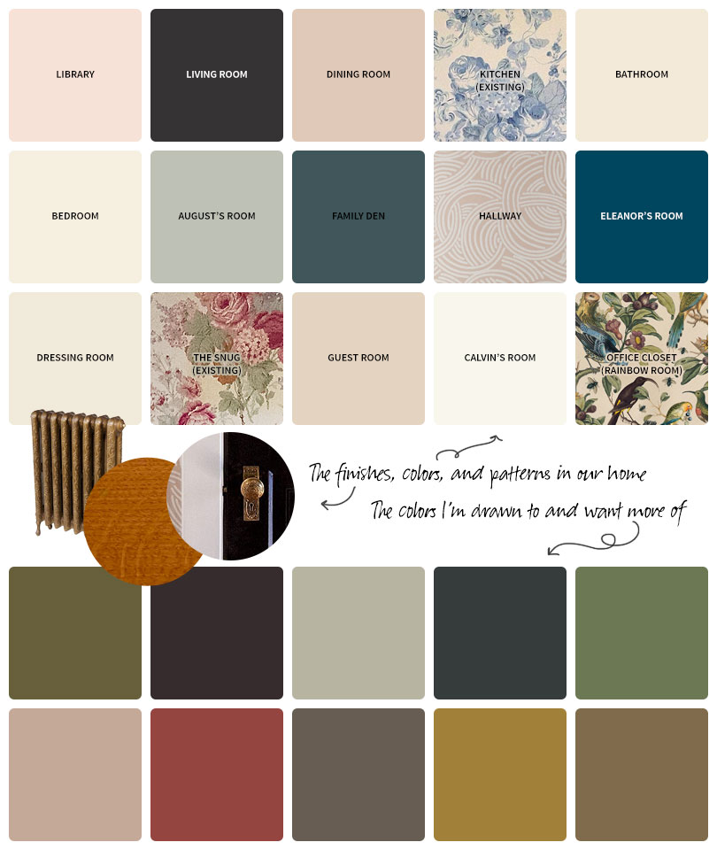
I’ve been planning two more big DIY renovations for our home: the laundry room and the second floor bathroom. The laundry room in the basement is dull, and the bathroom is having issues that are forcing the renovation more than aesthetics alone. I’ve chosen the appliances and fixtures, and everything so far is black, white, or brass. Even the flooring is white (or “biscuit” in the case of the bathroom, but close enough). Neutrals. A classic foundation. I can do anything I like with the wall colors!
What do I like?
The moody, somber hues that suggest mysteries and the passage of time. The paint colors that pick up names from secluded forests or old world travel destinations. Or that, if you’re not a fan, pick up less charming monikers like “baby poop green.” I lovingly refer to these as “the ugly colors” but of course they’re not. They’re muted. Shaded. Rich. Moody. Nuanced.
• I list sources for everything in the Shop Our House section, including the specific paint colors and wallpapers in our home.
I love pink (quelle surprise!). But I’ve used it in the front entryway, library, dining room, bedroom, hallway, office, and guest room. Might it be time to choose another color for the next few rooms? The house has likely reached its pink quota.
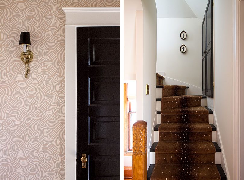
The living room’s black walls and the many, many doors I’ve painted black still thrill me. The brown antelope runner on the stairs is perfection.
The bathroom is off of the hallway with pink wallpaper. The sink and toilet will be white, and the outside of our existing claw foot tub can be painted (likely black, but not finalized). These are some of the options I’ve been thinking of for wall colors.
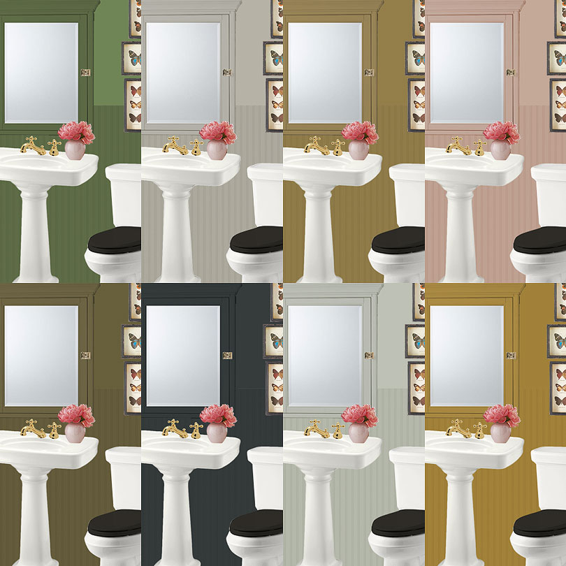
It’s the same palette I’m looking at for the laundry room, though the ceilings are shorter (significantly) and there’s much less natural light. I shared a sneak peek of both design plans on my Instagram Stories and everybody sent messages voting for pink, but I think it’s time for me to consider that maybe just maybe other colors exist that I can decorate with. Moss, mushroom, ochre, olive… they’re calling.

26 comments
Sarah Belcher
I’m really feeling the greens!
JenniferN
Surprising myself by liking the ochre in this room.
Kelly Mahan
I agree, the “ugly” colors need more representation. There aren’t enough interior tones like these ones.
goosefairy
One of the (many) things I appreciate about your design style is your use of colors. Nothing you do looks like anything else out there. I am so mightily tired of all those spaces that look alike. One of the things I think you should consider for your bathroom is, you probably want to stay away from anything in the brown range, especially anything that smacks of baby poop brown. Personally, I love the green but it’s not my house. You do you. You’ve done brilliantly so far!
Sandra
If nobody is putting on makeup in there, then I like the green. The warm gray looks nice in the mockups but a little too contemporary (and common) for a home like yours, but that would be my choice if makeup is being put on.
Noni
I’m on Team Dark Color. I’ve had my eye on Narragansett Green (Benjamin Moore) for a while now and I think I’m going to go for it. It’s so deep and inky. And blue when it’s not green.
Blythe
I love Narraganset Green! My friend painted her apartment that color and I love how it changes between blue/green/black depending on the time of day .
Emily
I think green would love *amazing* with the pink and the black, but I’d play with the shade of green a little more. Maybe a green with a little more “smokiness” to it?
Holly
Is this where your family will be getting ready in the morning? I grew up in a house with an avacado bathroom and the color cast a strange light on my reflection. I strongly urge you to consider the colors which are most flattering to your coloring. Perhaps the pink or navy? Or perhaps that lovely medium blue in the bird’s wing just over the O in the clip of the rainbow room wallpaper.
Making it Lovely
I get ready at the sink in my closet, and I did choose a creamy linen white for that reason! This is the bathroom the kids use mostly.
Kayla aka I Am Kilo Bravo
Hooray for ‘ugly color’ love! I always joke that I love all things ‘ugly’. I don’t think you can go wrong with any of these choices, but I would eliminate the lighter grays and pink first. Agree with the other comments, the two greens and muted navy are strong contenders. Good luck!!!
Ally
The darkest one!
Rebecca Long Pyper
I share your affinity for the ugly colors. If you haven’t checked out BM Mustard Olive, you should.
Lyndsey
The dark Navy one is hands down the one I’d go with. (The one to its right would be my runner up.)
Haley
I’m super into that mustard version in the bottom right. Maybe not the best color to surround yourself with if you are putting on make-up in the space but it looks great with the butterflies.
Jeanne
My vote is the darkest one…navy/black…a perfect backdrop for the color/drama of bold art in the room.
Peggi
I was on Team Olive for the guest room, so I’m going with it again! Although I usually detest yellows, the more muted ochre-y shade is oddly compelling… Three cheers for the ugly colors!
Tina
Oooh! I vote for 1) green, 2) navy/black, 3) the darker gray, or 4) mustard. I know gray is going on year 10-11 of popularity and everywhere, but it does look great in this mock-up.
c2
Immediately I wanted to explore the bathroom with the stormy thunderous hue on your mock-ups (#6?). It seems so genuinely lepidopteral (that’s the word I’m using, standing by for an English majors tongue-lashing) for a house rich in history. I agree, for resting the pink tones, and giving the house some new stories to tell. Excited where you’re headed………..(;
Caroline
I like either the first, darkest green you’ve chosen or the darkest color (navy-blackish?). LOVE your house!
Linda Moore
I am drawn to the darkest color also. A navy would be great and that really works with pink.
jenn aka the picky girl
Agh! This is so exciting to me because I’m putting finishing touches on a half-bath install on a space that has sat empty for a long time (old butler’s pantry). Ancient bead board walls, so we installed plumbing, redid the tile floor, but it looks so much like some of these photos!
I painted the lower half of the walls black and went with a magnolia wallpaper above with black trim except baseboards. Everything else is brass and white, and I love it. But I’m totally going to pull in some baby puke green to make it more interesting. :)
Can’t wait to see what you do!
Sarah
I love the khaki green, but I really am drawn to the darkest color in your mock-ups which looks like a dark navy. The fun of a hall bath is that it’s not a lot of surface so you can go pretty bold without it being too much.
Amelia
Yes to all the greens and ochres.
Shelly Mathes
Yes, enough Pink, time for something different. I love Green but I also love Black, to me Black is timeless. Good luck.
Nicole
Khaki green, 100%. It’s great with pink, it’s moody and sophisticated, it’s historical, it actually goes well with the patterns you have already. It’s perfect
Comments are closed.