

The Dining Room with Painted White Trim
I know, I've taken far too long to show you the 'after' photos. The problem is that I don't really…November 22, 2010
Painting the Built-in Hutch
The baseboards and trim in the dining room have been painted white. The windows have been primed and painted, but…September 30, 2010
…and Continuing with the Trim
This is what I woke up to this morning. Now I'm off to continue painting. How did you spend your…September 7, 2010Starting on the Trim
I woke up feeling somewhat energetic (I've been exhausted through the first 16 weeks of this pregnancy), so I skipped…September 3, 2010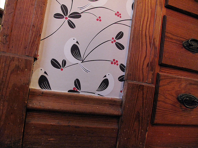
Why I’m Painting the Wood Trim in My Home
Painting wood always draws up strong feelings on both sides. A lot of people are all for it. Some are…September 1, 2010
Martha Stewart Paint Review
I used Martha Stewart's new line of paint for The Home Depot this weekend to paint the bedroom. Since I…June 3, 2010
The Dining Room with Painted White Trim
I know, I’ve taken far too long to show you the ‘after’ photos. The problem is that I don’t really see the dining room as…
Painting the Built-in Hutch
The baseboards and trim in the dining room have been painted white. The windows have been primed and painted, but are awaiting a second coat.…
…and Continuing with the Trim
This is what I woke up to this morning. Now I’m off to continue painting. How did you spend your weekend?
Starting on the Trim
I woke up feeling somewhat energetic (I’ve been exhausted through the first 16 weeks of this pregnancy), so I skipped my morning shower and put…
Why I’m Painting the Wood Trim in My Home
Painting wood always draws up strong feelings on both sides. A lot of people are all for it. Some are hesitant in most cases, but…
Martha Stewart Paint Review
I used Martha Stewart’s new line of paint for The Home Depot this weekend to paint the bedroom. Since I shared a preview of the…