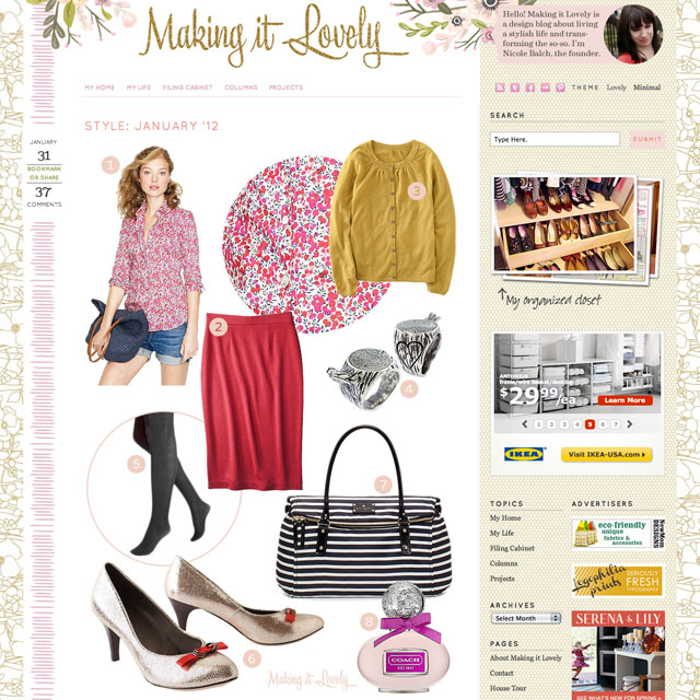
The watercolor flowers in the header have given way to etched clouds and flowering branches. The glittery script is gone, replaced by a storybook title. I had designed the previous blog theme in 2012 (!) and it was a perfect representation of where I was at in the old house, but the direction I’ve been heading in with this house is a bit different and the site needed to reflect that.
The redesign is everything I’m into these days. It’s the wallpaper patterns I love (“lush, mysterious, and just a bit sinister”). It’s a reference to motherhood by way of a few of my favorite illustrated children’s books — the wonderment of Alice in Wonderland, the sincerity of Charlotte’s Web, and the absurdity of Where the Sidewalk Ends. It’s anthropomorphic animals in fancy dress. It’s the house’s Victorian modern, and of course it is pink.
I’m terrified of birds, so naturally I had to include the swan in the header when I came across her. The illustration is from a book that predates my 1891 Victorian by more than twenty years, Les Métamorphoses du Jour by J. J. Grandville. It’s rather pretty and feminine, but at the same time, absolutely frightening. I’ve collaged her in front of an etching several decades older of clouds and flowering branches that I’ve tinted pink. We’ll see how long she stays since she has nothing to do with anything else, but you do have to admit that she is doing her best to make it lovely! I am that swan. We are all the swan. Deep.
There are other illustrations I’ve altered and added throughout that I love to pieces. Oh, and the site is responsive and mobile-friendly with wider images, improved navigation, and a better focus on content too. (I say that like it’s no big deal, but it’s a big deal.)
I began creating the new design on the Genesis framework, but it’s just not for me. I don’t want to relearn WordPress with hooks — let me dive into the code directly and muck about with the PHP and CSS. I found Solo Pine’s themes to be a great foundation to build upon, and what you’re seeing is a customized version of Oleander. The serif font is Lora and the sans-serif is Source Sans Pro.
There are several features that I may experiment with — a featured posts slider, promo boxes, and additional space in the footer. I’ll also be tinkering with any issues that come up during the switch. My old theme had been altered a great deal as I made changes and additions over the years, and I’ll want to reincorporate any of the old div classes I may have missed. Please do let me know if you encounter any errors so I can be sure the blog is working well for everyone across various operating systems.
This new redesign has been a long time due, and a long time in the making. I hope you like it as much as I do! Thank you so much to all of you for reading, and I’d love to hear what you think.