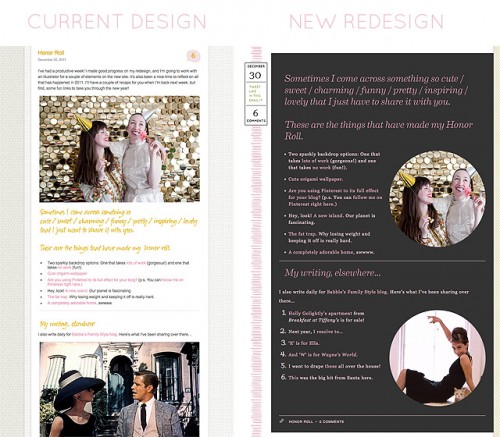
I’m really excited about the upcoming redesign of Making it Lovely! I thought I’d give you a little sneak peek today (because it’s killing me to not just switch everything over immediately!). This is what last Friday’s Honor Roll post looked like and will look like:

Not every post will have that dark background, but one of the things I’m working on is giving different types of posts different layouts. I was inspired by print magazines and their regular column formats. Many posts will still have the standard white background, but the Honor Roll will get the charcoal gray you see above, other posts will get the palest of pinks, others still will get other colors, and maybe even some patterns thrown in for good measure.
I haven’t fully redesigned the site since 2009. I used to do it every year, or even more often than that! This feels really good.


35 comments
Katie Martin
Your redesign looks like it will turn out really nicely! I do agree with HM though that keeping things simple does make readability much easier. I’m all for updating color and layout, but make sure fonts aren’t too squiggly and the color of it isn’t hard to read because of the contrast with the background. Making something fresh and new can definitely be fun for you, but make sure it is still to the advantage of the reader- that is the point! Why did you stop doing redesigns before?
HM
Go back to basics! I have been following since the beginning and used to visit daily; now I hardly read (hence the super late comment here) because the blog feels like an ultra-busy advertisement.
=/
jane
I love the way your site looks now, so I am glad you will only do the dark background on some of the posts. Ever since D*S changed to the dark background I have had difficulty enjoying the site, and I had been a long time follower over there.
I don’t want to squelch your creativity, though—you do all of this so well!
Sherry @ Young House Love
Wahoo! Can’t wait to see it!
Laura Gaskill
Yay!! I can’t wait to see it live, I’m sure it will be utterly gorgeous! xo Laura
SmallHouseLife
OK< so I'm not sure if you asked for feedback?
Noooooo.. on the dark background. I know you said not all posts will have it, but IF you're taking votes, mine is NO!
I love your site and might come back because I already know you.. but on the few occasions I land on a site with dark/light text.. I bounce right off. Too difficult to read.
dee
Alison
It looks so awesome! I love the idea of different post background colors. Looking forward to seeing it live!
nicky
LOVE. especially the left side design. can’t wait to see it live!
sabrina
Love your blog but feel the changes might come close to Design Sponge’s new look. Honestly, once the change was made I visit almost never. Something about the design doesn’t interest me. Maybe the darkness or the clutter. Totally unsure.
April
You design it yourself!? That’s amazing! So impressed right now!
Celeste
While I love the “look” of the dark background it can be difficult to read the text. Just a thought
Mrs. Limestone
Can’t wait to see it. I’ve always loved your site designs and have been a fan for so long. I wish I had an ounce of your web design talent.
Diana @ Boy + Girl
I love your current design but I can totally get on board with the new one. It looks great already! Looking forward to seeing it all put together.
-Diana
megan
i will miss the old site…..i love it. but i’m sure your new one will be amazing too… just a suggestion…is there anyway to sell the design of the old site? or tutorials/online workshops on how to design our own sites?
Kristen
I can’t wait to see the final reveal of the redesign. Like others I think the dark background with the images in circles will look amazing, along with different formats for different types of posts. What an original idea! And of course what I am most concerned about is…that you’re keeping some pink! I can breathe easier now!!!! :-)
whoorl
So fun! Can’t wait to see it in action!
Michelle
Can’t wait to see it!
Kelly
Of course I think your current design is great, but change is pretty awesome too. I’m really loving the date icon (or whatever you want to call it) that you’ve come up with, along with the vertical element–love how it draws the eye down the page. Excited to see your new look!
arvee
I’ll be looking forward to the new look! I can’t wait! ♥
Reta K.
The best things you could do are to:
Stop using yellow headings against a white background – extremely hard to read
Increase the type size for the same reaon – readability
Miss B.
Can’t wait! I love me some charcoal;) You NEVER disappoint so I am sure it will be very inspiring!
Rebecca @ beautiful square feet
Very classy! Love the idea of different backgrounds for different posts – wish I was better at coding stuff!
Ruth
Looks great!! Can I make a suggestion? Could you shorten or eliminate the introductory paragraph to all of your “honor roll” posts? I find it quite repetitive to keep reading “Sometimes I come across something so cute etc etc etc” week in and week out. Just post “Honor Roll” and then the links, it think that would be better, from a reader’s perspective.
Holly
It must feel good to get back to your web design roots. A nice start to 2012!
Molly the Waffler
I especially like the circular photos — not something I’ve seen very often and a nice break from all the straight lines in a typical blog format.
Beck's Chic Life
It looks great! I am inspired by your DIY web design! But I hear you on the lack of time these days to devote to it! You are truly talented! Thanks again for the inspiration!
susy
ohhh! i see! : ) wow! it’s going to look amazing. i love the long element on the side, and the circular image vignettes – fun and pretty too
it’s so tough to do type on a dark background – it needs to be coded just so… you’ll get your typography/esign fix there, i’m sure.
i love the idea of different colors/patterns. i wanted to try something like that on my own site – but it didn’t feel right and i couldn’t get it to work. i can’t wait to see how you’ve done it!
maria @ mk square studio
love the idea of different layouts, and the dark background color so sophisticated good job. look forward to the reveal
jbhat
Is there nothing you cannot do? : )
Excited for the new look!
jbhat
emily @ go haus go
The sneak peek looks great Nicole! You are quite the web designer!
Making it Lovely
Thanks! I miss doing more design work, but I don’t have the time to devote to it these days.
Naomi A.
Ooh, this is so exciting! I can’t wait to see everything!
Jenni
Fun! Can’t wait to see it… I’m going to have to read you site on my computer rather than my phone’s reader just so I can enjoy all the changes!
Making it Lovely
I’m keeping my RSS subscribers in mind and making sure everything still looks good in a reader, but I’m working really hard to make the site enhance the content. I’m really proud of how it’s turning out!
Loren
I love the idea of different styles for different types of posts. The redesign you’ve got going looks lovely.
Comments are closed.