
My Office in Ladies’ Home Journal
My office is in the July ’12 issue of Ladies’ Home Journal! It was great to see my space featured along with the offices of two fellow bloggers: The Nester and I Heart Organizing.
You can read portions the article online (Dress Up Your Desk), or pick up the July 2012 issue. You can also enter to win a design consultation from me, which will later be featured on Ladies’ Home Journal’s website. (Good luck!)
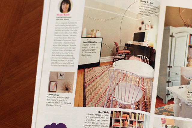
The magazine used my photographs (yikes), and they had me rearrange the furniture slightly so that it would work for their layout. I kept it that way for a good six months before finally changing it back yesterday. Now I’m not so sure which way I like it better. Here’s another shot of it arranged the way the magazine’s art director requested it.
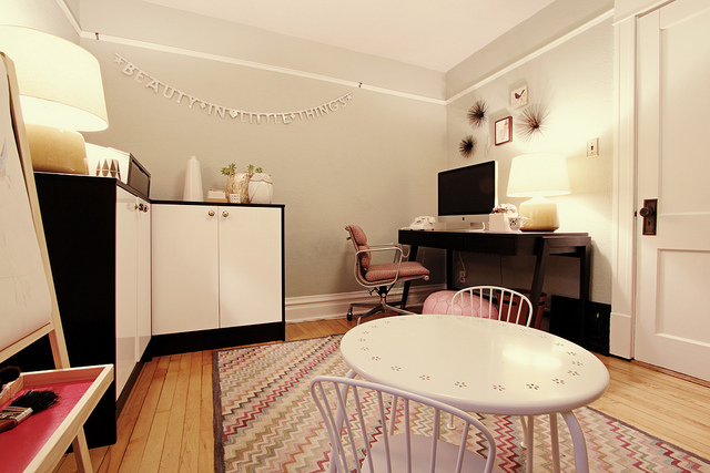
What do you think? It does free up some space for the kids’ easel, but I felt a little boxed in, having the storage at my back. Also? Whoops, there’s a bit of a functionality problem.
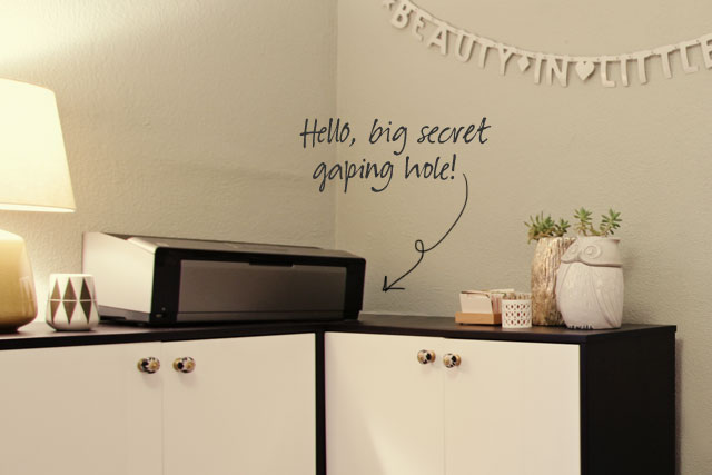
Yep. Let that be your friendly reminder that sometimes things in magazines look fantastic from certain angles. Trickery!
My office originally looked like this, and mostly does again, but maybe a little less photo-ready.
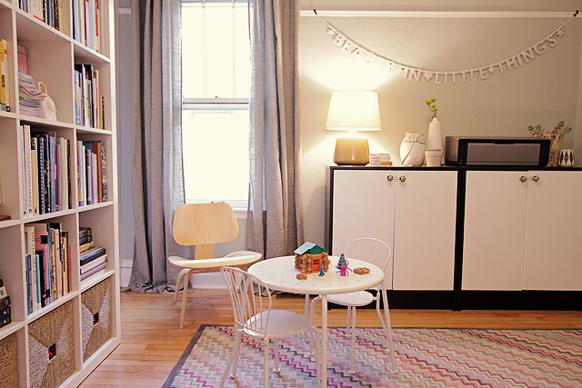
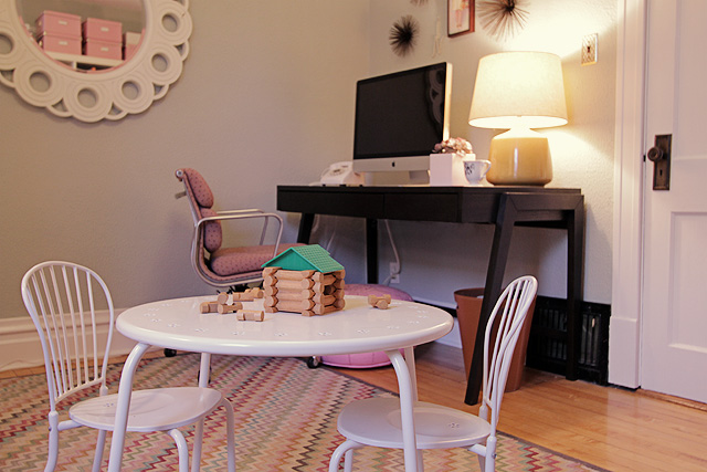
Thanks again, Ladies’ Home Journal! It’s an honor. Now, if only you hadn’t confused me about the best layout for the room…


38 comments
Janelle
where did you get that dreamy fabric for your office chair. MUST KNOW!
Making it Lovely
It’s not so dreamy close-up! It’s the original eighties dusty rose fabric that was on the chair.
Chelsea Anne
Oh how I wish I could have the space for my own Home Office. :( Any ideas how to fix my small bedroom so I can fit a small office-friendly space?
callie grayson
Congratulations Nicole!
I love the photo layout, it looks fabulous but the function & effect of not feeling boxed in, I am with you there….. I like how you had the layout, and would prefer to feel comfortable when working.
xx
callie
Alisha E
Congrats, Nicole! This was a fun read. I’ve admired your office since your sweet desk chair post.
I missed your round-up this week, I look forward to your Friday links.
Kamini
Oh I’m with all the others…I prefer your original layout. Looks cleaner and way more spacious. And like someone mentioned above, it includes your kids in your area.
sarah perry
Hi! I was wondering how I submit my essay for the Boost my Roost contest? I have my written part and pictures all ready to go. I may even include a video on my blog. :) But I’m not sure how I send it to you.
becca
good for you & your sweet little space! I love the wall color so much, and the way it feels so clean and bright.
you’re famous!
carol jane
Wow. Beautiful office, and congrats for being in LHJ. Where is the rug from? I love it!
Making it Lovely
It’s by Dash & Albert.
Anna
I prefer the way you designed the room layout. I love the way you arrange things! We want to see how you do it. After all, we read your blog to inspire us to have your style. Leave it the way you did it.
Cherie
Your original plan seems to include the children in your side of the room where all the fun is taking place. It seems more receptive to them belonging in your world! Eventually they can have eleanorpink blogs and gusbrown blogs, write about the little train world and make their own
suitcases. Children are such a gift! They are mirrors of us and they want to do what we are doing. May God bless your family.
Making it Lovely
I wonder about what creative endeavors they’ll take. I like your idea of their future blogs!
the domestic fringe
You have a gorgeous office space. I love it! I like your way better too. Seems more practical. Congrats on being featured. That’s really super-cool.
~FringeGirl
Natalie
I like your set-up better! It seems much more open AND user-friendly. :)
kim
For what it’s worth, I like your original way best too.
Sanja
Congratulations on your feature! A question: what’s the toy on the table (last image)? Thanks :)
Making it Lovely
Classic Lincoln Logs. Eleanor gets really frustrated with them sometimes though because she wants to build tall things, but they aren’t very stable. And then August comes and dismantles everything.
Kimberly Jones
Congrats on having your office featured! I love the office both ways, and I am coveting those Ikeas shelves!
laura parke
congrats on the feature, nicole!! you have a beautiful, tranquil office space. i loved seeing the “behind the scenes” a little bit in what magazines will do to make rooms look perfect. :)
jbhat
I very much prefer your layout. And congrats on the feature!
jbhat
Little Gray Pixel
I prefer your original layout. It flows better to me. Also, did they photoshop out your electrical outlet and cords? I always suspected design magazines did this.
Making it Lovely
They didn’t do anything to my shots, though magazines often do.
Jen @ RamblingRenovators
Congratulations on the feature! And great photos too.
I’d feel a little boxed in too with the L-shaped cabinets. Are those Ikea storage units? You could always go to the As Is section and cut down a matching top to fill in that hole. I know my little one would have toys, tea cups and legos stuffed in that spot in no time ;)
Making it Lovely
Yes, they’re IKEA. If I put them back in an L shape, I’ll either fill in that gap or put some sort of countertop-like thing on top.
Jacklyn (Ohbygolly)
Fancy Pants! I love it! Congrats!
Kathryn Humphreys
I like the way the angle looks in pictures, but I’m sure it takes up a lot of floor space. Although the secret hole would be great when the kids play hide and seek.
Making it Lovely
Oh, they can’t access it unless they climbed over top and shimmied down. Possible, but unlikely.
Ronda
Congrats Nicole! I’m excited to see your office in the print edition of the magazine. You’re so fancy! :)
NancyO
What’s the color of your walls?
Making it Lovely
Yes, it’s “Contented.”
Jacklyn (Ohbygolly)
I’m pretty sure it was Contented from Sherwin Williams. She posted it here. http://makingitlovely.com/sources/my-office/
I love it…I’m saving it for the next room to paint.
SINEAD
Congratulations on being published!It looks great both ways.
Janae @ Bring-Joy
Congrats Nicole! That’s such an honor, you definitely deserve it. You always create bright, welcoming spaces.
I think it’s funny that LHJ points to the kid’s table & says: “kids play at the table while Balch blogs.” If only it were that easy! I know my kids don’t just happily play for hours on end while I blog. Your kids are probably much more content to sit & draw for awhile, than my kids are :).
Making it Lovely
Haha! Maybe 20 minutes, here and there.
Comments are closed.