

Darjeeling Font
The entire typeface is nice, but my oh my, look at Darjeeling Regnaments. • VeerNovember 16, 2010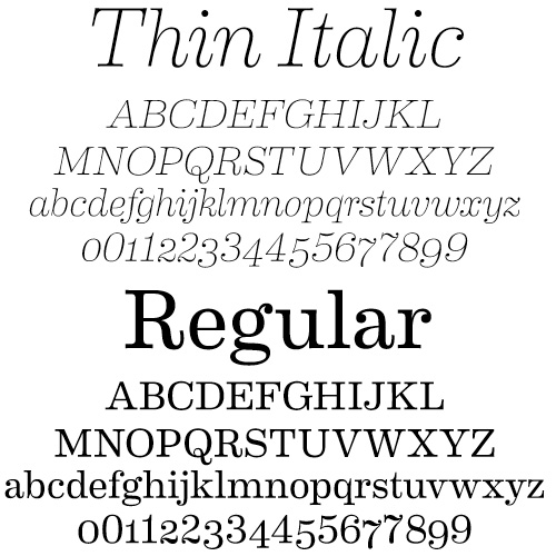
Eames Century Modern Font
I want this font so badly. The Eames Cover Numerals are going to do me (and my wallet) in. •…November 11, 2010
A Huge Blogroll, a Nice Font
I've made two changes to the blog that you may or may not have noticed… I've been wanting to overhaul…June 17, 2008
Archer
"Squeee!!" That is the approximate sound I made when I found out that Archer is now available. The font was…January 28, 2008
Font Crush 2!
I have chunkier, more substantial fonts for you this time around. Just as before, they've been added to the far…December 15, 2007
Using the Mac Keyboard Viewer
There's a nice tutorial over at Suffix.Abuse about using glyphs. Many fonts have alternate versions of letters that you can…November 3, 2007
Eames Century Modern Font
I want this font so badly. The Eames Cover Numerals are going to do me (and my wallet) in. • House Industries
A Huge Blogroll, a Nice Font
I’ve made two changes to the blog that you may or may not have noticed… I’ve been wanting to overhaul the blogroll in the sidebar…
Archer
“Squeee!!” That is the approximate sound I made when I found out that Archer is now available. The font was created for Martha Stewart Living,…
Font Crush 2!
I have chunkier, more substantial fonts for you this time around. Just as before, they’ve been added to the far right sidebar above my wishlist,…
Using the Mac Keyboard Viewer
There’s a nice tutorial over at Suffix.Abuse about using glyphs. Many fonts have alternate versions of letters that you can use for a more decorative…