

A New Look for the Blog
The watercolor flowers in the header have given way to etched clouds and flowering branches. The glittery script is gone,…February 15, 2016
The New Site Design
I've finally finished the redesign of Making it Lovely! Well, that's not entirely true. There are a million and one…February 1, 2012
Minimal vs. Maximal*
I'm still working away at the redesign, and I will be launching it February 1 as scheduled. I'm waffling between…January 30, 2012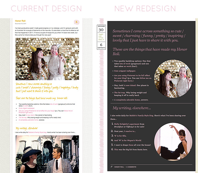
A Sneak Peek at the Site Redesign!
I'm really excited about the upcoming redesign of Making it Lovely! I thought I'd give you a little sneak peek…January 5, 2012
Introducing a New Section on Making it Lovely: The Filing Cabinet
I am so jazzed. I have a whole new section to introduce to you today! I'm calling it The Filing…November 17, 2010
Making it Lovely Turns Two
Today the blog is two years old! To celebrate, I've freshened up the design a bit. Yes that's right, I…January 9, 2009
A New Look for the Blog
The watercolor flowers in the header have given way to etched clouds and flowering branches. The glittery script is gone, replaced by a storybook title.…
The New Site Design
I’ve finally finished the redesign of Making it Lovely! Well, that’s not entirely true. There are a million and one little tweaks and additions that…
Minimal vs. Maximal*
I’m still working away at the redesign, and I will be launching it February 1 as scheduled. I’m waffling between a clean, white minimal (well,…
A Sneak Peek at the Site Redesign!
I’m really excited about the upcoming redesign of Making it Lovely! I thought I’d give you a little sneak peek today (because it’s killing me…
Introducing a New Section on Making it Lovely: The Filing Cabinet
I am so jazzed. I have a whole new section to introduce to you today! I’m calling it The Filing Cabinet, because that’s where I’ll…
Making it Lovely Turns Two
Today the blog is two years old! To celebrate, I’ve freshened up the design a bit. Yes that’s right, I celebrated by creating work for…