
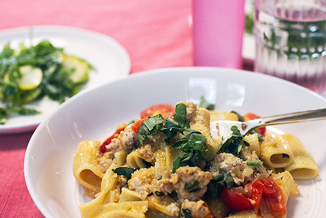
Know Any Good Cast Iron Jokes?
Sponsored by Blue Apron. Most people know the basics of cooking. But did you know that in order to make…July 29, 2015
DIY Abstract Art Clock and Serving Tray
This is a sponsored post by NESTLE Coffee-mate. All reviews and opinions expressed in this post are unbiased and based…July 27, 2015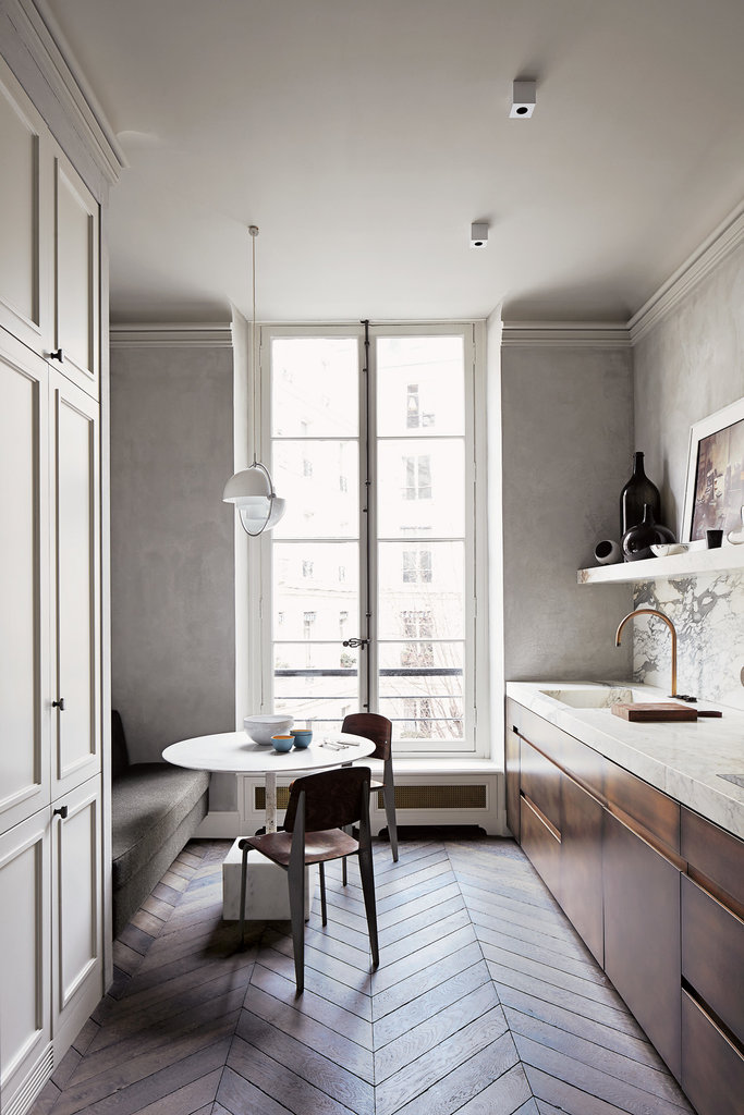
My Dream Wood Floor
This post is sponsored by Floor & Decor. Here's a quick 'how long have you been reading this blog' check.…July 23, 2015
An #InspiredStart with Coffee-Mate and David Bromstad
This is a sponsored post by NESTLE Coffee-mate. All reviews and opinions expressed in this post are unbiased and based…July 20, 2015
Art from Minted (With a Giveaway!)
Minted is a marketplace that hosts regular competitions to source all their art from a global community of independent artists.…June 23, 2015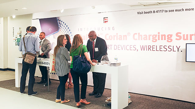
Cut the Cord(s)
This is a sponsored post written by me on behalf of DuPont™ Corian®. All opinions are 100% mine. NeoCon is…June 22, 2015
Know Any Good Cast Iron Jokes?
Sponsored by Blue Apron. Most people know the basics of cooking. But did you know that in order to make a meal truly special, you…
DIY Abstract Art Clock and Serving Tray
This is a sponsored post by NESTLE Coffee-mate. All reviews and opinions expressed in this post are unbiased and based on my personal view. I…
My Dream Wood Floor
This post is sponsored by Floor & Decor. Here’s a quick ‘how long have you been reading this blog’ check. Remember when Brandon and I…
An #InspiredStart with Coffee-Mate and David Bromstad
This is a sponsored post by NESTLE Coffee-mate. All reviews and opinions expressed in this post are unbiased and based on my personal view. David…
Art from Minted (With a Giveaway!)
Minted is a marketplace that hosts regular competitions to source all their art from a global community of independent artists. They recently invited me to…
Cut the Cord(s)
This is a sponsored post written by me on behalf of DuPont™ Corian®. All opinions are 100% mine. NeoCon is a huge annual show for…