I tried out a few lamps with Photoshop to see which one I liked best, but I’m still not sure.
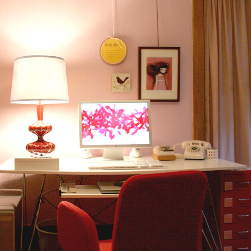
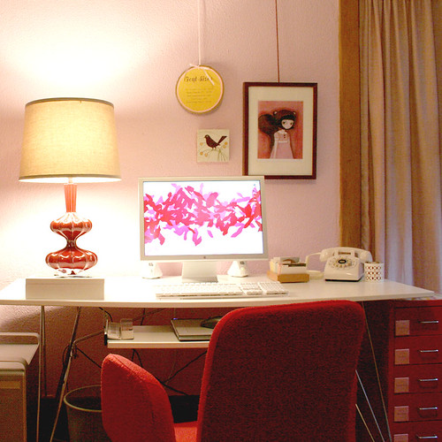
Here’s the office with the new lamp:
Here’s the same lamp, but with a white shade:
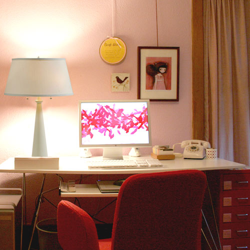
This is the Nikki lamp:
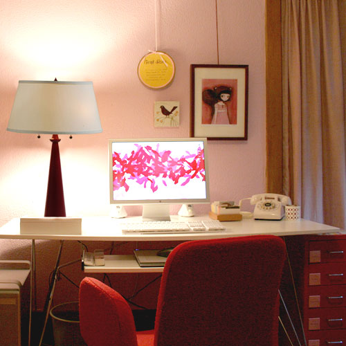
And this is the Nikki lamp in red:
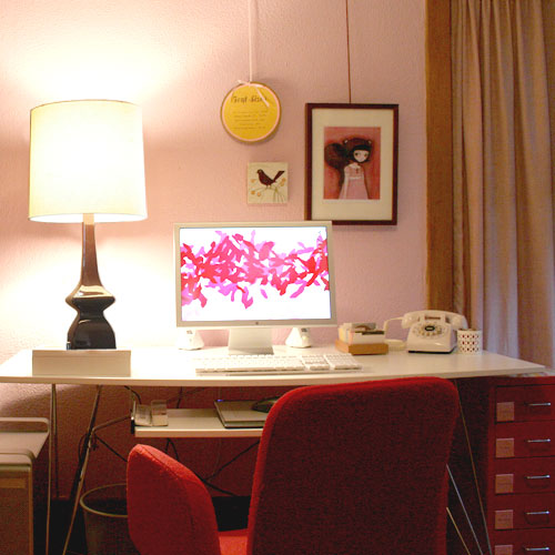
And this is the lamp that used to be in the office (which will probably go in the library instead):
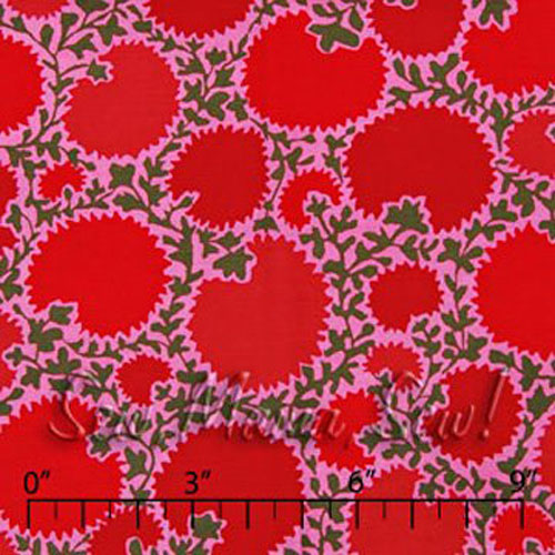
Something else to consider is that I just ordered this fabric for the window directly to the right of my desk:
That’s a whole lotta pink and red.Do you still like the chili lamp (maybe with a white shade)? I’m liking the simplicity of the Nikki lamp. Oh, and the Nikki has two light bulbs (which is a definite plus).
I’m feeling indecisive lately.




Caroleen
October 27, 2007 at 11:09 pmMy choice would be the Nikki in white. It seems “obvious” in the setting. When I look at the other pictures, I focus on the lamps (maybe because they are quite big) ; in the picture with the white Nikki, I just see a really nice place to work.
lsaspacey
October 27, 2007 at 11:12 pmI was about to give an answer and then I saw the fabric. I think I need to see a mock-up with the fabric as curtains now and maybe with the lamps “off”.
And yes, it will be a lot of pink and red regardless, however by putting a white lamp on the desk, “everything” on the desk will be white.
Merry
October 27, 2007 at 11:37 pmI really like the simple white lamp. With that there, it seems like everything in the space is there intentionally.
Also, I love your desktop background. Did you design that or get that from somewhere?
~J
October 27, 2007 at 11:41 pmI like the new red lamp. Probably with a white shade, if you are change the fabric on the windows. Hard call without seeing it together.
I think that the Nikki lamp is completely BORING since everything on your desk is already simple & white…
paola
October 28, 2007 at 12:58 amOf the two I prefer the Nikki, but am not completely bowled over by either of them. Maybe you aren’t either, which is why you’re feeling indecisive.
Sommer
October 28, 2007 at 4:49 amI really like the white Nikki lamp. It makes everything feel so much cleaner. I don’t know about you, but my work space, once I get to drawing and painting and school work, becomes chaotic. If your desk top ever gets chaotic and cluttered, wouldn’t it be nice to know that the objects that have to be there don’t add to the general mess? I like how the white items keep everything fresh and relaxing.
moodboard
October 28, 2007 at 5:11 amI like the chili lamp with the natural lamp shade. It warms the room up,and I love how vintage it looks. The Nikki lamp for me looks a bit common, but from what you wrote it feels like that is the one that is calling to you.
zee
October 28, 2007 at 5:15 amOh, I think the first image looks perfect Nicole. The fabulous lamp you have and its shade look great right where they are. If you’re thinking of returning it though, can I suggest posting it to me here in Ireland?! I love it.
jm
October 28, 2007 at 5:30 amI get the sense that you either:
a) haven’t found the right lamp yet and that is contributing to your indecision, or
b) really like the Nikki lamp but are wondering if it warrants the cost.
I’m a big believer in having things that you REALLY love (versus sorta love) in your space, especially your work space. So, I would say, keep looking until you find what will bring you pleasure everyday :)
jm_houseinprogress
drey
October 28, 2007 at 6:01 amfirst pic. go with that. the warm shade of the red lamp really adds dimension…
Claire
October 28, 2007 at 7:34 amI like the white nikki lamp.
Lili
October 28, 2007 at 8:16 amGoing out on a limb here…
I wonder if the old lamp will pull out the dark green in the fabric and balance out all the pink and red?
I think its the cool tone of the nikki lamp i dont like. Have you seen it in person? its a bit white/blue and doesnt feel very homey.
On the other hand the chili lamp feels a bit overwhelming with the red. Its great lamp but thats a lot of red. Those curtains are going to change the room a lot.
beh! i feel the same as you!
Julieta
October 28, 2007 at 8:43 amNicole, I don’t think you’ve found your lamp, yet. Both lamps are great, but they don’t seem like the right scale for your petite desk. But, really, I’m more concerned with your desk. Are my eyes playing tricks on me, or is it starting to bow? You may need to put a desk on your shopping list before you solve the lamp dilemma.
Julieta
October 28, 2007 at 9:15 amI keep coming back to look at the pictures, and I think the chili is the best in terms of size. I love it, but I’m wondering about the curtains next to it? It might be a nice balance. To me, the Niki seems very heavy for some reason.
technicolorsarah
October 28, 2007 at 9:23 ami like the chili with with white shade. it looks more… eye catching than the nikki. :)
sarah
October 28, 2007 at 9:24 amEither way, I think you need a red lamp with a white shade, but I think I like the curvy lamp better. And you already have it, which is a bonus.
Stephanie
October 28, 2007 at 10:30 amred lamp for sure!
Mim Smith Faro
October 28, 2007 at 10:49 amchili with white shade…too much white otherwise.
Peggy
October 28, 2007 at 11:05 amHi Nicole! I certainly understand indecision. It could be that neither lamp is exactly right. And you are right about the old lamp, it will look great in the library.
I love the fabric for the curtains.
Perhaps each lamp has something that you like. For example, I love the color of the Nikki, but the shape of the Chili.
What about something in an organic shape like the Chili, but in white with a red shade. I think a red shade will really pop with that fabric.
Of course, you need to think about what kind of lighting you like when you work, I tend to prefer dim lighting.
Whatever you decide, I know you can’t go wrong!
Making it Lovely
October 28, 2007 at 12:13 pm“Are my eyes playing tricks on me, or is it starting to bow?”
Jules, the desk is actually quite large and it’s rounded in the front! It’s this one: Paperlip Desk (but in white).
” If your desk top ever gets chaotic and cluttered, wouldn’t it be nice to know that the objects that have to be there don’t add to the general mess?”
YES. I think that’s why I like the white lamp so much. It’s a very nice looking lamp, but it doesn’t draw attention to itself.
“I get the sense that you either:
a) haven’t found the right lamp yet and that is contributing to your indecision, or
b) really like the Nikki lamp but are wondering if it warrants the cost.”
I think it’s ‘b’.
“Also, I love your desktop background. Did you design that or get that from somewhere?”
It’s a painting, but of course I can’t remember who it’s from. I’ll try to remember though, because I really liked his (her?) work.
“I think its the cool tone of the nikki lamp i dont like. Have you seen it in person? its a bit white/blue and doesnt feel very homey.”
Really? Hmmm.
—————
I dont’ think I like the chili lamp with a white shade. I like it with its tan shade, but it doesn’t look that great against the pink.
Julieta
October 28, 2007 at 1:48 pmAha! It must be the curved lip that I see that makes it look bowed. And I still think your desk is petite, but wait until you see the two monstrosities A and I bought for our studio in the backyard. Way too big (both L-shaped!) but with 5 businesses between the two of us, we need the space.
Get the white Niki. See if it has a blue tone, and if you don’t like it you can always return it. Don’t try to sell yourself on the chili, because you’ll be buying something else in a year or so and when you add it all up it will be more than 1 niki lamp.
Making it Lovely
October 28, 2007 at 3:28 pmGood point.
I just checked the Design Public Outlet, and they had the Nikki lamp for $145 (plus free shipping), so I ordered it!
kiona
October 28, 2007 at 4:42 pmI see the Nikki is on it’s way, but I just wanted to chime in and say I totally love the chili with the cream shade. I love the way it looks with the red and the pink and those curtains (tho I know those curtains aren’t staying.
lsaspacey
October 28, 2007 at 4:56 pmI just saw the Chili lamp in person and I’m not as enamored as I was. I had thought it was ceramic or glass, but when I touched and tapped it the first thing I thought was shellacked paper (paper mache?)…curious. What do you think it’s made of?
Go with your gut, you always make the right decision.
Anonymous
October 28, 2007 at 7:33 pmwow, my first reaction was love the Nikki lamp in white, then I liked it in red, then I saw the curtain material, so am back to loving the lamp in all white.
also love your white phone… :)
Julieta
October 28, 2007 at 8:21 pmIt’s not ceramic?! Now I have to go to my local Pier One to check this out for myself.
I’m glad you bought the niki. I think you would have regretted it otherwise. I speak from experience.
Laurie G. (moringk)
October 28, 2007 at 10:45 pmLove the Nikki lamp, either color would be great–I prefer the white. I think you’ll know for sure which color when the drapes are up.
Steph
October 29, 2007 at 8:16 amHi Nicole,
Where did you get your rolodex?
I’ve been looking for a nice rolodex for my home office.
Ana
October 29, 2007 at 9:04 amI think the first lamp/shade combo is the best.
Jessie
October 29, 2007 at 9:11 amOkay, you have a million comments already.lol I like the Nikki lamp better myself. Also, you had said you rather get what YOU really want for just a little bit more money. I like it in red or white. I think the red one looks better sitting on the white desk though. Love the fabric you got! Very cool.
the antibride
October 29, 2007 at 12:40 pmi totally agree! stay with the firt pic! that lamp gives such detail and draws attention, plusit will look great with the new fabric…
Cybelle
October 29, 2007 at 8:06 pmNikKi lamp in white!
nerminn
November 1, 2007 at 5:26 amı like the second picture
Anonymous
November 7, 2007 at 12:45 pmI really like the first lamp with the natural looking shade, but with the new fabric for curtains, it may be too busy in such a small area so maybe something simple like the nikki lamp is needed. i really like the first picture though, its perfect (even without the new curtains)!
Erin
July 26, 2011 at 7:44 pmI like both the Chili lamp, or the Nikki in red, with white shades. I think the white lamp feels unbalanced, like something’s off-kilter.
AS a side note, isn’t it grand how we are all just as indecisive about this? XD
Maybe the right choice just isn’t in the picture yet. :)
Erin
August 16, 2011 at 10:41 amHow did I not notice that this post was from four years ago?
I plead Baby Brain. >.>
SuSa
August 17, 2011 at 12:43 pmHello there,
I love the chilli lamp. With this fabric I would even look for a pink lampshade. But, I tend to love opulence when it comes to hotpink & reds.