
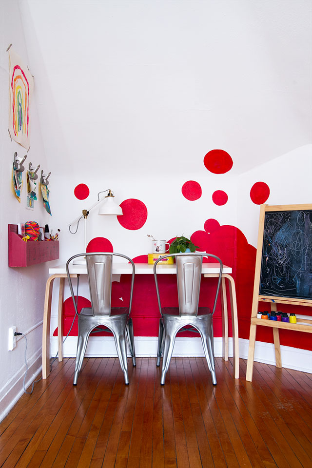
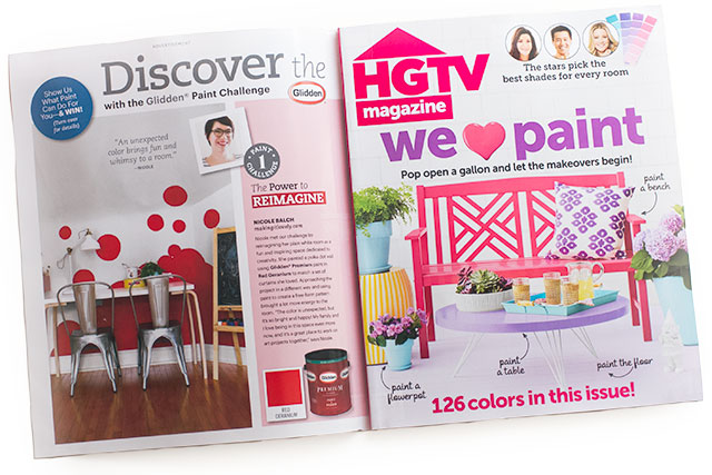
The playroom is sporting a different look from the last time you saw it! I showed a couple of shots while the wall was in progress a couple of months ago, but then I couldn’t show any more until the feature with Glidden ran in HGTV magazine this month.
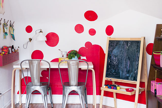
I write for Glidden, so when they asked if I had any painting projects coming up that they could share, I told them about my plans for the playroom. Typically, I’m not one to do an accent wall, as they can seem kind of arbitrary. In this case though, I really liked the white walls on the third floor for the most part, but wanted to bring some of the color over from the curtains on the other side of the playroom. A big block of color (like a traditional accent wall) could have worked, but I thought this would be a good place to try something a bit more playful.
The feature is inside a peel-back front cover in the June 2014 issue of HGTV magazine, along with projects by Kate and Eduardo, who also write for Glidden over at My Colortopia.
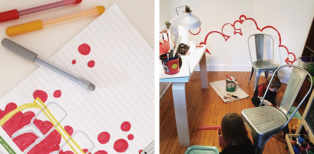
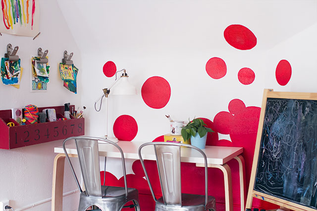
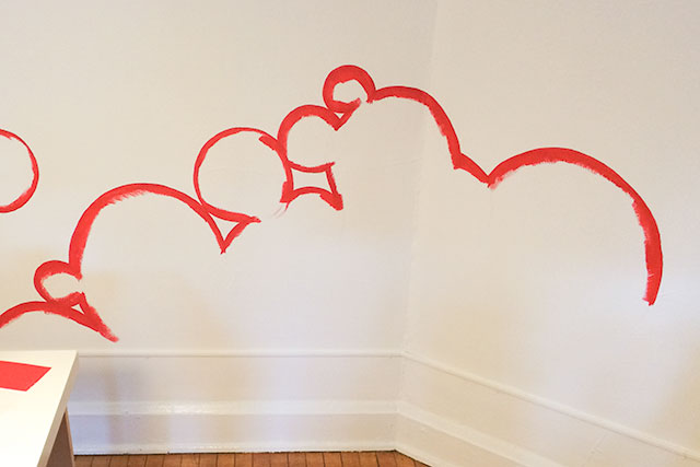
Initially, I thought about creating a more orderly polka dot wall, but I changed my mind the day before I started painting and went with a bunch of falling bubbles instead. The walls on the third floor are textured, so the design couldn’t be too intricate. I started with the quick marker sketch you see at the beginning of the post, and then drew large circles for the design on the wall, freehand with a pencil. I used an inexpensive art/craft paintbrush to outline some of the smaller circles, and used a 2″ angled paintbrush for the rest, and to fill everything in.
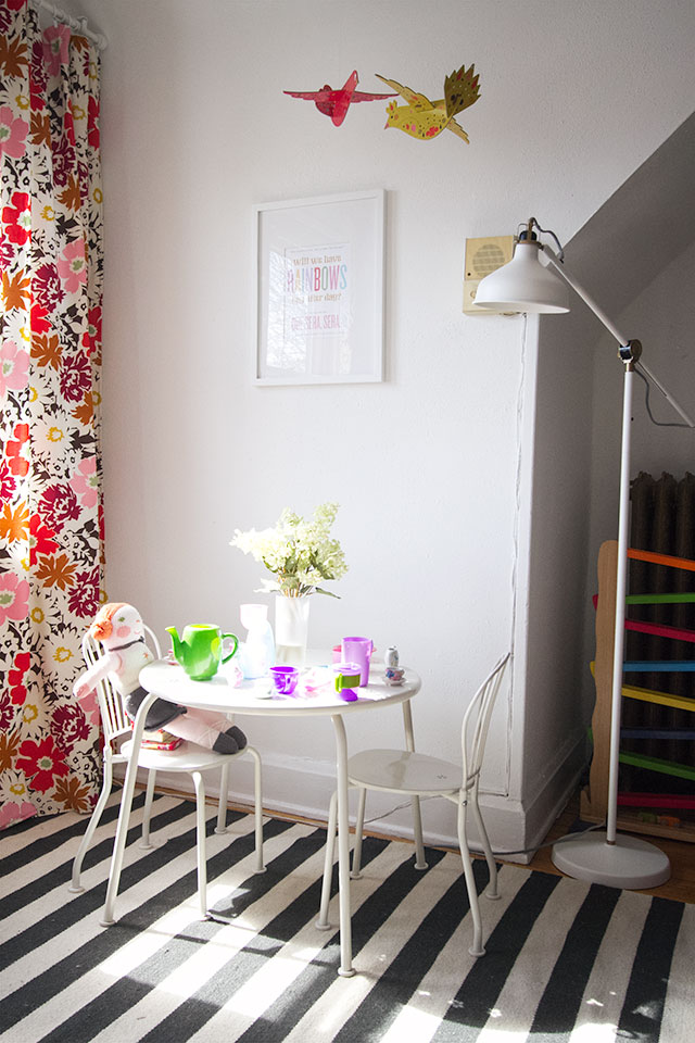
The other side of the playroom has those floral curtains that I made years ago from Moda’s “Mom’s Couch” fabric. They hung in my stationery studio initially, and were also used in Eleanor’s bedroom in the last house.
I chose Glidden’s Red Geranium because I wanted to pull in that bright orangey-red color and bring it to the other side of the room.
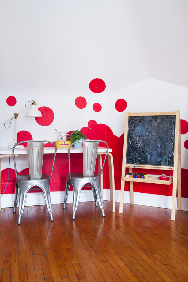
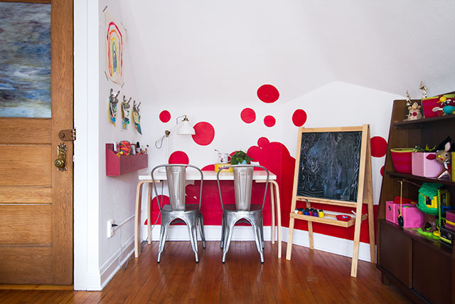
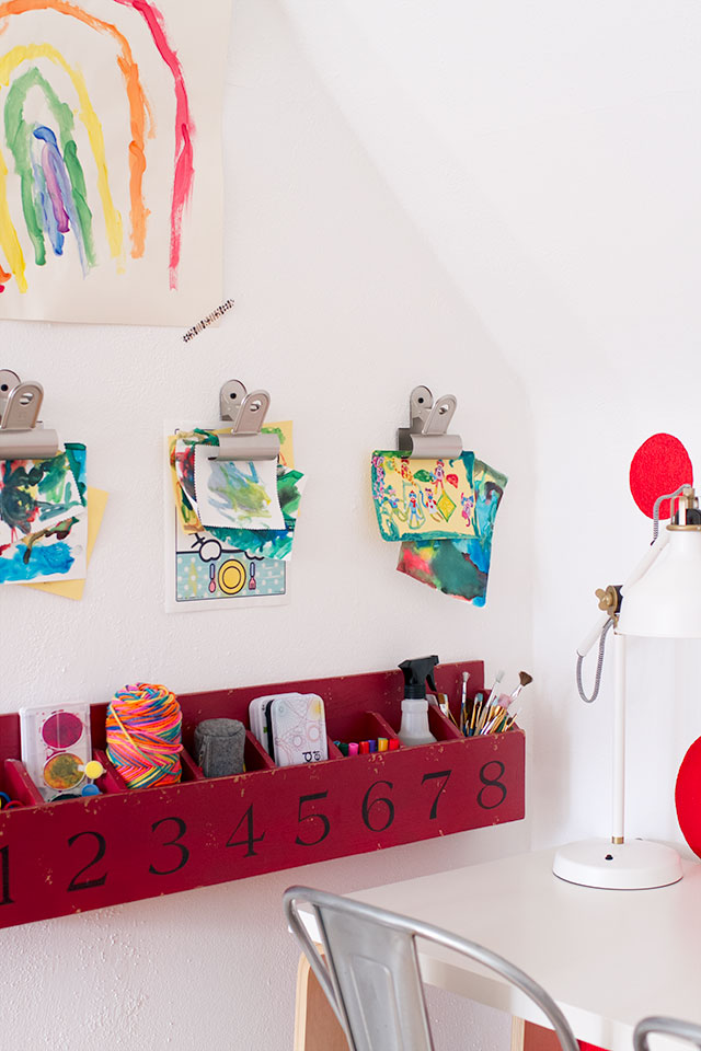
There are bookshelves for toys to the right of the easel, and along the left side, I hung cubbies to keep art supplies within reach, and also put up three large wall clips to use for rotating artwork on display from the kids.
I’m glad I’m finally able to share this updated space with you! We spend a lot of time in the playroom, and the added color has made it even more fun for the kids. And thank you, Glidden and HGTV magazine for featuring the project!


24 comments
Meg
those lamps! I am sure you’ve mentioned before, but where are those from? love both the desktop & floor lamp versions!
Making it Lovely
They’re from IKEA!
Meg
Awesome thanks so much! Will have to plan a field trip asap :)
alisa
I love it! When I saw this I thought of the bubbles rising up or like a lava lamp. Very cute. It makes me think of how little ideas come to together to complete a project.
shavonda@ahomefullofcolor
Congrats lady! I love it. Its so whimsical and fun. Im a little bummed, though, because I got the issue with the other cover and you’re not in mine:( Thanks so much for sharing!
Making it Lovely
Are you sure? The other cover peels open, and then this is inside!
Lena
Why are you thanking HGTV magazine for printing an advertisment?
Making it Lovely
I’m thanking Glidden for the opportunity, and the campaign was created in partnership with the magazine.
Katia
I saw Mickey Mouse ears hidden in there. I love it.
Xoxo
Mary
I have read your blog for years now, but have rarely commented. I love the hanging cubbies for art supplies. Can I ask where you got it or if you know of something similar? Thanks! Keep up the great work!
Making it Lovely
Thank you! I picked up the cubbies on clearance at Pottery Barn Kids a while back. It was a floor model, and I haven’t seen them in the catalog/site/store since, sorry.
Mary
Thanks for the reply & no need to be sorry! Just another treasure for which I’ll have to keep my eye out.
Kelly @ DeBoopShop
Adorable! I love how that transformed the room, giving it a fun & playful vibe. Now I’m thinking of ways we could turn our crafting headquarters into something more playful.
Since we rent, painting isn’t the easiest option. But maybe some cute vinyl polka dots to attached to the wall!
Making it Lovely
Yes! You could get a roll of adhesive vinyl and cut your own in various sizes, or I’m sure there a plenty of pre-made polka dots out there to choose from.
Elena
Freaky! My co-worker gave his HGTV mag to me last week to read and it’s been sitting on my desk and here I am reading your blog and BAM! There it is. I love the room.
Making it Lovely
That’s awesome! Thanks.
Laura
Perfect for a kids’ art space: imaginative and colorful and fun!
Katie Eve
Love your creativity and the styling, but the rust red on white screams “Dexter” to me.
D'Ann
I kind of feel the same way… even with the updated photo. It seems a bit forced.
Making it Lovely
This is so bizarre. I saw one of the photos pinned on Pinterest, and it did look rusty, bloody red. It’s a happy, bright red! I think I saved the jpegs in the wrong color mode initially, CMYK instead of RGB, but I’ve replaced them and they look true to life now! (They looked OK in WordPress to me, but I think it was pulling a cached version? Not sure.)
Anyway, compare the rusty/bloody color to the happier/truer color.
Of course, it’s still red. Hopefully less Dexter in appearance now though, with the proper color formatting. ;)
Katie Eve
Oh my, you’re right! I’m glad I came back — MUCH better in that happy, poppy red! Thanks for the response and update.
emily @ go haus go
It looks great! I’m glad you went with free form bubbles instead of polka dots!
amy
Where is that drawing table from? I love it!
Making it Lovely
It’s an old tabletop and legs from IKEA. I bought two of them for my booth at the National Stationery Show in NY years ago, because they were easy to pack and ship off in a crate.
Comments are closed.