
You probably recognize this kitchen. It was in the much-featured, much-blogged-about home of Jenna Lyons.
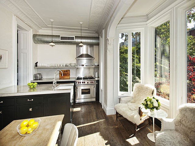
Lyons’s New York brownstone was sold and is now owned by Tracy Martin and Vince Clarke. They hired Roman and Williams to redesign and decorate it, and here’s the kitchen now.
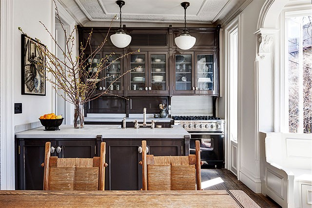
I missed the redecorated home’s feature in the New York Times when it was first published last year, but was glad to come across it recently. It’s easy for me to fall back to cute! and colorful!, but I’m so inspired by more masculine homes, and I love the vintage character brought back into this kitchen. The entire redesign is inspiring.
Which way do you prefer it? How about the home as a whole? Domain Home put together a collection of photos of the house’s two very different looks.


21 comments
Cheryl
When I first saw the kitchen on your post, I loved it and went to Domain to see more. Overall, the kitchen is my favorite of all the rooms in this more masculine design. The other rooms feel a little heavy for me.
Marcee ... ILLINOIS
All white kitchens are a must for me. In younger days, loved the clutter of a kitchen. No more …. icky dust. So, yes, if I could do it all over, white + modern kitchen. Pops of color are certainly marvelous though. Lots of ways to do that. My choice is Jenna’s kitchen. The remodel is too dark. Not appealing. Everyone has their own ideas which is fine.
Laura
I prefer the simplicity and lightness of the Lyon’s kitchen. The remodel seems over done (pretentious?) for such a small space.
grumpy
I love, love, love, the redesign. It was a gorgeous house to begin with, but now it’s superb.
Jen
As a Jenna Lyons fan and a medical illustrator I adore this house both ways! It was a nice surprise to see my friend Emily’s gilded skull wallpaper in the bathroom at the end. It can be hard to have a love of anatomy and interior design, but the new space accomplishes it. You have to have fun and take risks.
julia-tagandtibby
I like the after, it feels a bit warmer, more like a family kitchen. And the upper cabinets are practical.
RebeccaNYC
am I the only one to look at these photos and think “what a waste of resources”? A perfectly good kitchen, gutted and discarded? Any idea if the kitchen that was removed had it’s components at least donated to Habitat or some such charity?
Sarah @ 702 Park Project
Love this post! Although I’m not a huge fan of brown cabinets, I like the second better. There seems to be so much more storage…a necessity in this small kitchen!
Nat
Thanks for this! I actually went to Domain to see more of the comparison and came back to comment. Hands down, I prefer the new version. So much warmer, so much cozier, so much more character. I used to be all about industrial minimalism, but have since grown into the more traditional/layered look. I found in my home, the minimalism felt cold and unwelcoming (to live in).
Malia
I prefer the original, even though I would wish for more kitchen storage, personally.
I have a question, though–when people do such major renovations, what happens to the previous (seemingly excellent condition) cabinets and other kitchen things? Do they get reused/sold (by the contractor?) or mostly trashed?
Kim
love the redesign. The other is way too stark for the home. Maybe in a loft.
Andrea Jane
While I like Jenna Lyon’s kitchen, I much prefer the redesign. With Jenna’s I have a “oh that’s lovely.” reaction but with redesign my mouth starts to water. That’s my design litmus test!
zandra zuraw
I definitely am more attracted to the Jenna Lyons kitchen. The new one is pretty traditional with nothing unexpected. I also checked out the link you gave to Domaine (thanks!) and for the most part, I’d go with Jenny Lyons. There were a few spaces where I liked both designs. Do you know if Jenny Lyons hired a decorator? It feels a bit more personal than the one where they did hire a designer. Especially all of those clothes in the bedroom!
alisa
The adore the remodeled kitchen. It has so much character and detail plus function. I feel as if the kitchen has history and stories to tell.
Laura
Any idea where the fridge is? Is it a counter height fridge under the counter? This kitchen layout is VERY similar to my own galley kitchen, which I loathe, but there appears to be so much more counter space here!
Danielle
Love the side-by-side comparison! I like Jenna’s style better overall (aka, the rest of the house), but the kitchen redesign is definitely more functional, from my perspective.
Roxy
I prefer the ‘after’. I think that the ‘before’ looked too industrial and didn’t suit the room.
Looked too unfinished for the space.
Now, the cabinets compliment the detail in the moulding and it’s more mature looking.
Kim
I love the latest design too – but is the ceiling THAT crooked? I can’t stop staring at how the cabinets slant – or maybe it’s just the way it’s photographed?
Catherine
I think the ceiling slopes. If you look at the before picture, the shelf looks level but the venting looks slanted. And the light on the left looks like it’s at an angle. They’re probably 12 foot ceilings, so what’s a few inches? ;)
Feisty Harriet
I like them both, but the redesign seems so much more practical to me, from sink placement to upper cabinets for storage in a clearly tiny space, to the built-in seating in the little bay window.
xox
Comments are closed.