
Are you feeling the shift from minimal white spaces? I’ve been waiting for you. Join me, and together we can rule the galaxy as… *ahem.* I mean together we can decorate some pretty rooms.
I went to an event the other day for Benjamin Moore’s new Century line. The colors are gooood.
[one_half]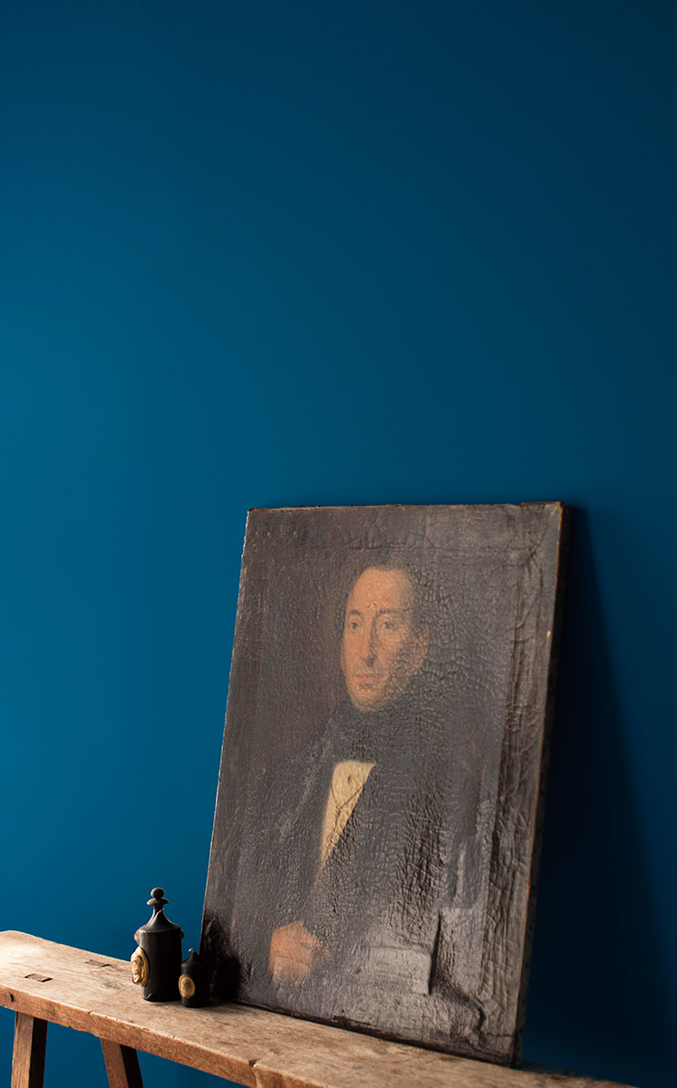 [/one_half]
[one_half_last] [/one_half_last]

Fireclay Tile has a new palette collection based on the paintings of the Dutch Masters. More excellent colors.


Throw in the abundance of blush/millennial pink right now, and everything’s coming up Milhouse.
Are you all as excited about the direction design is going in as I am?

18 comments
chrustinalynn
Yep, been waiting for quite a bit! Sick to death of white on white on white. See also: “Farmhouse Style” :D
Manda
With you on this. I’ve been inexplicably lusting after jewel tones and deep dark greens for my (relatively new) house and haven’t taken the plunge yet–the white wall bias is a hard one to shake!
Emily
I’d been wanting to do a darker color, specifically spurred by the sitting room off your bedroom, for a while, but people talked me out of painting my not-bright closed floor plan living room navy or teal or something. Maybe I need to try it anyway! Rich dark colors!
elizmcanally
I’m totally on board! We’ll be building a house soon and I’m trying really hard not to go the easy, all-white route. Thanks for the inspiration!
Jane
While I love richer colors (especially with wood trim), I just can’t with the icky brown in the top right hand image!
Celeste
I’m digging it. I’m loving that Fireclay series! Though, my house is painted the same shade of light gray throughout, which I’m still loving. But man, you were ahead of that curve!
Vanessa
The black table against the black wall looks good because the light is falling across the apples. That same scene in the evening or on a rainy day will be a much harder view I think.
Liz
I love it!!
Sherry
Totally! I think colour is going in a gorgeous direction. *cheers*
Erin
YES! I love neutral in big fixed elements but love color everywhere else. I am quite excited about the change in direction.
Vicki
Ha! I was *just* thinking about dark and cozy yesterday! Our new living room (yay first house! Woohoo!) is pretty small and dark for half the day, and I’ve been thinking we needed to do white everywhere to make it feel big and airy. Or (*light bulb*) we could just embrace it and make it kind of moody and quiet and snug. I love those blues and greens!
Susanna
All the points for ‘everything’s coming up Milhouse!’
Kimberly Tanner
yes yes yes! Finally!!!! I have been desperate for something different for a while. So glad to see a shift toward classic, dark, rich, cozy color.
Amelia
My bedroom was painted that “brown” color when we moved in, and we’ve kept it for years! I’m always surprised that I like it so much, trying to describe it sounds awful (brownish, greenish, goldish), but it really is pleasant.
Tineke
Oh! That deep blue is just what my family room needs!! I love a bit of drama in a room. :)
Meredith
I realised about 18 months ago you were ahead of the curve on this one.
Kathleen
What’s interesting to me is that those first two colors by themselves didn’t do anything for me, until I scrolled down and saw them against the artwork and flower. Then I was all heart eye emoji’s. Especially that brown, which looked very taupe-y until the dahlia and then BAM! beauty.
Rebecca
I love it. But I want all those lovely colors AND my clean white walls!
Comments are closed.