
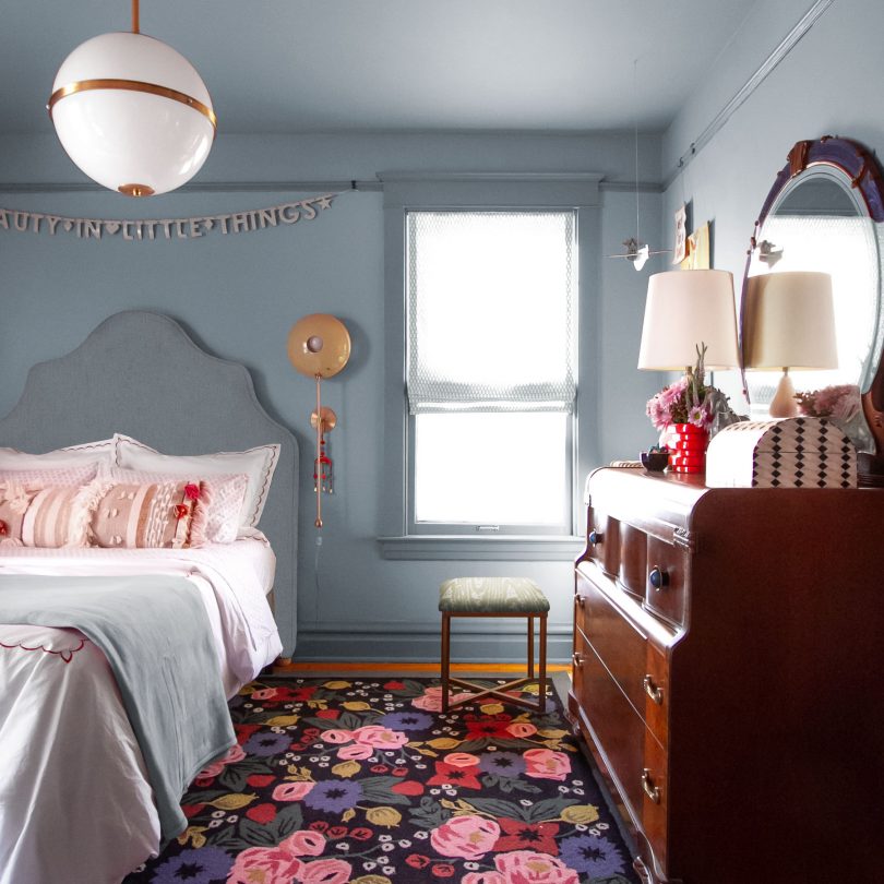
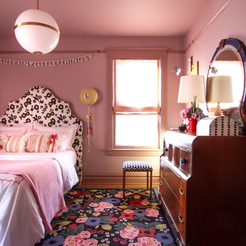
Eleanor and I had initially thought we would paint her room blue. She chose dark blue when she was five, and five years later still liked it but was ready to lighten up a little. Maybe something like Farrow & Ball’s Light Blue or even De Nimes? Then she decided on purple and the color scheme completely changed.
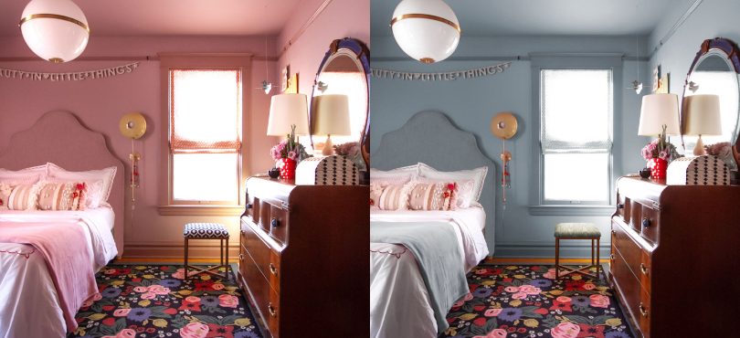
But do you want to see what could have been?
I mean, I do love it. A lot.
It’s funny though, the wall color drives the color scheme but we only had to make a few changes to some fabric choices to make it work. And the purple/pink design we ended up with fits Eleanor’s personality perfectly.
Do you have a preference between the two?
The sconce color even worked well, and it might have been the choice I was most worried about. I chose a pair of POP Wall Sconces from Blueprint Lighting in Rubbed Sage before we changed the palette. I think I would have chosen Vineyard from their custom colors had I not already ordered the other color, but E and I both still liked the green when it arrived!
Blueprint Lighting was a One Room Challenge sponsor and provided the sconces. We liked some of the more retro styles like Campana or Ludo, but the vertical element of those POP Wall Sconces grounds the curves of the headboard (a lucky FB Marketplace find) so nicely.
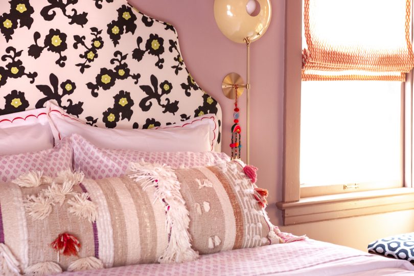
Eleanor has continued to make changes here and there. It’s her space to personalize as she sees fit, and oh, she does! String lights have been draped from the picture rail over to each sconce. Toys get moved around. Signs have been pinned to the fabric of the headboard like it was a giant bulletin board. They’re small glimpses of changes to come as she heads into her teenage years and I love it.


8 comments
Lokonida
The version is really awesome, I love it.
Joseph
This is so beautiful, I like it.
Kate
Both are beautiful, but I love the purple/pink color she decided to go with; so perfect!
Kate,
https://runawayfiancee.blogspot.com/2020/03/why.html
sandyc
Although the blue is lovely, somehow it speaks to a sophisticated young but adult woman whereas the pink suggests an exciting and excitable young woman mature beyond her 10 years, and what fun to watch her mature further. And I loved that Serena & Lily headboard from the beginning.
Liz
I prefer the blue. But both are lovely. Something about the blue though. Amazing.
Max
Loooooove this. What are the paint colors you used in the blue version mockup?
Deborah Raney
What Jenny said. But I can see why she likes the actual version too. But that blue is luscious!
Jenny
I’m glad she found what she likes, but I LOVE the blue version!!
Comments are closed.