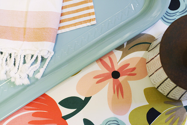
The details for the kitchen update are starting to come together.

I still haven’t picked a paint color, but I have everything else down. The white cabinets, dark brown quartz countertops, and stainless steel appliances that Brandon and I put in five years ago will form the backdrop. Then we have the floral backdrop that will become curtains, a couple of white and coral striped tea towels, a pretty turquoise tray, and a set of vintage brown and white ceramic canisters that I picked up at the Renegade Craft Fair.

The cabinets have green ceramic knobs, and my vintage breadbox (that I love) is green too. They don’t really match the greens in the fabric, but I don’t think they’ll be jarring either. If they are, I suppose I’ll hunt on eBay for a new breadbox and sell the old one (money-wise, that should equal out), and then replace the green knobs. With black and white ones, perhaps? I like the combination of black, white, and brown as a foundation. I’m even considering white walls, but it’s hard to pull that look off without beautiful architecture. What do you think?


32 comments
Holly
I am also renovating my kitchen and love your fun pops of color! I think I may have to look at adding some more color into my space. You can check out the progress (we are just starting) at http://createbakecelebrate.blogspot.com/2012/10/create-kitchen-remodel-backsplash-and.html
Farmgirl Susan
I love the floral print! :)
sarah@boxwoodclippings.com
can’t wait to see the results, loving the floral
Korianne
Your canisters remind me of Daleks from Doctor Who! Hee hee. Very cute stuff though. I’m excited to see the finished project.
Sarah
I love that fabric! The tray color is such a great match too. I think that’s the color you should put on your walls (assuming it not a cold room). If it is a cold room I’d go coral pink on the walls. I hope the green accents work!
Suzette
You are sooo gorgeously talented Nicole! I love your blog and I am excited to see the finale of your kitchen. The colors are lovely and have that perfect kid-friendly and grown-up fun-feel. Thanks so much for sharing.
V. J.
All greens match; as in nature.
The Lazy Fair
I love how you are always reconsidering rooms that are “done.” We’ve been renovating our shotgun house for YEARS, so whenever a room is “done” (you know, like 85% complete), we move on to the next thing. But really, what makes the difference are the details. You are inspiring me to go back and give my house a second look!
Stacey
LOVE THE COLORS!! Everything is so fresh and sweet.
Christine Drumgoole
Very pretty, indeed!
Kim @ Yellow Brick Home
Oh, man, I am loving what you have so far!
I think you’re right about the white walls + beautiful architecture. I think our living room color could look really pretty with your combo though – it’s called Winterfresh by Behr.
PAppel
Nicole,
Went and saw it again, it’s online, It’s not an exact match but it is pretty close. The latch is a bit different and it does not have a handle on top. Here is the link. See what you think?
http://www.target.com/p/polder-retro-bread-bin-black/-/A
10909409#prodSlot=medium_1_5&term=bread%20boxes
Lynn
Love your palate. Can’t wait to see the finished plan!
AnnW
I would paint the walls the flesh color on that four petalled flower, or the slightly darker pinky coral on the bottom of that apple or whatever it is. I have had every color imaginable in kitchens and a bright one is always nice. The cabinets and floor always tone down the color anyway. My favorite color in the world is that blue-green turquoise that I call beach glass. That would look nice also.
Tara
I love these colors together! Nicole, would you mind if I used the top image on my blog this week with a linkback of course?
Making it Lovely
Go right ahead! Thanks for asking.
jenn aka the picky girl
I am in love with that fabric. So much so that I’m convinced I need it for curtains in my vintage-y kitchen – My walls are near the color of your breadbox with white cabinets.
Can’t wait to see the look.
Megan
I have really similar kitchen cabinets and I painted my kitchen Benjamin Moore’s Decorator’s White about two years ago and I still love it – it certainly brightened the room a lot.
PAppel
FYI , , ,
Target has a black bread box identical to your vintage green one for under $50.
Making it Lovely
Really? I looked online and didn’t see anything. Maybe it’s in stores only?
LaDonna
http://www.target.com/p/polder-retro-bread-bin-black/-/A-10909409#prodSlot=medium_1_5
Staci @ My Friend Staci
“I’m even considering white walls, but it’s hard to pull that look off without beautiful architecture.” Aha! Yes, that’s why white worked so well in my old Spanish-style house but looks so BLAH in my new cookie-cutter apartment!
Can’t wait to see how your kitchen turns out. Have you considered using that light teal on the walls? Or even a lighter version–just a hint of teal?
Making it Lovely
Yes, that’s in the running.
Angeli
Oh I love those canisters!
Modern Jane
I’m anxious to see what you do. I want to paint my kitchen white but worry about the same thing..
brandy
where are your towels from–they’re great. are they small hamam towels? thanks!
Making it Lovely
The fringed one is from west elm and the other is by Studiopatró.
LeeAnn
Your kitchen update is going to turn out great! I hope the vintage green accents play well together. In my mind they do. And I have the matching sugar and creamer to your canisters. :)
Making it Lovely
Oh, fun! I don’t know anything about the set — now I want to track down the other items in it.
Comments are closed.