Blog

  • Oops, Wrong Color.

    Oops, Wrong Color.

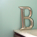
    I painted the bathroom a few days ago. It looks much more blue than I thought it would. Oops.

    Here’s what the bathroom looks like so far…

    bathroom progress

    That’s “Antiguan Sky” from Benjamin Moore. It’s a pretty blue/green color that I pulled from the shower curtain, but it’s much brighter than I was expecting. It doesn’t look so terrible in the photo, but I just took that picture a few minutes ago (it’s midnight). It’s a very *ahem* cheerful color during the day.

    I hated it at first and immediately thought I would repaint. Now that I’ve added some towels and a bathmat from IKEA, it looks kinda cute. Kinda.

    *addendum*
    Here are some new photos, taken at 10:30 a.m. with lots of daylight coming in:

    bathroom progress

    another progress photo

  • Elsewhere: Julieta’s Kitchen

    Elsewhere: Julieta’s Kitchen

    Julieta asked how I would finish her (already lovely) kitchen in the comments of my last post. I do already have an idea of her style because we’ve been working on a web project together over at Smart & Lovely, and hey – I was up for a fun distraction.

    She’s already transformed her bland, old kitchen into something great:

    Julieta’s Kitchen

    Really, the only thing she hasn’t finished is the backsplash. I say throw some white subway tiles up and call it a day. Hey, it worked for me. Oh, or she could get all fancy with tile from Ann Sacks.

    Ann Sacks Tile
    I would be so jealous of you.

    Julieta isn’t crazy about flowers, until she finds just the right floral pattern (right, Jules?). I did include some florals, but they’re not overwhelmingly girly. I worked with the colors she has now, and decided to bring in more of the blue I know she loves.

    Here’s a gorgeous fabric for the tablecloth (Amy Butler fabric from Purl Soho):

    Amy Butler Fabric

    Maybe for the curtains too? That might be too matchy matchy. Maybe a striped fabric would be better, or another fabric from the same line.

    Moving on, here are some other fun touches for the kitchen:

    julietaskitchen500.jpg

    The little dishtowel from Anthropologie is so sweet (sorry, more florals). The Nigella Lawson bowls are designed to be cradled in your arm as you mix, and they’re a really pretty color. Also pretty? The pallette dinnerware from CB2.

    I just bought a few of those lacquered cupcakes (the small and medium sizes) for my bathroom redo. I know – bathrooms and cupcakes? I don’t care. I’m putting my ponytail holders and barrettes in them. And they’d be adorable in Julieta’s kitchen, but they would make much more sense there (being in a kitchen and all).

    Lastly, there’s the retro blue scale. Perhaps you don’t need a scale in the kitchen? Rubbish. Find a spot for it! You know, either that or you could get a breadbox. ;)


    …And perhaps this is the start of a new feature on the blog? Helping others? Or maybe designing a room around a color, fabric, or object?

    Or would you rather I just focus on my own house?

  • Bigger Than a Breadbox?

    Bigger Than a Breadbox?

    No, exactly the same size! Ba dum bum.

    There was a breadbox in the kitchen at the family lake house, and I really liked it. When we returned home, I started searching on eBay for something similar. I lost the first one that I bid on (it ended up going for $125!), but I won the second.

    My New (Old) Breadbox

    The green picks up on the green of our cabinet knobs. I love that our breadbox is vintage, but there are plenty of new breadboxes to choose from too (with a vintage look)…


    I really like the Buick Red Bread Bin from Anthropologie.

    I’ve also seen it in white and shocking pink (yum!).

    I would love to see this in a kitchen with sparkly red vinyl chairs, a boomerang laminate tabletop, counters with chrome trim, a Nelson Ball Clock, cherry fabric for curtains, and a vintage-style apron.


    Next is the lovely, soft green Vintage Bread Bin Box from Ballard Designs.

    I imagine it in a kitchen with creamy white cabinets, jade milk glass knobs, striped cafe curtains, feminine switchplates, mismatched ivory plates on the walls, and a big, old farmhouse table.


    And then there’s the Classic Enameled Breadbox from The Vermont Country Store.

    I think they got the gingham in the photo just right. A breadbox like that belongs in a vintage Americana kitchen… cute red gingham curtains, distressed metal sign (or letters), a vintage floral tablecloth, rooster juice glasses (I wish I knew what happened to my Grandma’s similar glasses), and a white cake stand (with apple pie on top, of course).

  • A Mustard Pot?

    A few years ago, my mother-in-law (thanks, Helen!) gave me a little stainless steel set that I believe was her mother’s. It had a little tray with salt and pepper shakers, and a sugar bowl. Well, I thought it was a sugar bowl.

    Salt, Pepper, and Mustard Pot (?)

    I was cleaning it today, and I decided to google the manufacturer’s name (Stelton Denmark). It turns out that the little ‘sugar bowl’ might actually be a mustard pot, at least according to unica home and the rest of the interweb.

    I was more surprised though to learn that the set had been designed by Arne Jacobsen! It’s part of his Cylinda line from 1967.

    “Hmmm”, I thought. “I have a book about Arne Jacobsen. Maybe it will be in there.” [Note the ridiculous use of quotes. I am ever so writerly.] Anyway, it was in there:

    Arne Jacobsen Cylinda Line

    Like the commercial version of the AJA flatware, the new line jettisoned the ornament and associations of traditional silverware in favor of a machined product that reflected both the nature of the material and Jacobsen’s own vision of sensuous utility.

    Michael Sheridan, Room 606

    Now, the book doesn’t make any mention of a mustard pot. In fact, the picture credits it as a sugar pot. And that’s exactly how I intend to use it.

  • 2 or 6?

    2 or 6?

    I think I’m down to two options for the bathroom redo: #2 and #6.

    bathroom-redo2.jpg
    #2

    bathroom-redo6.jpg
    #6

    I actually like the Zinnia Shower Curtain more than the Graphic Fabric Shower Curtain, but I think the latter works better in my bathroom.

    Have I mentioned that I’m not a big fan of blue? Well, I’m not. I don’t hate it, but I wouldn’t normally choose it.

    Now, do I go dark brown or white with the sink and mirror? Overwhelmingly, you all prefered white (#6). I’m leaning towards dark brown (#2), which was also popular.

    The hallway directly outside of the bathroom is dark brown (the color of the library), so I think it would look nice if continued into the bathroom. I had originally intended to paint all of the trim on the second floor white (I’ve already done the library and our bedroom). Would the bathroom look funny if I paint the trim and the door white, but paint the sink and cabinet dark brown? Do they need to match in such a small space?

    My plan is to paint the walls, add a shelf, switch to the new shower curtain, and then figure it out from there.

  • It’s Magical.

    Sorry, this is totally random. I’ve been looking for gel pens, and I came across this description:

    Its sleek, white color makes it the unicorn of gel pens.

    Wow! Really? How can one pass up a pen like that?