
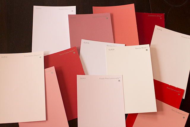
Glidden Paint Review & A Giveaway
I write for Glidden® over at My Colortopia and I've been using their paint for a few projects around the…August 20, 2015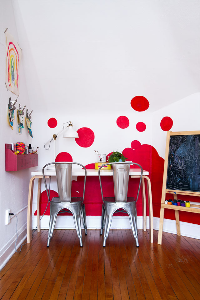
The Playroom’s Accent Wall (Featured in HGTV Magazine)
The playroom is sporting a different look from the last time you saw it! I showed a couple of shots…May 20, 2014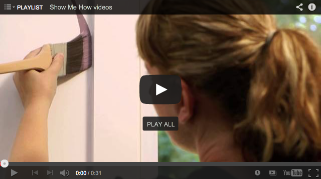
A New Video Series with Painting Tips
I'm so eager to get some paint on the walls of the new house. I'm fine with taking my time…October 9, 2013
Orange You Glad
This post is in partnership with Glidden. I've used orange a lot in my home (like in August's nursery and…October 9, 2012
Three Apartment Makeovers
I write for Glidden over at MyColortopia, and a while back I was discussing a few ideas with them that…August 23, 2012
My Colortopia
One of my favorite things to do is to choose paint colors. One of my other favorite things to do…December 2, 2011
Glidden Paint Review & A Giveaway
I write for Glidden® over at My Colortopia and I’ve been using their paint for a few projects around the house recently, so today I’m…
The Playroom’s Accent Wall (Featured in HGTV Magazine)
The playroom is sporting a different look from the last time you saw it! I showed a couple of shots while the wall was in…
A New Video Series with Painting Tips
I’m so eager to get some paint on the walls of the new house. I’m fine with taking my time to make decorating decisions, to…
Orange You Glad
This post is in partnership with Glidden. I’ve used orange a lot in my home (like in August’s nursery and the original dining/living room setup),…
Three Apartment Makeovers
I write for Glidden over at MyColortopia, and a while back I was discussing a few ideas with them that I had for projects. I…
My Colortopia
One of my favorite things to do is to choose paint colors. One of my other favorite things to do is to talk about do…