
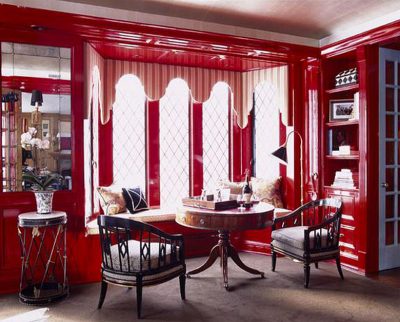
I’m not so sure. I’ve tried putting these curtains in the library before (they’re from my studio), but after someone mentioned trying them here in the comments I thought I’d give it another go.

Remember, here’s the before (with the curtains that everyone except me seems to love)…

I love the colorful curtains, but I don’t think they’re right for the library. Too kooky? Of course that makes me wonder if I’d like Orla curtains as much as I thought.

Now I’m thinking I might want something more masculine. Maybe a crisp geometric in brown and white.
177 comments
Liz
Hey Nicole,
I am a long-time lurker and I had to comment to ask you a question. I am looking to improve my 1923 California bungalow and I get so inspired by your blog. When I showed my husband your house he said “I bet they don’t have any pets” (we have a cat and a cocker spaniel) and I assured him you do. So my question is how do you manage to keep your home so spotless with a long hair cat and Murray? My cocker is black and everything in my house is covered in cat and dog hair. We have hardwood floors throughout and have given up on rugs because they end so filthy (particularly Ikea rugs). I swifter daily, gone through 2 vacuum cleaners and I frequently lint brush the couch which is white btw. Any tips are appreciated. You have a beautiful family and I look forward to new project ideas in the future. I get giddy when I see you feature dresses and shoes I own in your wishlists.
Thanks,
Liz
Michele
I think you’re right- if you don’t think this bright pop of color is right {I do- love the second curtains}, you probably wouldn’t love the Orla Kiely in that space.
carrie
rather the after. oops
carrie
i’m sure you have already made a decision, but i like the bright flower curtains better. they pick up the colors of the books in the book case and compliment the yellow wall. i also think they look a little younger than the before curtains.
Rachel H.
Before!
Jan
I think both of the curtains are great. As someone stated before, I think the bright colorful floral ones are great a nice change for the summer.
FoxFire
I love your ‘before’ curtains, though they are both gorgeous. The before ones just seem to fit a library area more. The brown and white geometric curtain idea might be perfect- a good mix of modern and edgy for a nice reading area!
Lynnie
Well, I gotta tell you that while I definitely prefer the original curtains here (sorry!)
I think the new ones are just too busy for the space and make it feel sort of crowded – actually scrolling back up to look at the pics again I feel sort of claustrophobic looking at them.
Maculine sounds gooooood, but I think an OK or more feminine print could still work well here. I think any printed fabric that’s going to go in the space needs to be clean, crisp, and on the graphic side to stop things feeling cluttered, and OK fabric would fulful that brief provided the print is an appropriate size.
[Disclaimer – just my two cents, please don’t hate me!]
Jocelyn Fraemohs
They’re lovely. Why not change the throw cover on the pillow to colours from the curtains, especially if one of them matches the grey.
Tommy Bahama Bedding
I’m not really opposed to more masculine curtains, but I really like these – they’re so cheery. Who says a library has to be muted?
melissa
Where did you get that table from?
oneshotbeyond
the color ones totally give something extra to the library-although it was already really special. :-)
kristin
i loveeee them! these are way better than before, at least. i like the way it works with the next room’s color (yellow stripes). you guys have great taste, so i’m sure that it will look fab no matter what.
Haley
I don’t know about the pattern/what the color is in person, but the mustard accent color would probably make these curtains from west elm look pretty awesome: http://www.westelm.com/online/store/ProductDisplay?partNumber=WE-PRODr669&storeId=17001&langId=-1&catalogId=17002&viewSetCode=E&parentId=WE-SH1RUGWIN&retainNav=true&cmsrc=WE-SH1RUGWIN.
Kickymarcia
I just took a spin thru your flickr set for the library. Where did you place the green ones with victorianesqe pattern with deep green, pink and chocolate?
You could repaint the mustard either a green or pink and put up the curtains. It would change the look of the room. It will still feel more masculine with the chocolate. Then replace the pillow and throw with a coordinating color.
Just a thought.
Kickymarcia
I like the look of the original curtains on screen. However, I do agree with an earlier poster about the room not really being a “Nicole” room. Most of your other rooms have some accent of pink in them.
Have you thought of adding pink as an accent color? Maybe a curtain with neutral ground with pink, mustard and chocolate.
The mustard wall is skewing things visually for me.
Have you thought of repainting it another color?
If you painted it a pink, kept the floral curtains and replaced the throw- Voila!
Ashleigh
I love the curtains from before, I thought they were perfect
Ed
the new curtains are really yummy , i way prefer them !!
Lauren
The old ones are cool but the new ones are perfect for summer and add an extra pop of color!
Laura
Have you thought about finding a curtain you like and then changing the yellow on the stairwell? Maybe you are ready for a change there!
jill
People, stop voting for the before curtains. She doesn’t like them.
I LOVE the after, and think they are the perfect pop for this already masculine room. There are two feminine ladies in the house now – you win. A little girlie element.
As for all new curtains, I say live with these for a while and put that money in a college fund to send that adorable baby to RISD.
ps. just noticed the little smile in the yellow flowers. wha???
abbi
I like the bright punch of color of the new florals but I think a masculine, geometric pattern would be much better! I think this is the perfect idea. Now let’s hope you can find them! ;)
Myranda
I prefer the original curtains that were up. They seem to pull elements from all over the room. Those other curtains are nice but it seems like they don’t flow well with the rooms as a whole.
Daniela
I agree with you.
I think the other curtains worked better than Orla´s.
Keep looking for your dream ones.
I’msure you´ll find them soon and amaze us.
Love
Christina
What about something in an Alexander Henry? In person, some of his fabrics are lo-o-vely
this colourway has mustard and green, but the lilac is different from what you have now (and geometric):
http://www.purlsoho.com/purl/products/fabricdetail/4998
Here’s one that seems ‘you’, though the colours may not go. missing mustard, but has green:
http://www.purlsoho.com/purl/products/fabricdetail/4999
or…
you could get a lovely textured linen in mustard and edge in vertically with the bright fabric from current curtains ??
Hope this helps :)
Christina
Fernanda
I think the before curtains are better for the library.
Nuit
I LOVE them, but for this space in particular, I would vote for the geometrical pattern in brown and beige…
Lua d'algodão
I like more the first one,I guess they go better with all the room!! And they are less floral!!
I come here for a long time, but usually never leave comments! I really enjoy your blog and your daughter is really cute!!!
***
M
JLR
I think a big geometric print would be fab.
LaNa
Hi,
I love the curtains! I was also wondering where you got the light at the top of your stairs? I’ve been looking for something to replace the awful brass fixtures in my home, but haven’t been able to find something I’m in love with.
Cheers!
melanie
Hi Nicole,
I have a question about the chair in your library. My husband and I are thinking about purchasing a similar one for our dining room turned library and I have my heart set on white. (what can I say? you’ve inspired me!). My question is, have you had any problems keeping it clean? Purchasing white upholstered furniture has me a little nervous but i just love the look of it! thanks!
Clair
I prefer the before.
SALLYROO
Hi Nicole, I love your house and choice of colors. I recently got around to making curtains from IKEA fabric I purchased early 2008. Not sure if it’s still available but I love the geometric pattern/color and I like your idea about a crisp brown/white geometric pattern.
Nicole RJ
I love the big bold flowers… everything else in the library has clean crisp lines, I think they add a nice break to that! Of course you have to be happy with it though.
Bridget B.
i like the first ones better.
Eileen
I like the floral print. It makes me want to grab a book off the shelf and snuggle in that great chair.
Isabel
I prefer the curtains “that everyone except” you “seems to love”!
Amber
I think for your style you need a bigger bolder pattern. Something with a dramatic dark graphic and bright colors. That being said, I think both of these work too.
kate "the proprietress"
i honestly don’t think you can go wrong! both look fantastic. go with the ones that give the room the vibe you want. and know that it might change several times throughout the year. i used to paint the wall behind my bed on a seasonal basis (and change out my throw pillows and a few low-key decor items). my mood shifted with the seasons, my wardrobe shifted – so why not my home? of course this was when i was single. i’m pretty sure my husband would have none of that now :)
Meg
I love the curtains you’ve just moved in. But I’m really on an Orla train as of late and think the pillow fabric you featured in a previous post would be perfection.
I used your site for a blog spotlight on my blog! http://thecottageapartment.blogspot.com/2009/05/sunday-blog-spotlight.html Love your work!
justme
Love them!!
Erin
I think the flowery curtains are way too busy for that space. I like your idea about a geometric pattern.
marilu
I think if you added a more colorful pillow and throw on the chair, it would pull it together better.
Nichole loiacono-young
I love the new ones. I love me some color.
Valerie from Studio Rose Flash
humm.. I’m not a fan of the floral in the curtains… did you check at anthropologies?
http://www.anthropologie.com/anthro/catalog/productdetail.jsp?id=77303
http://www.anthropologie.com/anthro/catalog/productdetail.jsp?id=77537
http://www.anthropologie.com/anthro/catalog/productdetail.jsp?id=880095
I would pick the last leafy one, though I think it’s black.
http://www.anthropologie.com/anthro/catalog/productdetail.jsp?id=883338
Sara
I do think the new curtains are better!!! Fun! (the old were fun too, but maybe too much beige?) The new brighten the space. Love it!
Amy P - Brooklyn
I vote for the before curtains. (or new geometric curtains).
Blondie
I like your new idea, a crisp geometric. Especially with the new ceiling light. I still think something with a light lining in it would be great so you don’t see the difference between the window and the wall.
Haley
I love the 2nd curtains, but not in that room. I vote for something more masculine or something graphic with 1 or 2 colors. The anthropologie ones were really nice. I feel like nice curtains are really hard to find… At least in the places I can afford.
Mell
Hi,
I’ve just stumbled upon your blog, wow! you have such beautiful taste. Your home is a dream. I just had to commment. As a Librarian myself (and one that specialises in designing libraries) I’m so jealous of your library, it looks so peaceful. Now, my thoughts….I LOVE the floral curtains perfect for the summer but not so sure about on a cold winter’s night.
Lisa M.
I think you need something bold, like a chevron design!
Ann
I really like both curtains, but I gotta be honest. Not for your library. They are a little bit on the feminine side. I am really diggin’ your new light.
Taylor
Don’t like. Too bright!
Sara McGinness
I thought I liked the curtains you had in the library until I saw the new ones and I LOVE the new ones, I say keep ’em.
Mirrored furniture
I like the bright floral curtains, although both curtains are lovely!
Ferienhäuser Sardinien
Those 2 sets of curtains are good, since these curtains will be used for your library, the both fit, if i will choose which curtain, I like the original one, for I can read peacefully with it, the floral one is nice too, it brings happiness to my eyes.
Diana
I feel your dilemma. Curtains are not my department at all.
I thought these were neat.
http://www.interiormall.com/cat/ndisplaycoll.asp?c1=Fabric&c2=&c3=&book=1377&pgcnt=44&color=&wt=
http://www.interiormall.com/cat/nsample.asp?ID=70663&t=1377
Jena
I agree with Kari, especially if your library is a room with a lot of shelves and books, that oh-so-comfy-looking chair and maybe a writing table? (Well, if I had a library room, that’s what mine would have.) I like my books to be the focus of a room, so my taste dictates something bold and simple like a solid or what Kari described.
If books and shelves aren’t the prominent features of the room, though, I’d prefer geometric prints over floral. I like the sound of the brown pattern described earlier, but maybe a red and brown or pink and brown (a masculine print, a splash of feminine color?) so you still get a splash of color in the curtains?
Pumpkin Petunia
LOVE the bright and cheery floral! They’re fun and unexpected in that space.
Kari
Although I like the newer set of curtains more than the original, I think you may be on track with some brown (and white) geometric vs. a floral pattern here. You already have a lot going on in this room, and something a bit more simple would really speak volumes and compliment the rest of the room.
And.. if brown seems to dull or not fun enough, why not try a bold yet solid red – even dressed up with some fun embroidery in a similar color (darker red or even pink) for accent? I had some taffeta fabric I made into curtains that, from a distance look solid, but when you get close you see embroidery and pattern. So it doesn’t look too busy from afar, but upclose is some fun eye candy when walking by! Have fun! :)
Malinda
I like both sets of curtains but only the “before” look right in the room.
amyrks
I love the second pair…they are so perfect or summer, bright and cheery… they would make me smile whenever I walked into that room.
danielle
love the colorful ones. you have such a happy home!
ewogirl
I think you have two options…go floral in more earthy and subdued colors (like the panels you hate)
http://www.kiitosmarimekko.com/gi621gr.html
or go geometric in a color way that pops. Beware of stripes though, your paneling already reads (or photograhs) stripes.
Dewi
I’d like to see a geometric less flowery look in that area.
But they do look cheerful and nice for the summer!
Sarah
I like the curtains that you have up in the library right now, but I do understand your desire to make a change! I agree that some more masculine curtains (in brown and white?)would look good in your space. Ikea (at least in their Bolingbrook store) has some nice brown and white fabric and The Needle Shop in Bucktown has lots of funky fabrics to choose from. Good luck with your search!
Wendi
Good Morning,
Just wanted to say that I like the original “boring-to-you” set better, but you may need to add a punch of color with a vase of flowers in pink and a pillow with geometric punch. The floral panels are too busy,while the colors work. Too small of a pattern. Something geometric and colorful would look better if you really want to change them.
I have summer curtains and winter curtains for my living room and my husband thinks that is totally abnormal. I love change!
Good luck and can’t wait to see what you decide.
Wendi
LuCia
Hi. The “before” curtains fits better with the colours of the room. I think that the “after” curtains era nothing to do in the room, the colour seems to be out of place.
Amanda
I too (still) love your “Before” curtains. But, I must say the “After” ones have grown on me too. I like the bright pop of color in there- cheering it up a bit.
Just wanted to also say that little Eleanor is such a cutie in those pictures in the previous post. She’s so adorable Nicole!
Kimbydee
I definitely like the before curtains, they aren’t as busy. As for the Orla Curtains, I think they’d be PERFECT. They have a geometric feel compared to the floral and would bring in the additional colors you love. Stick with the Orla!! :oD
Elizabeth
Keep searching…… the floral don’t work…. I love your idea of a more grometric pattern……
esther
I vote for…the geometric option you mentioned at the end. The light fixture looks great, btw. I think a more modern line would really bring your room to another level. if you have to pick one or the other…my vote goes to the 2nd set (original~) :)
Karen
I like the color of these curtains, but think the others look great in the space…but your ideas of brown and white graphic is the absolute best. They would go with the new light perfectly!
Erin
YES!!! The new curtains are GREAT! They add just the perfect “punch” the room needed! The before curtains are nice too, but they dont do as much for the room like these new ones do! LOVE them! :)
Vonnie
I like a more masculine print and a simpler line. I love the new light fixture!
Danielle
I see what you’re saying about both sets – the first set are lacking a bit of pizazz, the colourful ones just don’t feel right in such a calm space.
Funnily enough after reading your post I hopped over to This Young House, noticed the curtains in this ‘after’ shot and thought they would be perfect in your library: http://www.thisyounghouse.com/2009/06/reader-redesign-one-rockin-family-room/
They are ‘stronger’ than your gold set but not as ‘loud’ as the colourful ones. Plus they’re pink and brown! :)
April
I love them for the summer! I’d embrace the bold colour for the season and then change ’em back when fall hits!
Kelly
Oh my goodness. Who knew so many people had opinions on curtains?! I think either look great. I guess if I had to choose, I’d go with the brown and gold floral. Have you looked at any of the Amy Butler fabics? Some of those are pretty funky and might be close to an Orla Kiely feel.
Courtney
Love the original set as well. I’m not opposed to bright colors, but they just don’t seem to go well with the room.
greengirl
I LOVE the floral curtains in your studio, but not so much in the library. I know how it is when you just want something else, so you start moving things around, but nothing is quite working! Have you looked at the Thomas Paul fabrics – they are so lovely – I am currently coveting several of them!
http://www.duralee.com/fabrics/colorway.php?Colorway_id=328
Good luck – I’m sure it will turn out to be fabulous! And BTW – congrats on the BHG win! Well deserved!
Jenny
Love the original curtains, but a geometric would be really great too. I just love this room!!!
jen t.
the flowers get my vote. i like the pop.
kristen_verity
I like the original curtains. I agree with the remarks that describe the flowery ones as “discordant.”
Margie
I prefer the original curtains. I think they compliment that space perfectly! The new curtains are a fun change, but the originals get my vote :0).
Elizabeth
I think the flowery bright curtains are pretty but a bit discordant with the dark brown at the right in the pictures. The mustard walls probably make it hard to find something that goes, but of the two, I prefer the pale look to the vibrant in the space. Your house has so many colors and patterns, I think it would be great to have a neutral and soothing and (as you mentioned) masculine area of the house.
Do you have a floor plan or walk through? I’m not sure how the rooms go when passing from one to another.
Katie
I like these better than the before curtains. But really I’m not sure that I like either one in that space. Maybe you should search out a geometrically patterned curtain.
CapreeK
I prefer these curtains to the old ones. They really brighten up the space and make the mustard wall much more of an accent color. The ‘before’ curtains, while they matched everything, were almost TOO matchy-matchy, which can be boring. Those are my two cents. :D
Martha
Nicole,
I prefer the “before” as well. The palette just works. There’s a bit of visual cacophony w/ the new ones from the other room.
casacaudill
I like the “before” curtains better than the bright colorful ones – for that particular space – but now that you’ve hung the new light I think a masculine-looking geometric print would be the best option.
Lúcia
Loved the before curtains… Total harmony with the space…
Birdie
I think I like your idea of getting new curtains. Maybe something with a texture pattern instead of a color pattern? Something is just slightly off with the flowers on both curtains – it’s just not flowing with the books. That said, your house is 1 million times nicer looking than mine regardless :)
Valerie
I actually like the idea of stripes better, I think!
Simone
I definitely think you should go with the bright florals, at least for the summer. then, in the winter, you could try structured brown. go with your natural instinct, though – you always make the right choice!
Emma
I like the bright flowery ones the best – in the summer, I want to surround myself with a similar color palette to the ones represented in that fabric, and I like how the light falls through the various color blocks. Besides, aesthetic variation is always good for the soul!
Beth
I like the first ones better. But I also like your idea of something geometrical. You’re probably right about the Orla fabric, now that you’ve hung these others. You have a great eye!
robin
of the two, i like the black and white ones better (the present or before pic, i guess) but i could see something totally different really blowing that space away. something with a more substantial fabric and design. seems like you’re having fun spending your bonus!!! i love seeing what you’re using it on :O)
Alissa
Emily’s mock up rocks! I love the Pier1 curtains in Sand! Has the tones of your office curtains, but toned down. Bolder color to go with the rest of the house.
Jessica
I LOVE the first ones. It brightens up the room and adds a little something extra! :D
Heather
OOh, I like them both a lot but the bright flowery ones are my fave for some reason…
Amy @ Renovation Innovation
I prefer the original curtains – they compliment the space better
Comments are closed.