Pantone has announced the new color of the year for 2011: Honeysuckle! Oh you know I’m all over that color. And their spring 2011 fashion colors? Um, hello. You’ve seen my living room, yes?


This is going to be a good year.

Pantone has announced the new color of the year for 2011: Honeysuckle! Oh you know I’m all over that color. And their spring 2011 fashion colors? Um, hello. You’ve seen my living room, yes?
This is going to be a good year.
46 comments
Cher@NewburghRestoration
What is that green pom pom called on the vase?
stripes-on-stripes
Love your style……..really want to steal your antropologie chair or borrow!
French Style Furniture
Amazing palettes!
That print near the sofa is amazing and it adds a lot to the space!
She Loves Life
Your living room looks so fun, cozy and welcoming! WHere or where did you find that lovely flower print chair??? :)
Jessica
Way to go!
I want to snuggle up with all those colors! Especially beeswax and honeysuckle… is that weird?
Alicia Parsons | Atypical Type A
Well, aren’t you quite the trendsetter?
Alexis
I have to ask, where did you find that adorable print above your couch? Or is it something you made?? I am on the hunt for some groovy retro inspired wall art…
Decor Girl
Pink, once you get the guys beyond the idea of “pink” is a fabulous LR or DR color. It is cozy and chic, not girly. Your room looks happy! No need for validation, your gut was right!
Mich
Your home is so bright and just, happy! I love it to pieces :)
xo
Mich
Allison Rabbit
I love how boldly and perfectly you mix geometric patterns. Sometimes, I worry I’m a stark, spartan minimalist, but I find your beautiful, complementary color schemes inspiring and refreshing. :)
Rina M
I love the color of the walls. Is it silver peony?
Carolina
Hi! I’m from Brazil and I loved this room! We can feel everything so calm…It’s a good feeling.Kiss: Carneiro Carol
Mo
I love it. The white accents are perfect along with the brightly patterned chair. It is going to be a good year. I’m planning on having a good year myself.
Devon
That is so awesome! I love how beeswax and silver peony are also very close to your blog palette. And also, as always, your living room is goooorgeous.
Sarah
Gorgeous, though I don’t think you need any validating!! you did it all on your own – lovely color combinations!
Shannah
OK. This morning I am sure that I read this and admired a letter “B” beside the TV. It was really cool, on a stick, and I came back to look at it again and maybe try to find a “P” that is similar. But it’s not there. Am I crazy?
Making it Lovely
It was there! I switched the photo out shortly after publishing (for one with a better angle and brighter lighting), but you must have seen the post before I did that. This is the photo with the ‘B’.
Shannah
Thank you! (Always good to know I haven’t lost it…!) :-)
AK
Love it. I did my girl’s room in these colors, plus a very little green. I love pink done this way. I’m not a fan of the Barbie pink and purple.
Miss B
How awesome to be validated and such a trendsetter:)
Helen
Huh! You are genius. They must read your blog…
Gorgeous, gorgeous home!
sarah
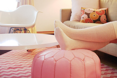
Hi There! Love your blog :) Where did you purchase the poof foot rest?
Making it Lovely
I bought mine from John Derian.
Jen K
Wow! Right on!
Annie, bossy color
Nicole, your LR IS lovely – and the perfect interpretation of that color. I want to see if anyone is bold enough to use Pantone’s actual Honeysuckle color on their walls this year…we’ll see! I posted about the color also – I think our male friends may have an issues with it. Great post!
Amy G
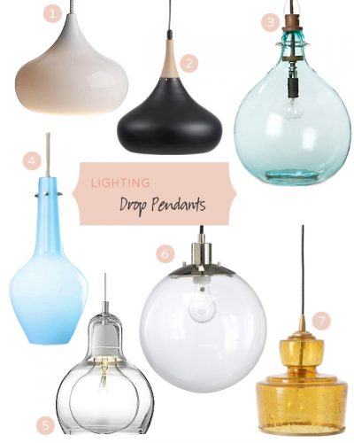
Nicole, you’ve seen these, right?
http://www.pantone.com/pages/Pantone/Pantone.aspx?pg=20748&ca=4
Pantone Visa cards! And they have Honeysuckle!!!
Ann
Love it- so stylish, yet warm.
Emily
You’ve got such a pretty living room. :)
Christine
I have to ask because I have been fruitlessly searching everywhere for something not ugly and failiing – where did you get your media cabinet??
Making it Lovely
It was from west elm, a few years ago.
Jaime (Design Milk)
you were way ahead of the trends!
Paige
I saw Young House Love retweet this yesterday and immediately thought of you!
Thanks for posting the spring fashion colors. I’m planning a pink/teal/yellow/neutral wedding, and Honeysuckle and Beeswax are the PERFECT versions. Those, plus last year’s color of the year, Turquoise and the lovely Russet for the text and I’m set.
Erika
Haha! What a lovely group of colors :)
I want Honeysuckle in a nail polish!
cottageofstone
That is amazing, actually! It is exactly like those color pallette posts they do on Design Sponge! Crazy!
Making it Lovely
Yep, just in reverse!
liveacolorfullife
You are obviously the trendsetter here and they are just validating themselves! Kind of uncanny. You are a great prognosticator (I think that’s the correct word…)
jbhat
Yes, I too think the good folks at Pantone have been reading Making It Lovely. Either way, it’s a fresh and pretty palette.
jbhat
elz
Maybe they’ve been reading you and that’s how they figured out the colors?! You have a great eye for color and style.
Eugenia
Is this better or worse than the time I bought those vintage cats-eye glasses to copy you?
Making it Lovely
At least we’re friends! Friends are allowed to copy sometimes. ;)
Amanda
Oh how great!!! That is really neat!
Linda
That is amazing! I love love love your colors! And…random question, but what plant in that vase by your tv? I absolutely love it & must have it :)
Making it Lovely
Chestnut branches.
Alicia Parsons | Atypical Type A
Just what my TV unit needs!
Audrey
this is hilarious! if that’s not validation for you making a great decision, I don’t know what is! :)
Comments are closed.