I have been working with American Express to redo a room for a reader.
I’ve been busy redecorating a bedroom for Kathryn and her husband, Finn. They live in Oak Park with their two kids, and they asked for some help with finishing their bedroom. The space was an attic once upon a time, but previous homeowners had remodeled it. Poorly. They longed to make it feel more put together, but their kids came first and the bedroom kept getting pushed back. I showed the space to you, in progress, last week. Now the room is finished though, and I love the way it turned out! I think Kathryn and Finn are pretty darn happy too.
American Express had provided a $1500 budget, and I used their Prepaid Card to help keep me on track. It was great because I could login to check my balance anytime I wasn’t sure, which was so helpful while decorating quickly and on a tight budget.
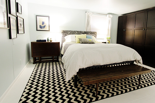
Kathryn and I swapped the Prepaid Card back and forth a few times as I would send her to pick up things like painting supplies and the wardrobe, and then I took it back to get the smaller decorative details. I was even able to pull a little cash out to pay for the end table I found on Craigslist.
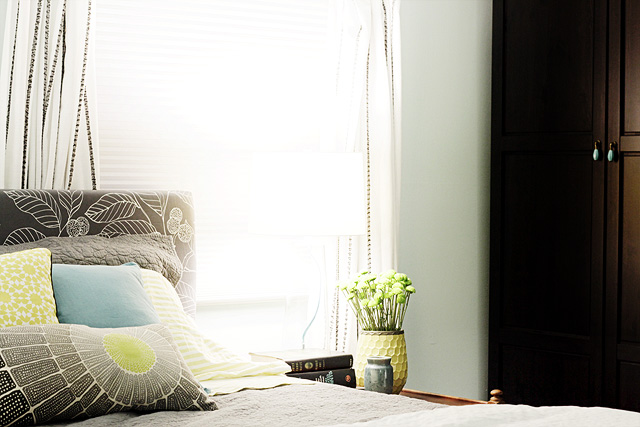
Lighting was my biggest concern when it came to budget. The room is large, but it only has one window. And that window? It directly faces their neighbor’s bathroom. Not exactly a room with a view.
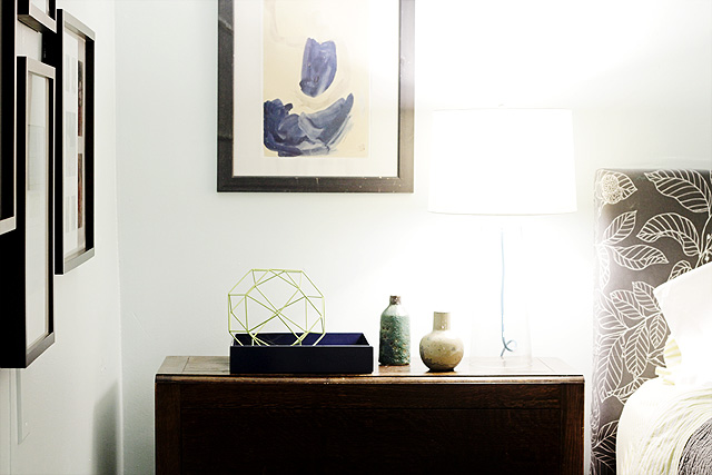
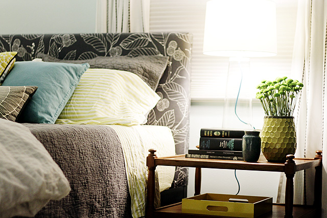
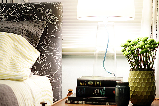
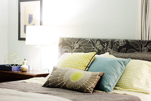
I wanted to be sure to provide plenty of light, but nice lamps tend to be expensive. It’s fairly easy to find inexpensive furniture that still looks good, but lamps are different for some reason. Luckily, I found some clear glass lamps on sale. They had a clean, simple shape with good proportions, and the added detail of the blue cord gives them some interest.
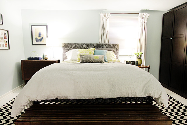
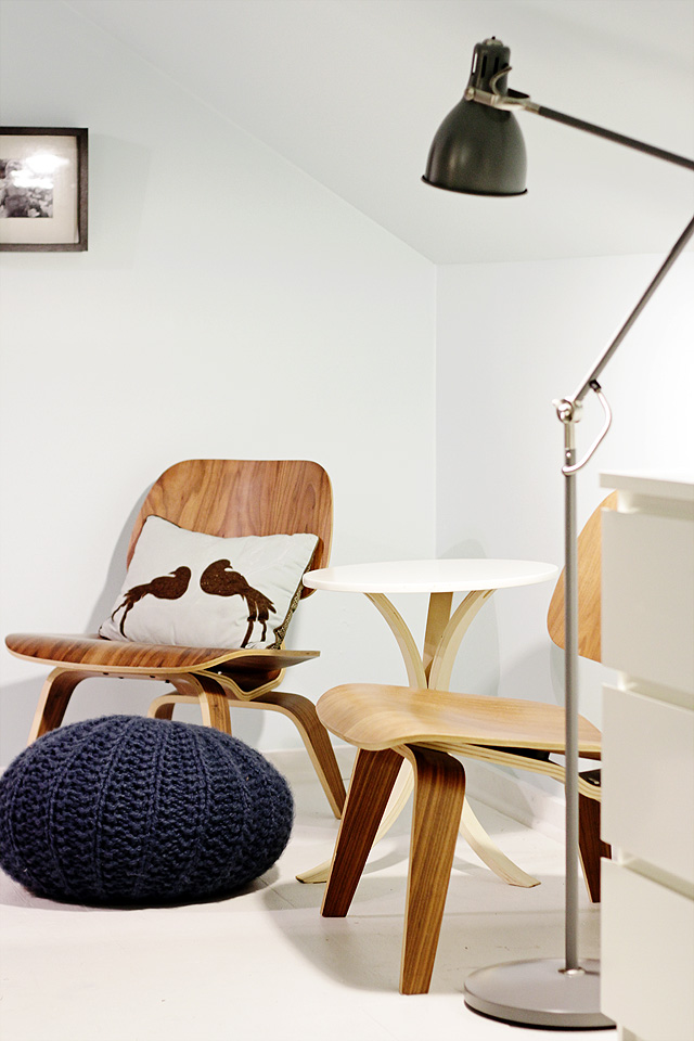
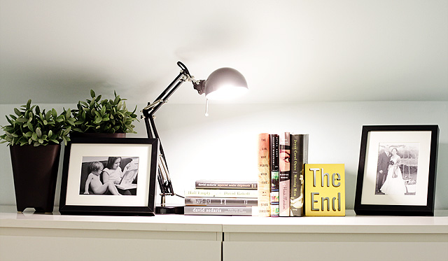
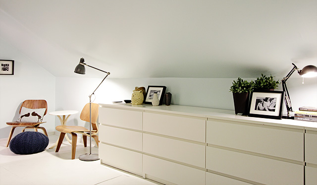
Originally, I thought I might put one lamp on the gateleg table and put the floor lamp I picked up on the other side, but I thought the room needed symmetrical lamps to balance the mismatched tables. The floor lamp ended up on the other side of the room, next to Kathryn’s pair of Eames chairs. A small task lamp that the homeowners already had was perfect on top of their dressers.
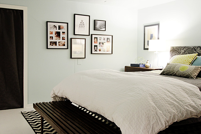
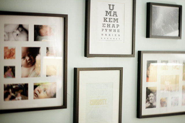
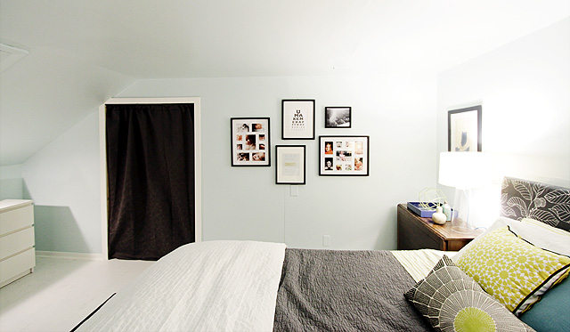
I hung art and photos that the homeowners already had in black frames, along with the print at the bottom that I created for them.
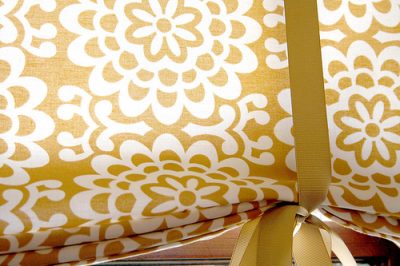
The doors to the kids’ bedrooms were curtained off. Perhaps Kathryn and Finn will add a sliding barn door in the future, but for now the curtains are a good solution. Such a simple thing to do, but it made a huge difference. Instead of feeling like an open area between two smaller rooms, it feels like a bedroom in its own right. The freestanding closet that we added helps too.
There were already four dressers in the room, but two were used as bedside tables and two were hidden beneath pipe and drape along the slanted end of the room. Pushing all four of them together made them look more deliberate in the space, and it was fun to decorate the top.
I loved working on a room in someone else’s home, and I hope to do more work for others in the future. Thanks, American Express for making this one possible. And thank you, Kathryn and Finn, for letting me takeover a room in your home!
* I’ll answer questions about where everything came from in the comments, but you can also check my Pinterest board for the room. Nearly everything (and more) is on there!


156 comments
Leah
Oh, nevermind – I didn’t realize Enamelware was a paint color :)
Leah
Can you tell me the paint color? I love this room!
Audrey
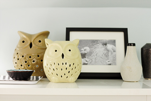
Where did you find those adorable ceramic owls? I love them!
cindy
Nice work, Nicole. Love this room. I saw the photos in Adore and hopped over here to check out the details. So beautiful.
I’m also a fan of barn doors (but not the price for that hardware) and have that same door pinned, too. Anyhow, I wanted to let you know of a blogger who’s husband made their own barn door and hardware himself. (You do have to know how to weld or know someone who does)
At Mini Manor http://www.maillardvillemanor.com/2011/12/barn-door-done.html
you can see photos on their blog and they will send you detailed instructions on making the hardware (I already have and Ashli emailed them to me)
I plan to make these for the loft bedroom in our new house- both my husband and I can weld so that’s helpful. Perhaps you, Kathryn or Finn know someone who can or at least find a local handyman who could do it for a decent price.
Hope this is helpful- love the room
Sara
Just amazing! Maybe Nicole you can help me with my attic conversion? Just a small flight to Australia is needed. No biggie? http://zaharadessert.blogspot.com/2012/01/converting-our-attic-into-3rd.html
Kathleen
Beautiful room! I’m curious about how you like the rug? I’m thinking of purchasing it for my living room. I love the price (crazy isn’t it?). Will I love the rug?
Kathryn Humphreys
I bought the rug for my living room originally. It catches fuzz easily and with two kids and a cat, I needed to move it to somewhere that got less traffic. If you don’t have those issues, go for it. It does make a great statement.
nicole
Beautiful! Just the right mix of vintage and modern. Great choice with the glass table lamps. I never would have thought to pick those but they look great!
Wendy
Where did you get the blue pouf ottoman?? LOVE!
jennifer
makeover looks amazing! i have a question that I could not figure out from the photos – is there a staircase heading downstairs behind the wardrobe? What is keeping the wardrobe from (god forbid) tipping?
corrin
Cute! I have those same owls in orange that I picked up for a few dollars at Marshall’s last winter!
Sara
I love this bedroom! It’s modern without being sterile or unlivable. I love the color palette because it’s soothing and gender neutral, and you’ve added pattern without leaning on floral and there’s so much storage! I think this is a great master bedroom that any couple would be happy to retreat to.
Ilana
I’ve seen the pillow with two birds (your eighth photo, sitting on a chair) in a handful of magazines & other designers portfolios, but I’ve never been able to find out where people get it. So please, can you tell me where it’s from?? Thanks!
Kathryn Humphreys
chez Target, dwell studio line, several years ago. I’ve always been surprised at where that one pops up too considering its humble origins.
TerraSavvy / Jill V.
Just perfect! You’re hired! If you were closer I have a Master Bedroom in such need of decorating I’d let you go at.
You are amazing!
Ann
This room turned out great! I do have a question about the Pax wardrobe. Did you anchor it to the ceiling to prevent a tipping problem? Can you show how this was done?
Making it Lovely
They aren’t anchored, but they can’t fall over because there isn’t enough clearance for them to tip more than an inch or two. Normally PAX wardrobes would be installed against a wall and anchored to it from the back.
Beth C
It looks gorgeous! The owls are my favorite part!
jodi
it looks so great!!
annelies
It looks phenomenal. I adore the wall colour. Actually, I love the whole colour palette! Very well done.
Bfordesign
I like how you have coordinated the colors in accessories and fabrics
Lauren
It looks incredible! I’m aware that the amazing rug was already in the space before the makeover, but I would love to know where it came from?
Making it Lovely
It’s from Overstock.com.
Jenna
A.MAZ.ING!!! Wow…wow…I can’t think of any other words! :) This looks so fantastic! Great job!
annie
Looks great! I didn’t see where the owls were from…..
Making it Lovely
HomeGoods. They were Kathryn’s.
LisaInIllinois
I love everything about this room – especially the color scheme. I may steal it for our bedroom!
Vanessa
I love this room! Feels so cozy and beautiful. Where did you get those cute owls!!
Bridget
I love the little, green, flowerish things coming out of the honeycomb vase but didn’t see it on Pinterest. What are the called? (Love the room.)
Making it Lovely
I think they’re called Kermits. They’re pretty readily available flowers.
nicole
Stunning….you did an amazing job! Now will you please come over and redo my bedroom?
J
Love!
Make and Do Girl
Wow. This is a beautiful room. Love the vibe. That floor is fantastic. It’s hard to tell from the photos, is that a rug on the floor or is it painted? Either way, I adore it and the graphic punch it adds to the room. Great job!
Making it Lovely
Kathryn had that rug in the space already, and I loved it so I reused it. It was from Overstock.
Natalie
Oh my gosh, it’s gorgeous! You did SUCH a great job! I love how all of the colors coordinate without being too matchy-matchy, and the laying textures is just divine. Well done! :)
AnnW
You probably won’t even get to this comment, but, great job. You made it very light, and modern without looking like something from the 50’s. AmEx should give you money every month for this. Whom do we write to expressing our gratitude that you showed us how to use AmEx for things? Ann
Making it Lovely
Thanks, Ann. I’m sure they’ll check in here, but perhaps I should send them an email and quote you. :)
Lydia
Gorgeous room! Very inspirational!
Very curious, though: where did the round side table between the Eames chairs come from – it’s so cute!
Kathryn Humphreys
Thanks! That’s from Ikea about 6 years ago, we stole it from my son’s room :)
Angela
Lovely! Did you slip cover the ikea bed with the fabric? I think I have the same bed. Also, is there a bed skirt? I also have nearly the identical bedroom layout – thanks for the inspiration!
Kathryn Humphreys
Finn and I put plywood in front of the steel and then upholstered the headboard around that with foam, batting and fabric, stapling it to the plywood in back around the bed frame. It doesn’t come apart now though. There is no bed skirt.
Tara
It was good before, but now it’s great! So clean, yet cozy. The wardrobes and the dressers in their new space make such a big difference. My only question is, why block the window with the bed? Is it the only way to get the two tables to fit? In any case, GOOD JOB and I hope the homeowners love it too.
Making it Lovely
The bed was blocking the window in the original layout too, so I knew the homeowners didn’t mind. It opens directly out to the neighbor’s bathroom, so they kind of wanted to take the focus away from it.
Jessie
Looks GREAT! The owls make me smile! :)
Alana
Crud- I meant “not emasculatingly so”.
Darn you, auto-correct.
Evelyn
I can’t believe how many details were fit into that budget! Love that it feels so spacious and elegant with fun details! Great work!
jbhat
Very, very nice. Hooray for all of you!
jbhat
Tanya from Dans le Townhouse
Wow – such a pretty space. It definitely has your gorgouse stamp on it, but really seems to reflect the homeowners’ style too. They had great pieces (the upholstered headboard, that fantastic rug) and you really let those elements shine!
Kathryn Humphreys
She really did an amazing job of taking the things we liked but didn’t know how to fit in and making everything cohesive and cozy.
Making it Lovely
Thanks, Kathryn. You had great things to work with.
Heather
Brilliant! It’s serene and beautiful! Congratulations :-)
Erin - Erin Jane Designs
Wow! So, so amazing! What a beautiful job. Truly unrecognizable from the “before”. I just love it! Oh, and those pillows…LOVE!
Kate @ change of scenery
Fantastic job! I love the mix of old and new, designed and personalized touches. The wardrobe is great and I love the detailing that almost makes it feel like paneling.
Kelly
Such an improvement, and I thought the “Before” wasn’t so bad. And, I feel so hip — I have one of those owls. ($7 at TJ Maxx!)
Lauren
Completely and totally lovely and perfect. Oh and hey if you’re looking for the biggest challenge ever, I totally recommend my home. It may or may not be a total decorating disaster (it is.)
Kat
The room is beautiful! I love the details and the color pallet. My question is on one of the more simple elements of the room – where did you get the white duvet from? I love the texture it brings to the bed while still keeping a crisp look.
Making it Lovely
It’s a duvet cover from IKEA. I had the same one in my bedroom a few years back.
Rose
Where did the owls come from please? :)
Jill
Where did the white and gray striped tray come from?
Making it Lovely
That’s a little IKEA tray that Kathryn already owned (I own one too).
Kate
Wow! I was wondering how it would all turn out after your last post about the limited budget…it looks AMAZING!!! Well done! And yes, to echo others, where did you get the owls?
Sarah M.
I totally have room envy now! It turned out great! Can you tell us where you got those owls? Thanks!
Dee in BC
Wow- That is now a beautiful room! What a great transformation.
Sam/LeavetheNestuptoMe
Eclectic but polished — looks great! Very soothing wall color too.
Lindsey @ arkadian belle woods
This room is incredible! You did an amazing job!
Vesna
I think my favorite post of yours ever! You did an amazing job!!
Making it Lovely
Wow, thank you.
my honest answer
I’d love a before photo! I’m trying to work out where the bed used to be… I think it was on the wall to the left of the window. Did you move it to make room for the wardrobes?
Kathryn Humphreys
click on the links in the post. The bed is in the same place, however.
Comeca
Simple,Perfection.
Anna
very very very beautiful! want there to sleep and to live
beth
I need to know where you got those owls!
Also, I’d love to hear directly from Kathryn and how she feels about the makeover!
Making it Lovely
She’s been popping in the comments! And the owls were hers, from HomeGoods.
Brankica
WOW!Well done!
mari
I see West Elm! It makes me so unbelievably giddy to see you decorate again!! I love it so much.
Making it Lovely
It makes me giddy to decorate too! ;)
Jill Browning
Very nice!!! And the photography is awesome!
Carla
I love how this turned out! So relaxing and inviting, just like a bedroom should be. The wardrobe was totally worth it, it makes the room!
elisabeth
Beautiful makeover, Nicole. So absolutely well thought out and beautiful. Lucky family!
Amber Baxley
So light and bright and I love all of the graphic, bold fabric choices. :)
YJ
Hi, may I know where did you get the owls and that cute little bowl from? They look so good together!
Making it Lovely
Those were Kathryn’s! She picked up the owls from HomeGoods, and I think the bowl was from Anthropologie.m
katieO
I absolutely LOVE how amazing the space looks.
Just curious…maybe I missed this part, but what did THEY think about the makeover?
Kathryn Humphreys
They think its unbelievably fantastic :)
emily
is that the mack lamp from crate and barrel i see? i have the same one with a white cord!
Kahli
This bedroom is great! I love all the natural light this room gets. It turned out so beautiful and done on a tight budget :).
Ash
Wow – impressive on a tight budget – love it. Hope to see more of these – do you offer an international service :) WE’re moving to our new home in two weeks and it needs a complete overhaul! Well done – fantastic job.
Lindsay
The room turned out beautiful! You really brought the space together with all the details: the art, vases, and pillows. And I just love the eames chairs and chevron rug!
barbara
Lovely!!
Beatrice
It looks gorgeous. It is so bright, fresh and simple. Love it.
Kathryn Humphreys
It is absolutely amazing, we’re so grateful you chose our space. I still just walk upstairs and look around at everything. Thank you!!!
claire@gibsonking
Wow, it looks great! Well done. The blue poof is my favorite!
Jan
You did an amazing job Nicole, I love it!
Daniela Conn
Wow! It just came out so beautiful!!! I knew that it would. It was so fun to see you make over a room! I hope you do it a lot more! I used your inspiration in planning my own future master bedroom (just bought a home.) You can see here: http://thisshack.blogspot.com/2011/11/bedroom-dreams.html
Thanks!
Caitlin
Great job!!! I love what you’ve done with the space :)
Tiffany
Wow Nicole I have been waiting for this post. Bravo!!!
houseofearnest
wow! It is even more amazing when you look at the whole transformation! Sometimes it takes an outside person to look at your space differently that you would.
Lauren
Looks so fresh and open. Quite a transformation. Congrats on a great job!
Beth
Like everyone else, I love it! What a transformation. You did an awesome job. :)
Mina
Nice job! Very inspirational, since we need to do our bedroom from scratch when we move. Love it!
Rachel @ I'm Loving Today
Gorgeous room! I love how open and airy it is – and with having just that one, bathroom-facing window, it seems so bright! Everything in this room is just so charming, without looking too overdone. GREAT job – unbelievable it was done under $1500!
Kristín
wow Nicole, you really made it lovely ;)
Holly
Wow! You are very talented – well done. The room is so well put together and looks so much bigger than before.
Lindy
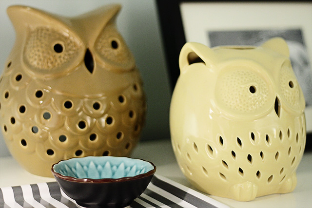
Where did you get the accessories that are on the white dressers? The owls, little bowl, etc. I didn’t see them on Pinterest.
Kathryn Humphreys
Those were mine. Owls from HomeGoods, bowl from Anthro, tray from Ikea. All a couple years old.
Molly the Waffler
It’s now such a lovely, inviting room. All the big pieces are great, but you really made it come together with the styling of the accessories. Love that West Elm vase!
Danielle
Wow! Looks like something out of a book! Great job!
Katrina
The room turned out amazing so much better! WOW :)
Keryn
Nicole, it’s beautiful! I am in awe of your color use of color; edited just enough, with depth and cheer. Congratulations!
Melissa
EXCELLENT job! how exciting and WHAT a transformation :)
Kristen
Love the room – love the gray quilt and shams – can you give the source for those puppies? (Didn’t see them on the pinterest) Thanks!
Kathryn Humphreys
They are from Target, several years ago.
Kathryn Humphreys
Found it. http://www.target.com/p/Target-Home-Tile-Stitch-Quilt-Black/-/A-13691398
Josephine
Well done you ;-) Absolutely gorgeous.
Kristin
Wow! Would love a pricing breakdown. Really hard to believe you did that for $1500!
Making it Lovely
The wardrobe took up $800 just by itself!
Christina
Everything is gorgeous, but I love how you fixed the layout and storage best. Everything looks like it’s meant to be there and it looks so cozy.
Making it Lovely
Thanks. I’m glad the room looks nice (I’m really happy with it), but I wanted to make it more functional first and foremost.
Rachel Mowrey
Really lovely! Great job!!
Kari
Love! Where is the bedding from?
Making it Lovely
The striped sheets are from west elm, the white duvet cover was from IKEA, and the gray quilt was Kathryn’s.
Kath
What a GORGEOUS room!!!!
Giulia
Love this room! Great job. Love the Craigslist side table, the glass lamps, love how you use trays and the colours and patterns are great! Want to come to Canada and do one of my rooms?
Robyn
I’m interested to know why you didn’t push the night table over towards the wall so the bed is not in front of the window?
Making it Lovely
The room would have felt lopsided. Plus Kathryn and Finn don’t like that the window faces the neighbor’s bathroom, so they were fine with not making it take center stage.
victoria
this looks amazing nicole! well done!!
Chedva
You did a great job, Nicole! It looks really airy and like a fun room to hang out, and read a book or something.
JENNIFER O'CONNOR
i love the whole space– fab! where did you get the ceramic owls? they are too cute!
Making it Lovely
Yes, I think those were from HomeGoods. Kathryn already had them.
Jenna
I larger of the 2 owls looks like the same one I picked up at HomeGoods. :)
Comments are closed.