
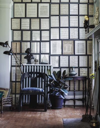
I’m still working away at the redesign, and I will be launching it February 1 as scheduled. I’m waffling between a clean, white minimal (well, minimal by my standards) look vs. my usual mix of patterns. Below is a little peek.

Any preferences?
* I’ve decided that’s a word, by the way. The opposite of minimal shall henceforth be maximal (e.g. my usual approach to mixing patterns).
205 comments
aam
Just getting to your new site design now! The minimal feels good, but the maximal is SO you. I also like the simple “bookmark or share” option on the maximal posts version better than the 5 choices (pin it, tweet it, etc.) on the minimal version. It appeals to the minimalist side of me. =)
You are such a hard worker and it is such a treat to have followed your blog for the past two years and see it change directions, but nevertheless stay true to your style, your flavor, YOU. Just lovely.
Miss B.
It’s GORGEOUS! Perfectly you!!!!
Ayadet
At first I didn’t think maximal, but now there’s this very encompassing feeling about that I like. Sort of like the simple square paintings they made in the 60s. It was only once you got up close to them, you could really feel the energy!
Andrea Howe
200 comments later, but I would say minimal :) the floral element sure is cute though. perhaps you could find somewhere else to use it?
Anastasia Marie
Love the minimal! It’s just the right amount.
Susanne
I like both but I’d go for MAXIMAL! witch by the way is a german adjective ;O)
arvee
I’ve always loved minimal but let’s go maximal this time! ♥
Lauren
Maximal!
Annie H
Minimal!
Marisu
You really are a talented designer, I like both! But if I had to choose, I chose the minimal.
moominesque
Minimal (i’ve been reading you for three years and that’s the very first time i’ve decided to say something)
Kayla
MINIMAL! :)
meghan
minimal, but i do think both are beautiful
rhonda
Maximal!
Betsy
I vote for minimal! Your style is so sweet and lovely. Even the minimal carries a big impact!
shortsweetseason
I vote for minimal, but they’re both fun to look at.
kristen
minimal…the other one is too busy.
Beth @ Remarkably Domestic
I definitely like minimal. But I’m sure it will be beautiful either way!
Hollis
I prefer minimal without patterns! But I like both a lot. Good luck with the transition!
Lindsey @ arkadian belle woods
I love them both but I say minimal! While I love the maximal design background. I feel like it might overpower the overall feel.
Brianna
Can I ask where you got the flowers?
Beth C
I vote for maximal!
Katrina
Both look pretty, I say go to the MAX! :)
stephanie
Maximal!!!
susan
It’s funny, usually I’m all about the minimal but there’s something about the maximal I’m really digging. Maximal for the win!
Skye
Wow, I can see why you’re waffling. I like the maximal style. The patterns make the page pop a little more…it makes the whole site look like art.
aure
I’m a fan of minimal :) Minimal looks perfect :) and it would be a bigger change.
Emily
I love the minimal layout!
lea
It’s hard because the minimal one is sleek & clean while the maximal one is just so PRETTY! I’d be happy with either.
Krys
Minimal!!!
Both are lovely, but minimal is much easier to read.
Kelly
I agree with Lori. I like the minimal with the honeycomb of the maximal. Can’t wait to see which one you choose!
April
Maximal, I like the hint and simplicity of the colors in the background. As long as it doesn’t get too busy.
lori
I am ususally a pattern-mixing fool, but I have to say I prefer the minimal… but with adding the honeycomb pattern from the maximal version. It would be the best of both worlds. Can’t wait to see the new design!!
lori
uhh… that would be usually…
Callie
Maximal!
Rachel from Birch + Bird
Oh…maximal, for sure! I can’t wait for the big reveal. :)
Clair
I say max!
Nikka
Maximal!
Jen B
Yes, both are lovely but the minimal feels like more of a change. Can’t wait to see, whichever you choose :-)
Lisa Parker
I love both, but really love love the minimal!
Tara Jane
minimal
Erika
I’m shocked to admit this, but I think I like “minimal” the best. Both are lovely.
Kim
Maximal all the way!
Amie
MAXIMAL!
Tory
Love the minimal(ish) design! And is that illustration I’m getting a peak of by Rifle Paper? I LOVELOVELOVE them!
Penelope
Maximal! I love it!
susy
actually – i really like the maximal. you’re one of the few people who actually does that look well. i say go for it. despite all of the different motifs in there, it looks like it’s still really fun to look at — and easy to use, too. i don’t know what your secret is to get that effect…but it’s really something. : )
Tanya
MAXIMAL, it’s more you!!!!
x from a Sunny South Africa
Shay
I love the new minimal look of your blog! But my real reason for commenting today was to ask a very random question…..Has anyone ever told you how much you look like the girl in the Progressive Insurance commercials? She’s really cute!
Making it Lovely
Ha! People tell me that all the time.
Diana @ Boy + Girl
I vote maximal!
LisaInIllinois
Both are Lovely! Maximal is my favorite!
Bethie
Maximal!
Shosh
Minimal. Those flowers are lovely.
Yee Von
Definitely love the minimal as readers can pay more attention to the contents of the blog :D Btw, I love the little flowers on the blog header!!
mribaro
Go for MAXIMAL! It’s more you :)
Belle
Maybe it’s the living in Denmark and the Scandinavian influence, but I like the minimal(ish) design. Less if more for me these days.
Heather
I like the minimalist look, it seems to have more pop! What about using the hexagon pattern behind your sidebar with the minimalist look? Just a thought!
Bridget P.
Maximal! Love the mix of the floral with the beehive.
Evelyn
I usually like minimalist but the max design is great. It just works somehow!
colleen
maximal!
Erinn
Maximal all the way!
Anna
MAXIMAL!!! It’s so gorgeous! Both are pretty, but I love the gold floral border. So you. X
katrina
many many blogs sporting minimal these days. be different — go maximal!
Julia
i’m a big fan of white space so i say minimal
Tammy
I’m a minimalist at heart — and I think it would off-sent your “maximal” style well :)
Tammy
offset, I mean :)
April
Maximal! :)
H.
Minimal (unless the maximal backgrounds are faded back). Minimal is so pretty!
tracy
I prefer the minimal but they both really are lovely! I was wondering what the font you are using for the “January 29” is? I like it!
Making it Lovely
The sans-serif is Quicksand, and the numerals are Sofia. Both are free Google web fonts.
Little Edie
Minimal.
Justine
I like the honeycomb-ish background on the maximal side, but without the floral pattern in behind. I like mediumal. :)
Jerith
I prefer the maximal. There are very few good design blogs on the internet that mix patterns as well as you do — I actually read your blog on your blog address instead of through a reader because I like the look so much.
Making it Lovely
Thanks. I’m going to be adding a lot of features that will be really pretty on the blog in the new design too. They’ll look fine in an RSS feed, but much nicer here.
Amanda
Both are lovely,! I’d pick minimal if it were my choice to make, but you can’t go wrong. Also.. in case you haven’t already seen it, Maximalism is a fun book of graphic design to thumb through for visual overload– came out a few years ago but is still fun. :)
gesikah
Both are pretty awesome but if I had to choose…minimal. But that’s probably just my projecting my minimalist tendency on others.
Sara
I LOVE both. But if you were to put a gun to my head I would choose the ‘Minimal’ design.
Vivian P
I love both! But i think i would like minimal plus the beehive pattern!
alicia king
love both! maximal maybe a bit more :)
Emily
I’m typical a more is more kind of girl. BUT I love the minimal design! The images you’ll be adding will be more evident on a more subtle background. But both are beautiful!
Linley
I have to go with minimal. I’m just a minimaly person though :P
Tamsyn T
I love the beehive background with the minimal look!
Beth
I like them both, but I lean toward minimal. You do such beautiful work!
K Stidham
I like the minimal better, it seems less cluttered and, since I have some problems with vision, less cluttered is easier to find the text and read it. I love the colors you have chosen!
Erin
Minimal!
Krissy
Oo, I can’t wait to see the new design revealed! Both sneak peeks look DELIGHTFUL. What about a combo of both? I love the freshness of the minimal, but I’m so smitten with that honeycomb pattern on the right hand side of the maximal. I think it would be the perfect combination of light and new and also a nice kick back to your blog’s “roots” so to say (since the honeycomb is reminiscent of this current design).
xo.
Making it Lovely
I do like that it’s a reference to the design I’ve had for so long.
Maria @ Orchard Bloom
minimal all the way!!
Shirley K
I vote maximal!
Lisa
The maximal represents your style so much better!! It really helps to define your personal brand!
Jenn Kemper of Blue Goose Celebrations
I absolutely LOVE both, but please do maximal! it’s so “you” and lots of folks have something similar to minimal. the gold floral? to die for! way to go! isn’t it exciting to see all the hard work come together? my site launched today! we’re still tweaking & de-bugging here and there, but it’s such a rush!
Ashley
I really prefer minimal. It’s so much softer and prettier!
Bonnie
The minimalist is SO much easier on the eyes!
Dana Rice
I love the mix of patterns you’ve selected for the maximal look. That has my vote. If you can’t decide between the two, why not go for a semi-max look and use only the beehive pattern and not the flowers? Can’t wait to see the new site! Good luck.
Faith @ Ordinary Mommy Design
They both look really great, but I’m leaning toward the minimal. That floral pattern is pretty though!
Ellen
Maximal *is* a real word! “Of, relating to, or achieving a maximum; being the greatest or best possible.” So, whichever you choose will be maximal! (I vote maximal, BTW. Love the border pattern.)
Julia@a-living-space
They both look great, but personally I’ve given in to being a maximal kinda girl. As clean and fresh and minimal can be, I just love mixing patterns! (it looks awesome, by the way. I can’t wait to see it all live in a few days!)
Emily
I like the minimal best, but maximal is very nice, too.
AnnW
I like the maximal. It seems to complete the whole design. The other one seems to be missing something. Ann
TieDye64
I really like the maximal, as I’m a color/pattern lover, BUT when it comes to a website I frequent I tend to like the minimal. It seems more pleasing to the eye.
Stephanie
Maximal!
Tracy
Just comparing the minimal with the maximal, I have to say the minimal is more my style. I love the illustration, as well as the sparseness. I would think that your images would “pop” more against the plain background.
However, when I look at the photo of your dining room table, I think it actually stands out better against the maximal. Why is that??
So, in the end, I vote MAX!!
Elizabeth Moon
Maximal! I like the idea of toning down the background a bit. Everyone in the world does the minimal thing these days. It’s great too, but maximal feels a little unique.
powwlita
the maximal is very pretty, but you could tone down the background, so that it’s there, but a very faint gold.
Megan
I prefer the maximal – it’s got more ‘zazz’, although the minimal version has its own charm. I personally would go for the zazz.
Deborah Wall
minimal feels more soothing to me.
Comments are closed.