
Would it really be surprising that someone as fond of pink as I am would also be fond of flowers? Even the less girly among us can appreciate a good bloom, no?
A few people, in writing about my keynote at BlogPodium, noted that I had dressed to match my blog. My branding. The truth is that I’m just consistent in what I like. My blog matches my clothes, my home… even down to some of the book on my shelves. For example, here are two of my favorites.
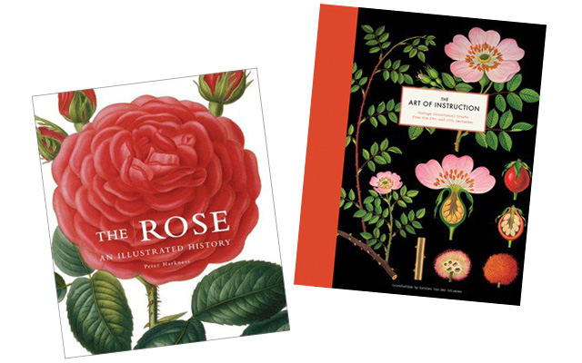
The Rose: An Illustrated History, and more recently, The Art of Instruction. My dog rose print is the same one featured on the latter’s cover.
I designed two themes for Making it Lovely, and if you’re on the default “Lovely” theme, you’ll see an abundance of flowers in the background. Even if you choose to view the blog in “Minimal” mode, you’ll still see my custom floral illustrations in the header. As much as I love a good, clean site with a true minimal aesthetic, it’s just not me. The flowers (and colors and patterns) I use aren’t part of a larger, calculated move on my part to reflect my branding (though it works as one), I just like them. Simple as that.

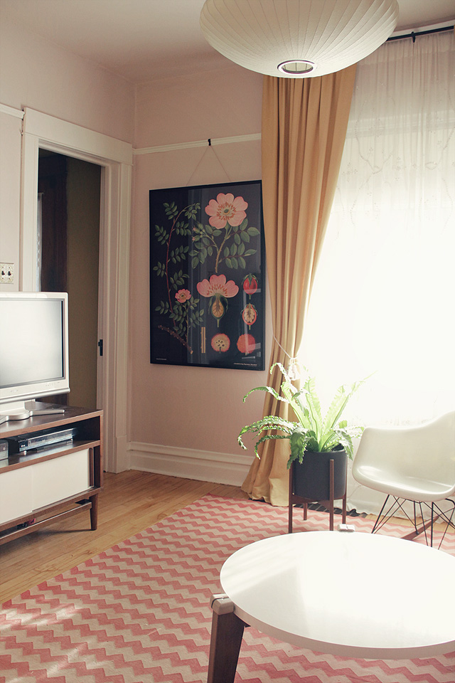
I saw that a flash shopping site was selling framed botanical prints a few weeks ago. I had enough credits to cover the cost, so I bought one. They’re no longer available on that site, but they can be found (unframed) at The Evolution Store.
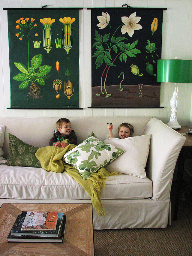
I would have loved to hang two prints over the sofa (like this), but the picture rail in my living room doesn’t leave enough clearance.
These prints are huge. I love the scale of mine, but I don’t know if that corner of my living room is interesting enough to warrant art of that size. Something feels a bit off too, between the print, the plant, and the vase on the other side of the TV. I’m going to leave things as they are for a while to see if I get used to the print’s (rather commanding) presence, but I may play around with the placement. It’s beautiful though; I’m glad to have it.



63 comments
Lindsey
Hi! I’m just seeing this post for the first time because it was referenced here: http://themerrythought.com/diy/diy-botanical-poster/ I just want to tell you that I love that corner of the room with the poster there. I think it draws great interest. However, I’m only seeing one corner of the room ;) I had to pin it because it’s so chic and comfortable. I feel like anyone would look flattering in that room. What I mean is the glow from the colors you’ve used flatter most skin tones. I think the black draws the room together. It draws up the black metal in the planter and makes all the rosy tones pop. I wonder if you’ve kept it there :)
Morgan
Hi! I love the botanical print and often shop flash sale sites – would you mine sharing which one you scored this one on? Thank you :)!
Diana
Sort of random, but what are those green pom-pom-ish branches in the vase by your tv? They are awesome!
Adrienne
I love the West Elm vase in the first picture – thanks for the inspiration, I’ve reblogged it!
e
hi! im wondering where you get those suspension-type of hanging you use to hang your frames? I have a thin metal print I need to hang and would like to do something similar…thanks!
Making it Lovely
My house has picture rail, so I use picture hooks (mine are from Rejuvenation) and picture hanging wire.
Jessica
Hi your place is so so lovely! Can I ask where is your coffee table from? I LOVE it!
decoguy
I really like the poster, against the beautiful pink walls if adds a feminine touch. Great work!
What is the name of the pink paint you used?
how2home
wow…i really like that pink chevron rug in the living room, where was it purchased?
Making it Lovely
It’s by Madeline Weinrib, from ABC Home & Carpet in NYC. Pottery Barn Kids has a similar one for sale now though that’s less expensive!
julie @ tractorgirl
I too, am fond of botanical prints, especially vintage ones – I think it’s the attention to detail that I respond to, that they have been made with such close regard and admiration for the thing that they depict. Yes, flowers are lovely.
Priscilla
Hi Nicole!
I love that floral print! It’s very dramatic with the black background!
I’ve been collecting prints in a similar style but with white backgrounds…I’ll have to look for a dark one to add to my collection for a nice “pop” :)
We also have a picture rail, and I’m wondering where you found your picture hooks… I’m currently using some old shower curtain hooks but they are a bit bulky.
katrina
wow, that’s a HUGE print. it’s lovely! and no, i’m not at all surprised that you’re fond of flowers — i would’ve been surprised otherwise.
Christina @ Little Victorian
Just wanted to say I love your response to the comment that you dress like your blog! I was recently struggling with my branding, starting with my Etsy shop, leading to my blog, then leading to the realization that my house itself isn’t even cohesive. So I went to my closet, pulled out all of my favorite clothes that are clasically my taste and am redisigning my house, blog and shop around my newly recognized style and I couldn’t be happier with the plans so far.
Emma
Am always on the hunt for great wall art – LOVE the idea of a botanical print for the wall – i’m pinning it now so that I don’t forget!
Beatrice
The print is so gorgeous! Having two above the sofa would definitely make for a bold statement and look really good.
Aspiring Kennedy
What a fresh take on florals. Beautiful botanicals!
Michelle
Love the print–gorgeous! I have a quick question for you. I have tried many times to switch back and forth from the lovely to minimal format, but I never see any changes. I believe that I always view the “lovely” format, with flowers in the background. I have tried “minimal” in both firefox and internet explorer with no success. Any tips? Thanks in advance.
Making it Lovely
Oh, I thought it was working for most people. You can try switching over and doing a hard refresh. The problem lies in my site’s caching, which is necessary to keep it running smoothly, but it interferes for some with the theme switcher.
alison at refurnished living
I second that question about the plant in the vase behind the tv – it’s so cool!
thanks Nicole.
Making it Lovely
They’re fake chestnut branches from Crate & Barrel.
Catherine
So gorgeous, and I think the black is a nice contrast to the lightness of the room. Also, (at least in that shot) it balances nicely with the doorway to the left. Honestly, I think it will look great wherever you hang it.
Bonnie
That is an awesome print and I think it’s placed well on that wall!
barbara@hodge:podge
That print is gorgeous! I have a few Audubon botanical prints that I love!
scs68
Love the flower pot/stand! Where can I find one?
Making it Lovely
Modernica makes them. Mine is the smaller size.
lori
Have you considered changing the frame? I can see this settling down in a nice white ornate wood frame. I’ve had my eye on these for a while, nice to see how large they actually are!
Making it Lovely
That would be pretty, but I think it would be a little too Shabby Chic for my taste.
Holly
I love this, already pinned it. Might i ask what that green plant is in the vase behind your TV? I’ve never seen anything like it – it’s gorgeous! Would look perfect in an arrangement on my dining room table.
Making it Lovely
They’re fakes (chestnut branches). I usually avoid faux flowers (I know a lot of people hate them), but these were so interesting that I couldn’t resist.
Mackenzi
I feel like it might just look awesome in your basement/playroom with that new rug and all those green floors. Maybe even your paint by number could coordinate in some way.
Making it Lovely
I think it could be great down there, but the ceiling height is pretty low. Something so big might look kind crazy!
Laura
I love that you know yourself so well that you can defy convention and are willing to put it out there for all of us to enjoy! And we do…
Making it Lovely
I don’t know if I’m really defying convention all that much, but thanks.
Kathleen
So perfect! Also – what is in the vase behind the TV? I NEED.
Making it Lovely
They’re fake chestnut branches.
Jillian
I think the print is beautiful. I would love to get one to hang over our bed to act as a headboard.
Tangled Sweetpea
What absolutely fabulous prints!
Victoria xx
Danielle
I think it’s the black for me. Your living room is so light and airy that the print feels heavy. It is stunning, though and is such an interesting piece! What about above a bed in a guest bedroom or in your awesome refinished basement?
Making it Lovely
It does look heavy, but it’s a bit more balanced when you see it in person, in relation to the rest of the living and dining rooms. It would look good in the basement too, but we no longer have a guest bedroom; it was turned into the nursery three years ago.
huette
A little off-topic … but where did that credenza/TV stand come from? Have been looking for something like that for ages.
Making it Lovely
It was from west elm, maybe seven years ago.
laura @ hollywood housewife
I think it looks great there! The colors are just perfect.
Sarah
Wow I love this! It looks so great in your place =)
Emily @ Peck Life
I LOVE botanical prints but agree they need to make a statement somewhere. I’ve contemplated hanging one in our entry way over a small table we have. The one you scored is GORGEOUS! :)
Connie | Daydream In Color
Florals are totally my weakness. I love that print & I love all the floral elements on your blog. So pretty!
Kimberly Jones
That print is simply stunning! Even though it’s vintage, it has a modern feel to it that I love. I’ve always been intrigued by botanical illustrations, and I checked out a couple of instruction books from the library last week so I can learn how to draw my own. Drawing isn’t one of my natural talents, but I’m determined to learn! Thanks for sharing this glimpse into your home decor!
Igor
I love the sort of vintage school-type posters. So cool. It think this is a floral twist even for the male eye:-)
Erica
I absolutely love florals and I’m a nerd at heart, so these scientific illustrations are perfect for me. I really need to get my hands on a copy of The Art of Instruction.
Also, I think its great that you carry your sense of style with you in all aspects of your life (blog, decor and personal style). I mean, if you like something, you might as well surround yourself with it! :)
Chedva
It’s gorgeous. I’ve been looking for a poster like this for a while in my area. Hope to find one (or two!) one of these days.
Comments are closed.