
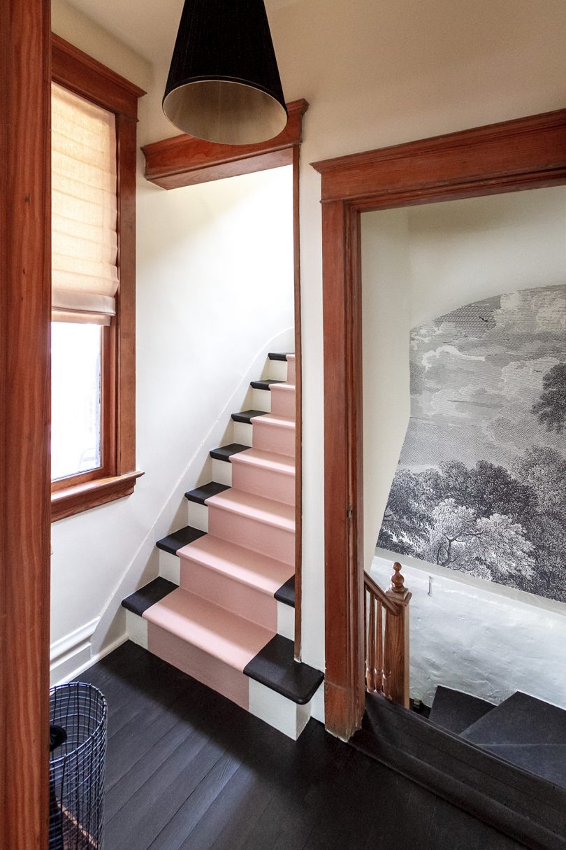
Painted Stairs and Entryway Makeover
This is a sponsored conversation written by me on behalf of Dutch Boy. The opinions and text are all mine.…March 6, 2019
My Son’s Finished Room
This post is sponsored by Dutch Boy® Paints. Red and light blue — those were the only parameters I was…August 22, 2017
The Guest Room, Painted Pink
This post is sponsored by Dutch Boy® Paints. Why did I hesitate to paint the guest room anything other than…July 18, 2017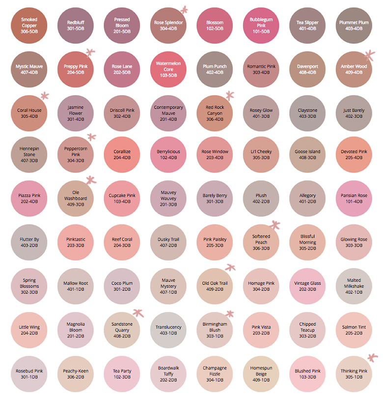
Planning Our Paint Color Palette with the Simply Yours Tool
This post is sponsored by Dutch Boy Paint. We took on several spaces for the latest round of the One…November 21, 2016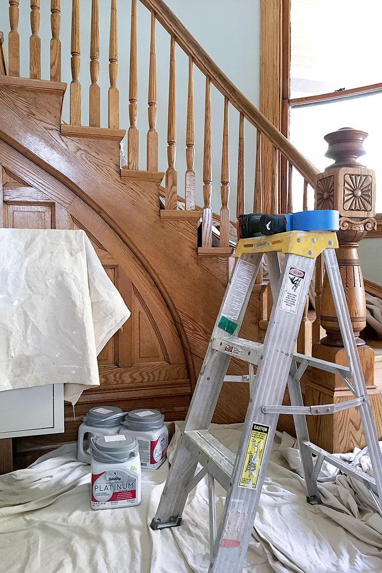
One Room Challenge: Week 5 (When it Rains, it Pours)
I had planned to finish — completely finish — two flights of stairs over the weekend. The old paint beneath…November 2, 2016
Painted Stairs and Entryway Makeover
This is a sponsored conversation written by me on behalf of Dutch Boy. The opinions and text are all mine. Our back entryway got a…
My Son’s Finished Room
This post is sponsored by Dutch Boy® Paints. Red and light blue — those were the only parameters I was given by my six-year-old. You…
The Guest Room, Painted Pink
This post is sponsored by Dutch Boy® Paints. Why did I hesitate to paint the guest room anything other than pink? The walls were white…
Planning Our Paint Color Palette with the Simply Yours Tool
This post is sponsored by Dutch Boy Paint. We took on several spaces for the latest round of the One Room Challenge. The work spanned…
One Room Challenge: Week 5 (When it Rains, it Pours)
I had planned to finish — completely finish — two flights of stairs over the weekend. The old paint beneath the carpet we ripped up…