

Pink, Brass, Marble, Repeat
It's nice when all of my favorite colors and finishes are trending because they're easy to find, but it's also…October 23, 2015
Making it Yours 13B: Möckelby Dining Table
Sometimes I have a good idea of where I'm going with these Making it Yours looks, and sometimes the design…August 24, 2015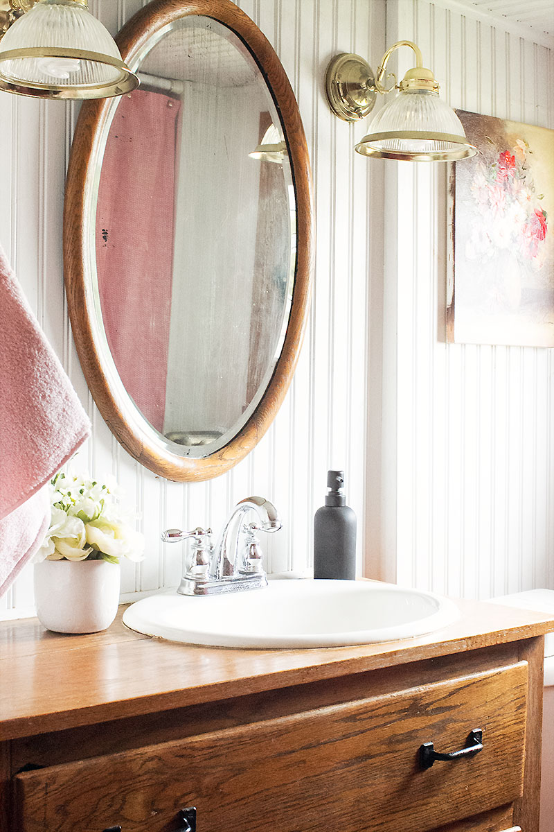
A Post-Summer Perk Up
This post is brought to you by Target Style. Shop the new Home collection in stores and online. Everything has kind of been up…August 18, 2015
An #InspiredStart with Coffee-Mate and David Bromstad
This is a sponsored post by NESTLE Coffee-mate. All reviews and opinions expressed in this post are unbiased and based…July 20, 2015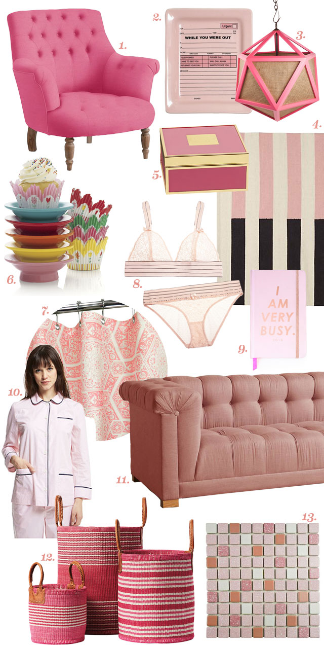
Oh, Hey. It’s National Pink Day!
Did you know that June 23rd is National Pink Day? It's OK, I didn't either. Apparently you can celebrate by…June 23, 2015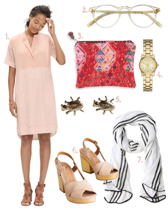
Style: Pink, Gold, and Bugs
As much as the idea of actual bugs crawling around my ears sounds absolutely terrifying, cute little gold ones can…May 21, 2015
Pink, Brass, Marble, Repeat
It’s nice when all of my favorite colors and finishes are trending because they’re easy to find, but it’s also all too tempting. I don’t…
Making it Yours 13B: Möckelby Dining Table
Sometimes I have a good idea of where I’m going with these Making it Yours looks, and sometimes the design shifts and changes along the…
A Post-Summer Perk Up
This post is brought to you by Target Style. Shop the new Home collection in stores and online. Everything has kind of been up in the air, house-wise, waiting…
An #InspiredStart with Coffee-Mate and David Bromstad
This is a sponsored post by NESTLE Coffee-mate. All reviews and opinions expressed in this post are unbiased and based on my personal view. David…
Oh, Hey. It’s National Pink Day!
Did you know that June 23rd is National Pink Day? It’s OK, I didn’t either. Apparently you can celebrate by doing things like… going to…
Style: Pink, Gold, and Bugs
As much as the idea of actual bugs crawling around my ears sounds absolutely terrifying, cute little gold ones can hang out all over me…