
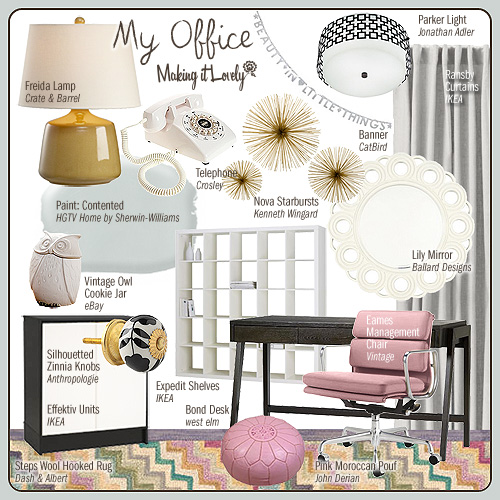
Where Did You Get That? (Office Edition)
I answered the questions about where everything came from in my last office post, but I thought I'd put together…August 17, 2011
Window Treatments
I’ve added another page to the new sources section: Window Treatments. I hope it’s helpful!November 10, 2009
Paint Colors
I've added a new section to the site where I'll list sources for various things used throughout my home. I've…November 9, 2009
Picking Perfect Pink Paint
It's no secret that pink is my favorite color, and I believe that pink can be a beautiful wall color…July 20, 2009
Where Did You Get That? (Office Edition)
I answered the questions about where everything came from in my last office post, but I thought I’d put together a page with the sources…
Window Treatments
I’ve added another page to the new sources section: Window Treatments. I hope it’s helpful!
Paint Colors
I’ve added a new section to the site where I’ll list sources for various things used throughout my home. I’ve started with paint colors, and…
Picking Perfect Pink Paint
It’s no secret that pink is my favorite color, and I believe that pink can be a beautiful wall color when chosen well. Unfortunately, it’s…