You remember the blue Journey rug from Loloi that I styled a while back, right? I love the chance to play dress-up with my house, so I was excited about switching things up with another room.
And guess what — this is a competition.
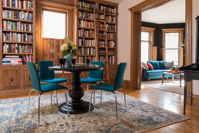
To celebrate the line’s release, Loloi invited eight design bloggers to participate in a styling contest. Super fun, but the best part is that the winner will get a $1000 donation made on his or her behalf to the charity of their choice! A win for me would be a win for Rebuilding Together. They work with low-income homeowners, bettering their houses and their communities at the same time.
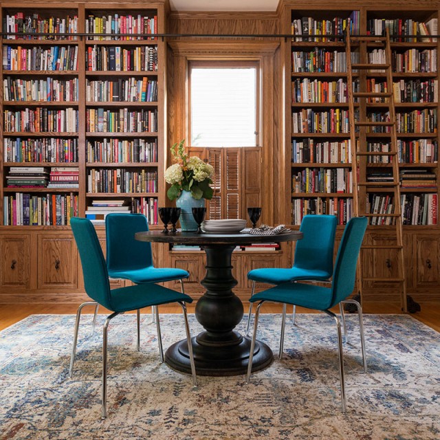
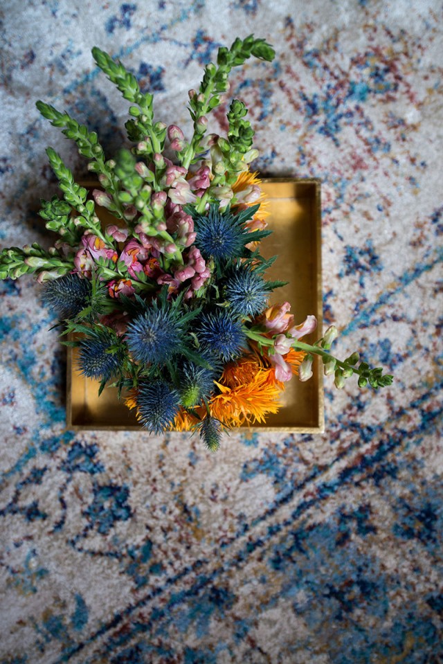
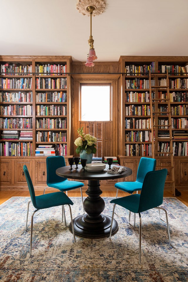
The Anastasia collection features traditional rug design elements made modern in scale and in the patterns’ distressing. There are bold colors (indigo, ochre, teal), but they’re tempered by creams and cool silvers. Our library has a whole lot of wood in it, especially from this angle, and the rug adds visual and tactile softness to the room.
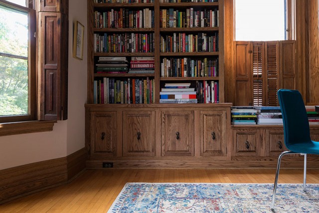
Like last time, this rug is not a permanent addition (alas!). Nor are the chairs, which I added to echo the blues in the rug and pick up on the color of the sofa in the next room over. And since it’s a bit of a fiction, I set the table in our home library for dining — even though you guys know we really eat our meals in the dining room.
You have until midnight, October 14 to vote for your favorite room. Hopefully it’s mine (hint, hint) because I’d love the win for my charity, but everyone did an amazing job and chose equally worthy causes. Go check them out!
The Anastasia Rug (AF-07 in Sand/Lt Blue)is available from Wayfair and RugsDirect.




Sarah @ onesuchlife
September 30, 2015 at 11:04 amBeautiful rug. I love the teal with the wood tones. I could see this being more of a game room rather than another space to dine in.
Making it Lovely
September 30, 2015 at 11:06 amIt is, really. The kids do homework in there, we play games, they bring their toys in, and we have all the books, obviously. It was just fun to set the table up like that!
Jill
September 30, 2015 at 11:31 amLove this so much! Those chairs are my favorite color. Where did you get them?
Good luck!
Making it Lovely
October 1, 2015 at 9:54 amThey’re from Target! Super affordable, too — $40 each, and they come in a few colors.
Laurie
September 30, 2015 at 12:02 pmYou probably already featured the finished book case and I missed it but I’m so glad to see it here and see how lovely it turned out! You really did a nice job with this. Well done! It’s gorgeous, it looks like it is a natural part of the house and I’ll bet it is super nice to have a single library like that! Score for beauty and function.
Love the teal pop against the wood. Really spectacular visually.
Making it Lovely
October 1, 2015 at 9:58 amThank you. That was the goal — for it to look like it has always been there.
Mary Ann Einarson
September 30, 2015 at 1:39 pmDone!
I just love the welcoming feeling of this room – the blues look wonderful with the warm wood. And, I really like your choice of charity. Fingers crossed for you (but only after tweeting and pinning!). Good luck!
Making it Lovely
October 1, 2015 at 9:59 amThank you for sharing!
Kate
September 30, 2015 at 5:18 pmYay! I love that you used COLOR. That rug is delicious!
Emily
September 30, 2015 at 8:43 pmI love the rug! The table! The flower arrangement! The books and wood and everything…. ummm, except the chairs – they look really stiff and uncomfortable, the opposite of an inviting library where I would want to spend lots of time.
I’m projecting my own favorites into this space and would use maybe a couple of Chesterfield chairs in teal leather? like these:
http://www.potterybarn.com/products/carolyn-leather-tufted-chair/
or this one, http://www.cb2.com/avec-chair/s234529 again in leather – super sturdy for kids to climb on!
I’m going to vote for your room despite the chairs. I LOVE your blog! I’ve learned so much from your stuff!!
Emily
Making it Lovely
October 1, 2015 at 10:03 amThose PB tufted chairs have been on my radar for a while now. These too, basically the same thing, but in linen (and lots of colors). I agree, a library needs comfy chairs! I have a post in the works about my actual plans for the furnishing and finishing of the room, which includes good seating to curl up in.
lsaspacey
September 30, 2015 at 10:55 pmI voted for you! I was amazed how alike the other blogger rooms were, all white walls. Yours was the only one that looked like a real room!
Making it Lovely
October 1, 2015 at 10:05 amWell, they all look like “real” rooms, but I know what you mean. White walls and white trim are definitely trending hard right now! And I, like everyone else it seems, do like the look a lot. But that’s never going to be this house, and I’m enjoying the difference.
Katherine
October 1, 2015 at 8:19 amBeautiful! I voted!
Where are the chairs from, may I ask?
Making it Lovely
October 1, 2015 at 10:11 amThanks! The chairs were from Target. I needed something with some color, and it proved a more difficult task than anticipated to find something in stock, in multiples! The legs aren’t ideal style-wise in my house, but they are cute little chairs.
Jess
October 1, 2015 at 9:53 amThe room looks beautiful! Can I just say how refreshing it is to see a style blogger who fills her bookshelves with -gasp- books! I’m so over the weird, meticulously spaced knick knacks that I’m seeing on every built-in out there. It just doesn’t seem like real life to me. So kudos to you for actually showing us a beautiful room that you live in, not just one that exists for the sake of photography!
jenn aka the picky girl
October 1, 2015 at 10:38 amOh man, Nicole, this is too good. I commented on your FB yesterday, but I just came here to look again and to vote.
I might have to reconsider this space if I were you because it looks AMAZING like this. Even though the chair legs are a bit spindly, I still love the whole look. That teal!
Danielle
October 1, 2015 at 4:14 pmLove the rug – it looks beautiful in your room! Good luck in the competition! :)
Lori L
October 1, 2015 at 9:39 pmI voted for your room today. All the rooms are nice but yours is the only one with real personality. The others all white look almost the same to me. I love how you continue to go with what you love and not follow all the latest trends. You have been a fovorite of mine for years.
susan
October 2, 2015 at 10:30 amI looked at all the rooms and, quite honestly, I really did like yours best. It was the most … accessible? It looked real. I love the books, the colors, the wood. I just love the whole thing.
Molly
October 7, 2015 at 6:21 pmCould you let us know where the black pedestal table is from? Love it!
Coulda Woulda Shoulda | Making it Lovely
October 7, 2015 at 11:28 pm[…] saw the library last week, yes? The rug was on loan for a styling competition and it’s already on its way back, but the […]
Michelle
October 9, 2015 at 5:18 pmI looked at them all, but I did like yours best. It felt like a room with texture and depth to it. I love the bright blue and all the books.