I have the design for the office to share with you this week! First up, let’s talk layout.
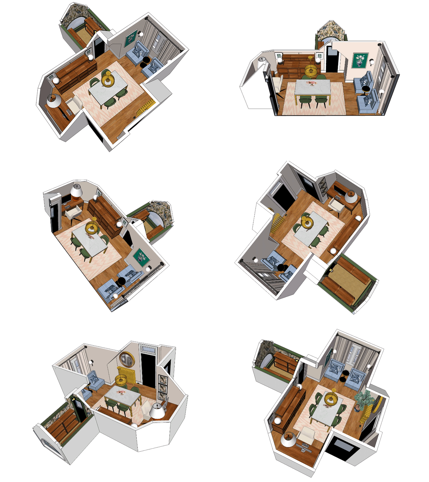
Look how fancy I am! Marvel at that rudimentary animation! I made it myself, and yes, everything is to scale. I’ve leveled up a little with SketchUp and it’s no longer the frustrating exercise it once was to create custom furniture. I even made the lamp on the desk! YAY FOR NEW SKILLS.
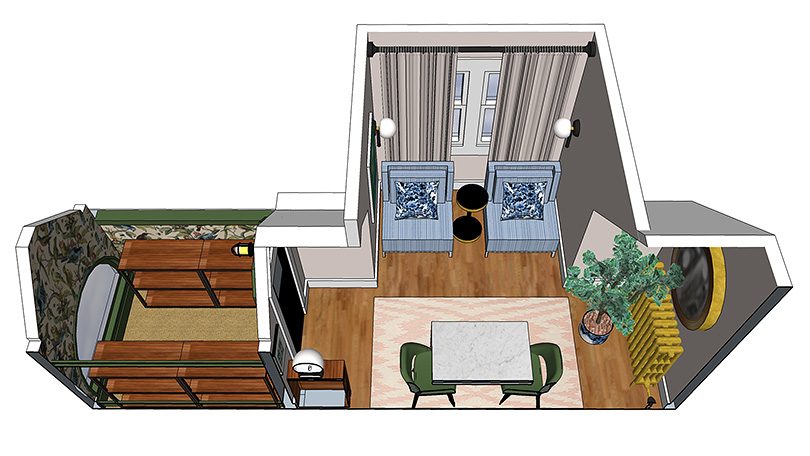
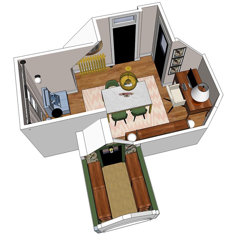
Anyway, I have still images too, which are probably more helpful in discussing the space.
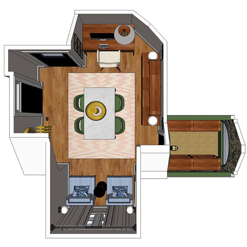
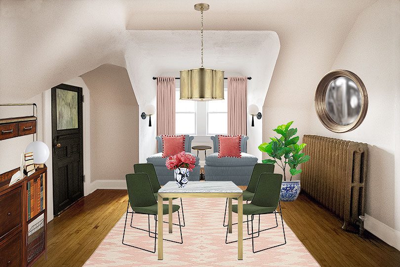
The room is all angles, so the layout was a little challenging, but I took advantage of the one long wall by lining it with 7’ of modular storage. The ceiling wonkiness is limiting, so to avoid everything being at the same height, I added a hutch atop the cabinets.
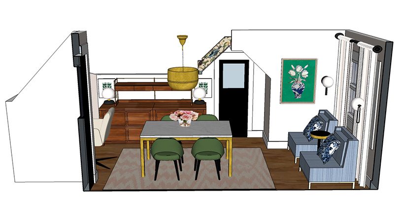
Floating in the middle of the room will be a brass and marble dining table. It gives me extra space to spread out while planning big projects, but it’s also a secondary desk, a homework spot (the kids like to hang out up there with me), and an alternate location for tabletop shoots. There will be four modern green chairs for everyday use, but the table can seat six.
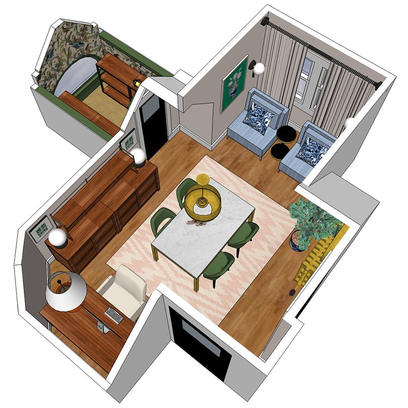
Next, the placement of the desk and chairs. This is controversial?
They can be flip-flopped, and in theory a desk in front of the windows sounds lovely. In reality though, the sun can be super bright there for a good portion of the day and I think it would hurt my eyes to be staring at a backlit screen (and I don’t want to draw the curtains all the time). I also have a window AC there which is very necessary on the third floor of an old house without central air, and I don’t want to sit directly in front of it. And also? I don’t want my back to the room’s main entrance! It feels wrong. My desk has been where it is in the mockups for months now, and I like it. I can also swivel to reach the scanner/printer which I don’t use every single day, but when I do I feel very much in control of my little command center.
Placing the desk in front of the window would make for a pretty picture, but the window nook will also be beautiful with my pair of vintage chairs and sconces on each side.
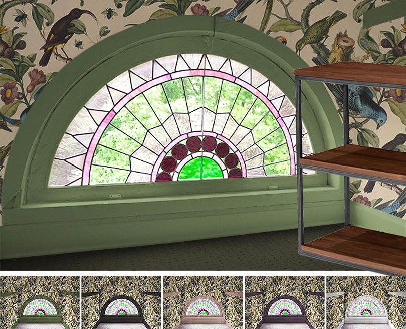
OK, and the closet. Excuse me, I mean “The Rainbow Room.” My family loves this little space at the very tip-top front of the house with its demilune stained glass window. We’re all pretty excited about giving it an update! I’ll be putting up the most amazing wallpaper with vintage-style illustrations of birds and bugs, and then painting the trim a complementary color (likely green). Four bookshelves will line the sides giving us tons of storage while keeping a clear view of the window at the end.
I’ve got a design board with the major pieces in place to share too. I always start my process here, adding each element layer by layer so I can swap things in and out as I make decisions.
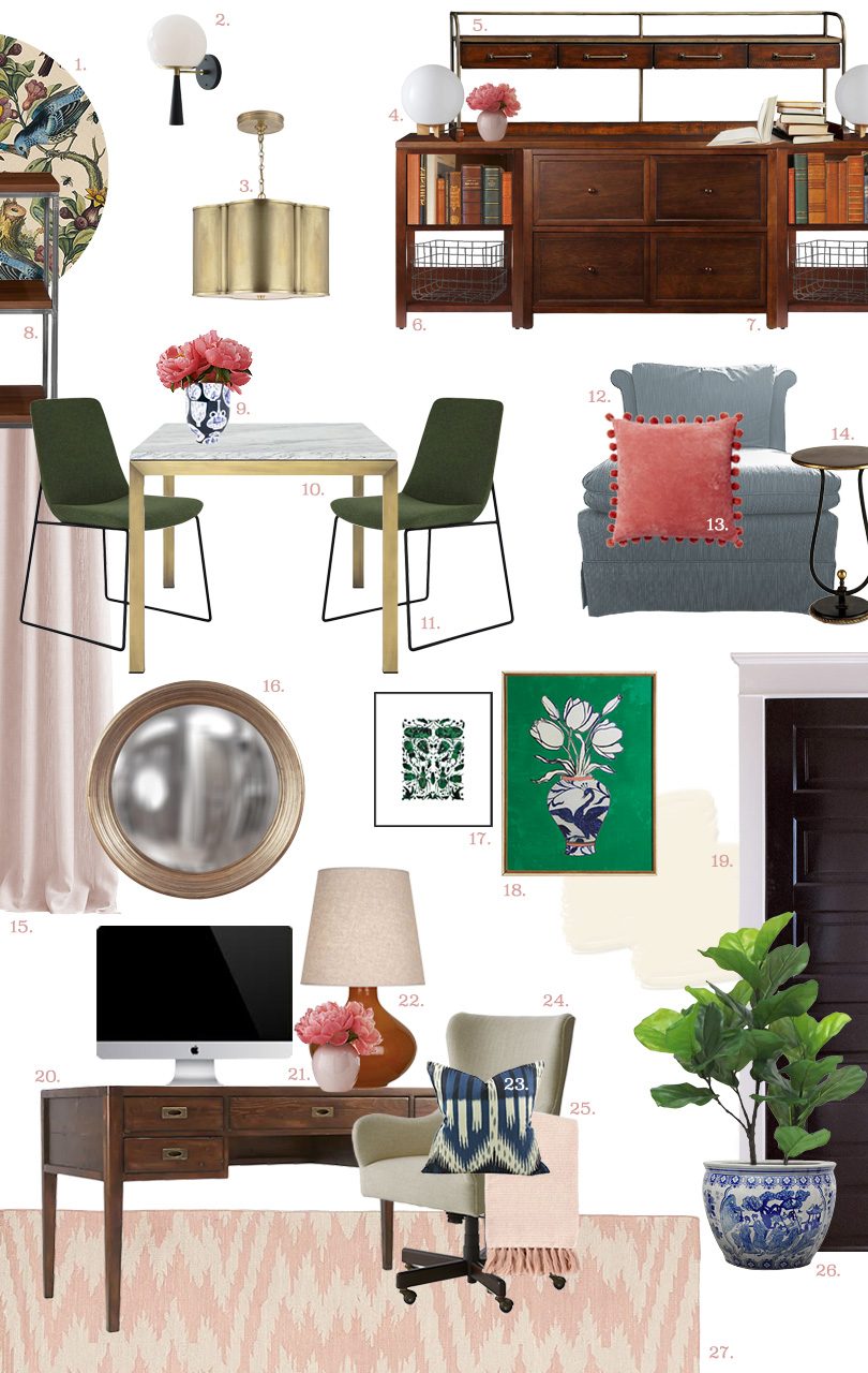
This board isn’t 100% final, but it’s pretty close. The room will need more to fill it out too — more art, accessories, and little styling touches — but that all comes in at the end.
* An asterisk denotes items that have been sent by sponsors for inclusion in the room.
-
Ornithology Wallpaper, Milton & King*
Birds and bugs! That illustration style! You guys, this is right up my alley. -
Audrey 8″ Sconce, Cedar & Moss*
Well these are pretty much perfect, yes? Customizable too. Mine will plug in. -
Alexa Hampton Basil Small Brass Pendant, The Mine*
Much nicer than the ceiling fan it’s replacing. I’ll be centering the pendant on the marble table. -
Globe Table Lamp, West Elm
There are less expensive options for a simple globe lamp, but I’m picky about the glass. I didn’t want plastic or anything etched/frosted. Beautiful milk glass all the way. -
Benchwright Hutch, Pottery Barn
The ceilings have funny angles and I needed something with height. This sits atop my storage cabinets. (Discontinued, but here’s the rest of the collection.) -
Martha Stewart Living Craft Storage Console, Home Depot / Home Decorators
Modular, so you can build your own storage solution. Alas, I’m only seeing this one in white now. -
Martha Stewart Living Craft File Cabinet, Home Depot / Home Decorators
More modular goodness, but this one is still available in wood, along with white and black. -
Archive Walnut Bookshelves, Article*
These have arrived and not only are they sturdy, the walnut is gorgeous. -
Freer House Slim Keith Vase, Jill Rosenwald*
Little vases painted on a larger vase! Delightful. -
Marble and Brass 60×36″ Parsons Table, Crate & Barrel*
I cannot wait to start covering this table with walllpaper samples and paint swatches. Perhaps its beauty will inspire me to keep a tidy workspace? -
Ruth Green Dining Chairs, The Mine*
I’ve been looking for more ways to bring in mossy green, and these chairs excellent in that regard. Digging the modern style too. -
Vintage Blue Slipper Chairs, Divine Consign
I grabbed a pair of these and used only one in my first One Room Challenge, but now they’re reuniting in my office. -
Pom Pom Velvet Pillows, West Elm
I’ve used these in other rooms, but my pillows like to shuffle around. I think they’ll be happy in the office, at least for a little while. -
Kendrick Currey & Co Side Table, Bellacor*
This is the cutest side table and I’m sad to say that it’s being discontinued. I was considering this quirky side table too, which is still available. -
Pink Curtains, TBD
I might steal these from another room, but then that would leave that space naked. Find something else? Keep the others and pick up some new ones for this room? (Pink for every window, everywhere!) -
Silas Round Convex Mirror, Overstock
Another item I might steal from a different room (the snug). But I think I might like it even better in the office. -
‘Emerald Beetles’ by Kate Roebuck, Artfully Walls*
It’s too good. I had to. -
‘Flowers in Vase’ by Ruti Shaashua, Artfully Walls*
Great colors and an equally great drawing style. -
Paint colors: White Blush, Benjamin Moore; Simply White, Benjamin Moore; Authentic Black, Dutch Boy
The second and third floor has white trim and black doors throughout (with just a couple of rooms left to tackle). The pale blush walls are the same as my bedroom — I loved the color that much. -
Morris 60″ Desk, Crate & Barrel*
Drawers! So many drawers. I’m going to devote one exclusively to novelty toys just because I can. -
Minna Vase, Crate & Barrel
I picked up four of these a while back. I have three children, and not so coincidentally I suppose, I now also have three of these vases. -
Jane Robert Abbey Table Lamp, Bellacor*
I’m playing with scale here. This lamp is huge, and it’s going under an angled ceiling. It should work, but until I see it in person I’m crossing my fingers. -
Bukhara Ikat Indigo Blue Pillow, Arianna Belle*
Oh my do I love this pattern. My desk area needed a little shot of blue. -
Liv Upholstered Wingback Office Chair, Crate & Barrel*
My number one choice for a desk chair. It’s so dang lovely.I’ve written about it before! -
Coziest Rosette Throw, West Elm
For chilly days. -
Ladies Blue and White Fishbowl Planter, The Mine*
There are touches of blue and white everywhere, and I’ve been wanting to add a planter like this somewhere in the house. I realized the office is the perfect spot to do so. -
Pink Ikat Genevieve Gorder Capel Dhurrie Rug, Pottery Barn Kids
An oldie but a goodie. The dusty pink is hard to find in rugs — they’re usually baby pink or much, much brighter.
Everything is coming together and I’m feeling good about it — except for the windows. Am I stealing curtains from another room? Leaving those and adding yet another set of pink curtains to my house? (Not that I would complain.) I’ve played around with lots of fabric patterns, going bold with scale and color, and I keep coming back to the subtle backdrop of plain pink. What do you think?
Follow along with the One Room Challenge participants!
 • Boxwood Avenue • Coco & Jack • Design Manifest • Dwell with Dignity • The House That Lars Built • Little Green Notebook • The Makerista • Making it Lovely • Old Brand New • Old Home Love • The Painted House • Megan Pflug Designs • Pink Pagoda • Erica Reitman • Sacramento Street • Simply Grove • Jill Sorensen • Sugar & Cloth • Vintage Rug Shop • Waiting on Martha • Media Partner House Beautiful • TM by ORC
My One Room Challenge Posts
Follow along from the beginning!
• Week 1: Hello, Office • Week 2: Design and Layout • Week 3: It’s Curtains • Week 4: Putting it Together• Week 5: What Trim Color?
And check out my previous One Room Challenges!
• Spring ’16: Our Bedroom and Den • Fall ’16: Front and Back Entry, Stairs, and Hallways
p.s. Here’s a smoother animation for you.


kimzepeda
October 11, 2017 at 8:52 amThis is going to be beautiful! Love the way you mix.
Making it Lovely
October 11, 2017 at 4:15 pmThank you!
Caroline E-H
October 11, 2017 at 9:34 amSuch gorgeous colors! I’m in love with the sconces and the wallpaper. Your sketch-up skills are definitely impressive!
Making it Lovely
October 11, 2017 at 4:16 pmI’ve made a big leap with the program in the last couple of months. There are truly impressive examples out there, but I’m happy with where I’m at!
Amy
October 11, 2017 at 10:04 amThe window is so lovely, why don’t you knock out the wall and door so it’s more open and you can see it all the time?
Making it Lovely
October 11, 2017 at 4:16 pmI like the idea of it as a little surprise. Plus I like the tiny little door that leads to the room just as much.
Taylor
October 11, 2017 at 10:25 amI love the dark purple trim around the rainbow room window!! It really compliments the stained glass. The green is also a great option though.
Making it Lovely
October 11, 2017 at 4:17 pmThe purple references the purple trim on the exterior too, and it is present in the wallpaper pattern. It’s definitely in the running, but it doesn’t relate to the rest of the office at all.
Jill Sorensen
October 11, 2017 at 1:48 pmWow love the animation. Feeling behind the tech curve! Rooms looks super chic look forward to results.
Kathleen
October 11, 2017 at 2:22 pmI can not wait to see the finished product – the choices and the rendering are perfect! Those sconces and that wallpaper!!! All the heart eyes
Jane @ quirk-shop.com
October 11, 2017 at 2:36 pmI am in awe of your sketchup skills, Nicole! Looks like it will be a beautiful room. Green and pink FTW!
Sarah
October 11, 2017 at 2:59 pmIt looks lovely, and I adore the wallpaper for the Rainbow Room, but aren’t you worried bookshelves on both sides will block out too much of the window? What about ceiling height bookshelves along the first two thirds of the walls, and make a swoon-worthy reading nook right in front of the window – a thick floor cushion and a pile of throw cushions to nestle into? The lines of the glass are too glorious to break up.
Kelly
October 11, 2017 at 3:22 pmI agree with Sarah. Blocking that window with book shelves would be a shame.
Making it Lovely
October 11, 2017 at 4:13 pmOnly two bookshelves (closest to the door) instead of four, you’re saying? It’s a tiny space — 5′ x 6′ and only 6.5′ tall.
Nicole
October 12, 2017 at 11:01 amWhy not do custom bookshelves? You know someone who did the library and then you can adjust the width and height to maximize the space. I have to say, in my new house, I haven’t bought any big box shelving or cabinets now that I have seen what a cabinetmaker can do with only slightly more money.
Judith
October 17, 2017 at 5:43 pmI actually only went to the comments to write this exact thing. Just two bookshelves next to the door, and then a floor cushion or two next to the window to hang out and read (and some cute lamp(s) or sconces for light in the evening).
If the sides are all shelves, then the window will be a bit of an incidental item in a book-storage room, instead of a central element of a book-lovers hidey-hole.
Judy
October 11, 2017 at 5:34 pmWow, this is really going to be a beautiful office! I love that there is also space for the kids to do their homework. I had to follow the “controversial” link. My initial reaction to the desk placement is that I would want to face out into the room, but I totally get the ugly wires issue, and being able to swivel your chair around to reach other areas makes total sense. I can’t get over how good your sketch-up of this room is! Can’t wait for the final reveal, as always.
Jessibee
October 11, 2017 at 5:56 pmI love it! I’m swooning over so many elements…the brass pendant, the wallpaper, the chairs in the window and my favorite door glass in the world. Can’t wait to see it come to life. Good luck!
Peggi
October 12, 2017 at 5:43 amWowza! Everything is smashing! That wallpaper! The marble table! The sconces! So many exclamation points! Maybe Professor Peacock should reside up here?? (Props to you on the tech skills, but the spinning room made me queasy! :-)
Kim Burdett
October 12, 2017 at 9:43 amGorgeous – that rainbow room is amazing! I would definitely do the floor cushion in there as others suggested with two bookcases instead of four. Imagine drawing sketches in there, or finding one of your kids hiding away in there to read while you work. SO cute.
Also, what about a vintage settee instead of the two large chairs by the window? I would want some place to be able to actually “sprawl out” a bit more, and you already have a bunch of chairs around the table that work for seating. Just an idea – I know you will make it gorgeous!
Also – that wallpaper is TO DIE FOR. SO beautiful.
C's Collection
October 12, 2017 at 2:22 pmI love the colors you’re choosing especially the green! I’ve been gravitating toward green lately- it’s been feeling a little moody but still fresh! Can’t wait to continue following the transformation!
C’s Collection | http://www.chelseascollection.com
One Room Challenge™ {The Guest Retreat} Week 2 - Design ManifestDesign Manifest
October 12, 2017 at 3:00 pm[…] Green Notebook | The Makerista | Making it Lovely | Old Brand New | Old Home […]
goosefairy
October 13, 2017 at 6:31 amOne of the things I really appreciate about your design style is the exuberant use of color and pattern. I am SO tired of all the gray/neutral spaces you see everywhere. This is really lovely.
Emily Clark-Nimz
October 13, 2017 at 11:23 amI love all the choices in the office space. True to your overall style with new adventures in different spaces. I think I’d paint the trim in the Rainbow room black, though. It would carry over from the doors, and really define the window from the colorful wallpaper.
One Room Challenge | Coco & Jack
October 14, 2017 at 11:28 pm[…] Design Manifest | IBB for DWD | The House That Lars Built | Little Green Notebook | The Makerista | Making it Lovely | Old Brand New | Old Home Love | The Painted House | Megan Pflug Designs | Pink Pagoda | Erica […]
One Room Challenge Week 2
October 16, 2017 at 4:40 pm[…] Design Manifest | IBB for DWD | The House That Lars Built | Little Green Notebook | The Makerista | Making it Lovely | Old Brand New | Old Home Love | The Painted House | Megan Pflug Designs | Pink Pagoda | Erica […]
One Room Challenge: Week 2: The Plans - The Makerista
October 17, 2017 at 10:20 am[…] Design Manifest | IBB for DWD | The House That Lars Built | Little Green Notebook | The Makerista | Making it Lovely | Old Brand New | Old Home Love | The Painted House | Megan Pflug Designs | Pink Pagoda | Erica […]
Shaker meets Mid-century modern style at The Woodhouse Lodge
October 24, 2017 at 12:38 pm[…] Design Manifest | IBB for DWD | The House That Lars Built | Little Green Notebook | The Makerista | Making it Lovely | Old Brand New | Old Home Love | The Painted House | Megan Pflug Designs | Pink Pagoda | Erica […]
Alternate Picks from The Mine and Other ORC Sponsors - Making it Lovely
November 10, 2017 at 3:28 pm[…] and vintage pieces, and product from sponsors. As I was choosing which things to incorporate into my One Room Challenge office, there was a lot that I loved, but either I didn’t have the right spot or it wasn’t […]
One Room Challenge: Week 7 (The Office Reveal!) - Making it Lovely
November 15, 2017 at 3:49 am[…] oversized lamp was a risk with my sloped ceiling, but I knew it would fit. (Thanks, 3D rendering to scale!) The vase hits that sweet spot between reverential and whimsical, and then the snake is just […]
One Room Challenge Reveal | Making It Lovely (ReBlog) | The Paper Mill
December 4, 2017 at 7:27 pm[…] felt that the oversized ceramic lamp was a risk because she had a sloped ceiling. But thanks to 3D rendering to scale it all worked out. It balances the desk with the large monitor. The vase offers something a […]
One Room Challenge Week 2: Our Master Bath Design Plan + Help us Pick! - Sugar & Cloth
March 29, 2020 at 6:06 pm[…] Design Manifest | IBB for DWD | The House That Lars Built | Little Green Notebook | The Makerista | Making it Lovely | Old Brand New | Old Home Love | The Painted House | Megan Pflug Designs | Pink Pagoda | Erica […]
A French Country Inspired Dining Room | ORC Week 2 - Boxwood Ave
June 1, 2020 at 3:09 pm[…] Design Manifest | IBB for DWD | The House That Lars Built | Little Green Notebook | The Makerista | Making it Lovely | Old Brand New | Old Home Love | The Painted House | Megan Pflug Designs | Pink Pagoda | […]