In part one, I discussed a few different options for product photography. Here, I’ll focus on taking a good photo against a white background. That’s what I’m (fairly) good at, and I think that’s where most people have trouble.
The Setup
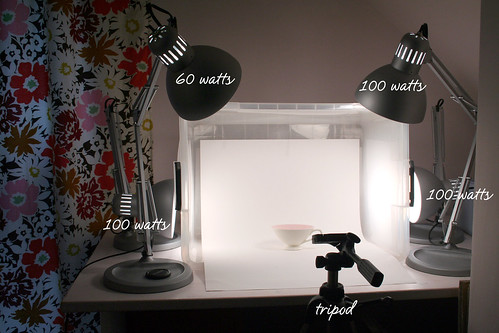
I use a homemade light box, a tripod, four adjustable lamps from IKEA, and daylight bulbs.
Three of the lamps have 100 watt daylight bulbs, which is often enough. If there are harsh shadows, I’ll also turn on the 60 watt lamp to add a little overall illumination. The light box is a clear plastic container with some fabric batting wrapped around it to soften the light. The white background inside is just a piece of poster board.
Getting the Picture
As I mentioned in part one, I am not an expert photographer by any means. I am however, quite good at Photoshop.
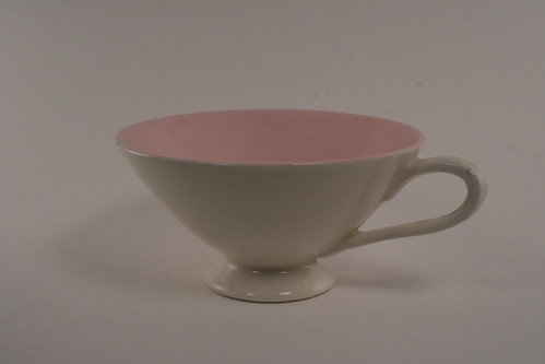
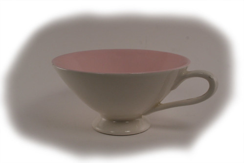
Here’s my photo straight out of the camera.
It’s not great, but it’s as good as I get. The colors are actually accurate, even if the photo is too gray. The tungsten white balance on my camera is the best for me, but you’ll have to experiment to see what works for you.
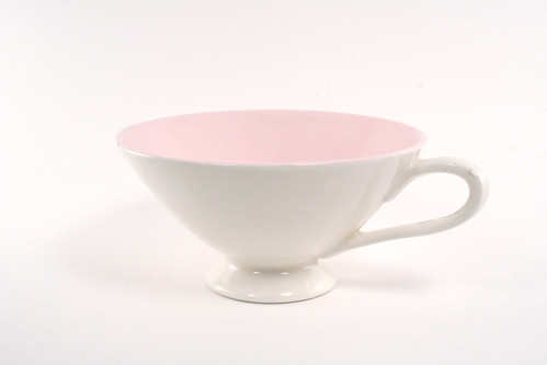
Next I adjust the levels in Photoshop. I always try “auto” first, but sometimes you get a pretty bad result (like the photo below).
By adjusting the levels manually, you can get the photo looking pretty good.
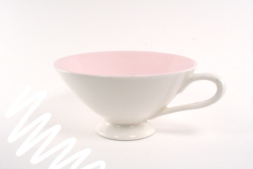
The photo won’t blend seamlessly into a white background yet though – the edges are still a little gray. See where I scribbled with pure white below?
Here’s what I do. I use a white paintbrush to go all the way around the edges. This way, I know the edges will be pure white. Here’s what the photo looks like with the levels off:
Next I go in and blend the edges a bit with the paintbrush set at a lower opacity. I use a Wacom Tablet, so I have pretty good control over the brush. If you’re using a mouse, it’s a little harder to be accurate, so it may help to select your object with the lasso or make a work path with the pen, and then select the inverse so that you’re only working on the background.
With the levels turned on again, here’s the finished photo:
I hope you found this helpful! If you’d like to try a different technique, there are a ton of tutorials out there. Lindsay Landis also wrote an excellent guide over at The Switchboards. Happy photo-taking!





49 comments
Crystal
Very impressive! I’ve tried this before and it works well.
Carrie Atkins
I so much appreciate this great information! I will definitely give you the credit due when I repost on my website! THANKS!!!
Karen LePage
This is a fabulous tutorial. Thanks for sharing your process flow between actual/digital realms.
Ishrath
I like your use of a plastic box. I tried couple of shoots with IKEA lamps before… but they deteriorate over a period of time. Bad quality.
Making it Lovely
I think the ones I used were ‘GE Reveal’ bulbs (they’re blue incandescent bulbs).
Katie
Nicole-
I’m sorry to bother you but I’m trying to put one of these together and I’m having a hard time finding “daylight bulbs” are they the energy efficient spiral kind? Thanks so much for your time.
Misha Ashton
great tutorial, just as a tip to help reduce the amount of photoshop work, go to a camera store and buy a grey card. If you can meter off of that, it will make your whites…white. All cameras are set up to meter 18% grey and whether you are shooting on pure black or pure white, with out the grey card, it will always turn out grey!!
: )
lovely work!!!
chezus
Great piece. What kind of daylight bulbs are you using?? Thanks!
Kate
i didn’t read the other comments but you can also put tracing paper over the lights to diffuse it a little bit! great tutorial!
Katie
Great tutorial! I’ve been meaning to set up a box like this for ages… you make it seem easy enough, so I might as well! ;)
hsp
You’re getting a grey image because your camera is averaging the ambient light for a percentage of grey. If you’re using M mode, over expose by 1 stop. If you’re shooting in Av, set the Exposure Compensation for +1.
Alternatively, shooting fully manual, meter off a grey card and then take the photo using those exposure settings.
From there you shouldn’t need to do as much PS manipulation.
Michelle
Thank you for sharing that most valuable tip! We want more of your tips and tricks!
Jan
Thanks for the helpful info. Just curious, what is TSB?
Cotton Heart
Very good setup, especially because it includes back lights which people so often forget – and are so very helpful.
Dark shadows can also be removed by bouncing the light, a white cardboard or very thick white paper can do the trick.
TWan
Great information and thanks for sharing.
Shashi
Great tutorial!
ashley crim
{i just ventured over to TSB…those gals {including you!} are so giving of their experience…I must immerse myself in tsb again!}
ashley crim
this is fabulous and so generous of your time to share! I need to start incorporating some of your oh so useful tips…and the picture of your light box…hugely helpful!
barb
we made a great booth that folds down using white coreplast (plastic sheets) and duct tape. we also us the clip lights from home depot and the daylight bulbs! it stores flat under our work tables!
Jeanee
I’m loving your suggestions.
Most of the time I take my photos in natural daylight near a window. Especially when I’m taking photos of larger items like my aprons. But I find that as it’s getting darker outside it’s too dark to take photos when I get get home from work. I hate the flash.
Maybe I’ll try your lighting suggestion.
TranquilityKnots
Thank you so much, Nicole. I tried your technique on one of my bracelet this morning, and it totally worked. I am very happy with the result. I have been struggling with this for several months now, I really cannot thank you enough. I just blogged about it this morning, so if you want to see what your ‘student’ did, please stop by and take a look. MY blog is at http://sallyzblog.blogspot.com
Thank you! Thank you! Thank you!
michelle b
Thanks so much! You make it look so easy ;-) – I’ll have to try the lighting. I’ve been using natural lighting so far- with a dash of photoshop.
btw, pretty cup!
Jerry
“I am not an expert photographer by any means. I am however, quite good at Photoshop.”
Feh. Potato – potahto. =)
If knowing Photoshop leads to results like those, who needs a pro? I mean, yeah, you might spring for one to have the added insurance of a professional on your wedding day, or whatever, but you’re doing something right for the day-to-day stuff, it looks like!
Jerry
themostfantastic
hi! i posted my comment in the nursery post, but i just wanted to let you know that land of nod and target both carry the same jenny lind crib/changing table brand…except land of nod marks up the price. they are by da vinci. i read about it in baby bargains. good luck!
315thomas
thanks for the tips!
Rachel
This is really great information. I’ll be linking to this.
TranquilityKnots
Great tutorial! I will try it tonight. Thanks a lot!
Benita
Thanks so much for part two! I have the box, batting and poster board. Next time I go to IKEA I’m getting four lamps!
jannypie
This is awesome, thank you so much for sharing. I always thought that the final photo was something you got straight from the camera, and that I was failing miserably! I’ll try fixing up some of my shots in Photoshop now. Thanks again!
minnie
I love the drapes in the photo. Where did you get them?
goody-goody
Thanks so much for sharing your set-up! I’ve heard people describe light boxes before, but it helps to see it and have my hand held through the Photoshop editing!
chhavy
We’ve been thinking about setting up a tiny photo spot in the corner for all our completed floral arrangements. I’ll be sure to test this out for all our blooms art. Thanks so much for the tips!
elizabeth
Excellent tutorial! Straight forward and eacy to understand.
Thanks!
Comments are closed.