
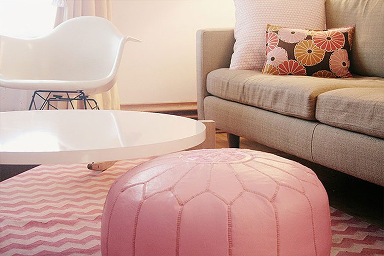
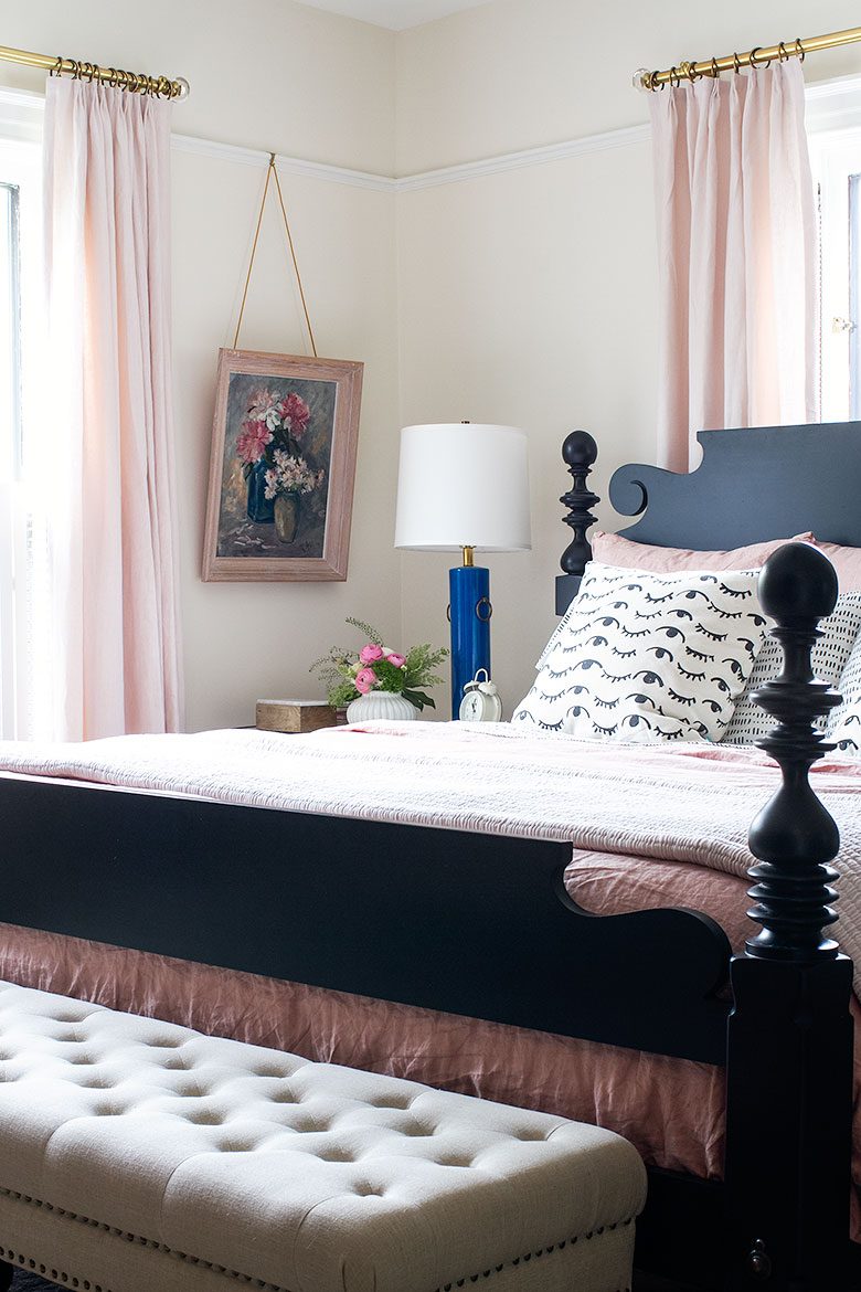
I’m narrowing down my One Room Challenge color choices for both entryways, and the second and third floor halls. Is it too much pink, I’m asking myself? So I started thinking about all of the rooms I’ve painted pink over the years.
The entryway and my home office in our apartment (before this blog existed). The basement, my former studio, Eleanor’s old room, my home office, and the living room in our first house — all shades of pink at various times. The library and dining room here. I even went for hot pink once, with disastrous results.


I should have a decision by this Wednesday’s update post. Is it too much pink? Psshaw.


11 comments
Bridget from Cali
Pretty in Pink. Love a pastel shade in fashion and decor, especially mixed with a glossy white. I like hot pink too — and even bright orange — just in significantly smaller doses. Pink can be ultra feminine, but doesn’t have to be too precious.
Chris
We renovated this summer and painted our entire top floor the most beautiful, neutral, warm, ever so subtle pink hue. My husband was totally on board because we find too white – stark. The colour is BM sunset hill diluted to 75% of the colour and it is PERFECT! Our trim, baseboards and doors are BM Chantilly Lace and the super whiteness of this white really brings out the pink. I highly recommend this combo. Perfectly pink!
Anne
When I was growing up, our friends’ house used the subtlest light pink for all the walls (it felt neutral, I promise!) They did have plaid wallpaper in the boys room but every where else was barely pink. It made such an impression on me that I’ve wanted to do it for years. One of these days my husband might come home to a pink kitchen! Thanks for the inspiration to add to my pink pinboard!
Carol
I love pink. If it’s what “you” love, go for it. It’s a happy and lovely color.
Ariane
50 shades of pink ! Good luck with ORC :)
Vicki
I love the pink. I bet people look really good in that warm light, too!
Natasha Meininger
Can you share the paint color names from your bedroom and dining? I’m looking for the perfect barely pink for a small space that also lacks natural light.
Hannah
If I were to use so much pink, I’m afraid it wouldn’t work as well. But you have a way of making pink look like the perfect neutral. All of those rooms are beautiful, even oddly masculine in some cases, and not overly feminine or precious. I cannot WAIT to see which shade you choose this time!
Melanie
This is perfect timing; I’m seriously considering doing pink in our dining room because you’ve proved it can look AWESOME with wood tones. Scouring your blog to find all the pinks you’ve used and just got a paint chip of the lovely Wild Aster! Can’t wait to see what you do.
Kylie Wakeley
There can never be too much pink! :)
Comments are closed.