
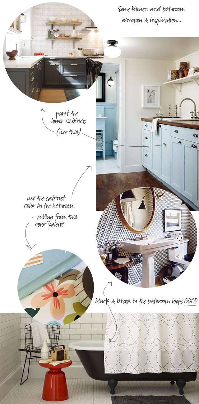
White Walls? Paint the Cabinets?
I've been thinking more about the kitchen and bathroom. All of you seem to be leaning toward dark or mid-gray…January 3, 2013
Playing with Paint Colors
I write for My Colortopia, and they've just launched a new online tool: Color My Room. You can upload your…January 3, 2013
Photo Skillz
I often see my old photos pop up on Pinterest, and I'm amazed at how much my photography has improved.…December 19, 2012
DIY Colorblock Christmas Trees
Here's a cute DIY project to add a little sparkle and shine to your holiday! These colorblock Christmas trees took…December 18, 2012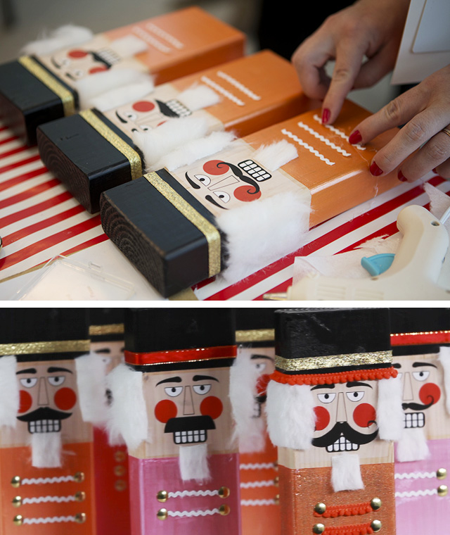
A Hip Handmade Holiday
I was in Salt Lake City last month to meet with Allison Faulkner and Susan Petersen of The Craft Pack,…November 7, 2012
Ombré Nesting Tables (With a How-to Video)
Brought to you by 3M DIY. I found these vintage wooden nesting tables at the Renegade Craft Fair, here in…November 1, 2012
White Walls? Paint the Cabinets?
I’ve been thinking more about the kitchen and bathroom. All of you seem to be leaning toward dark or mid-gray walls, where I’m looking at…
Playing with Paint Colors
I write for My Colortopia, and they’ve just launched a new online tool: Color My Room. You can upload your own photo, or choose from…
Photo Skillz
I often see my old photos pop up on Pinterest, and I’m amazed at how much my photography has improved. I still have a lot…
DIY Colorblock Christmas Trees
Here’s a cute DIY project to add a little sparkle and shine to your holiday! These colorblock Christmas trees took a few hours to create,…
A Hip Handmade Holiday
I was in Salt Lake City last month to meet with Allison Faulkner and Susan Petersen of The Craft Pack, along with their fantastic designer…
Ombré Nesting Tables (With a How-to Video)
Brought to you by 3M DIY. I found these vintage wooden nesting tables at the Renegade Craft Fair, here in Chicago, a couple of months…