
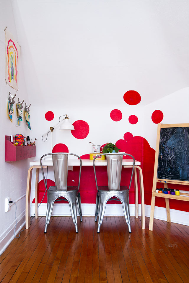
The Playroom’s Accent Wall (Featured in HGTV Magazine)
The playroom is sporting a different look from the last time you saw it! I showed a couple of shots…May 20, 2014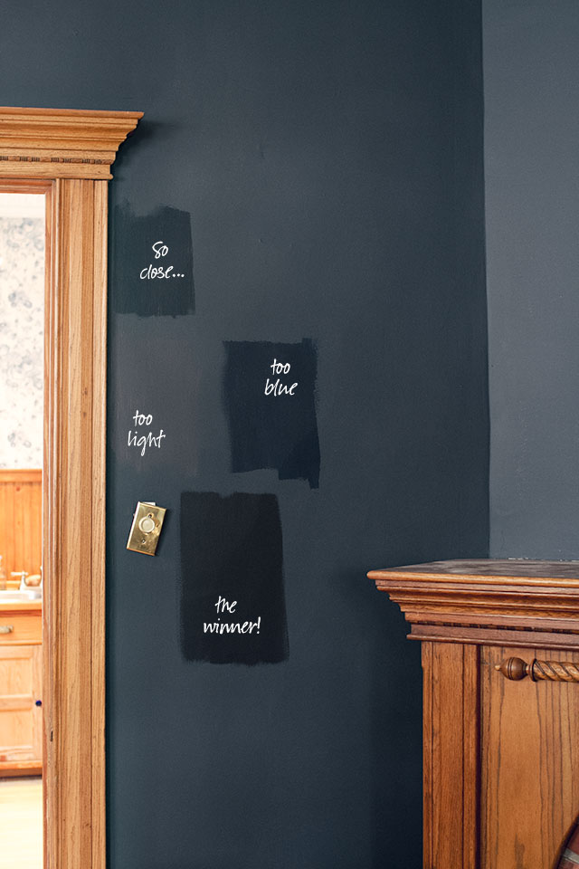
Black Beauty
I'd hoped to have a painted room to share today, but I underestimated the ability of my right arm to…March 3, 2014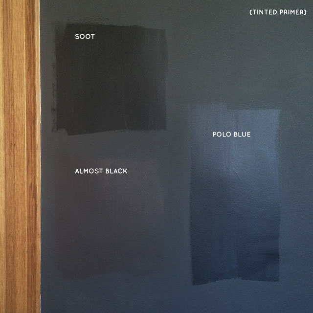
Almost Black
Hey, look, I did some painting this weekend! (My tiny assistant helped.) I need to find a ladder (the step-ladder…February 24, 2014
A Paint Color Palette?
Maybe? It's still very likely to change, but I'm thinking black (or nearly so), pale peachy pink, and olive green…February 17, 2014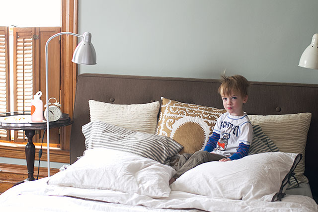
In the Bedroom
I'm attempting to make the bed more often. Is it a New Year's resolution? Not really, but I'm sure I'll…January 2, 2014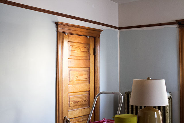
Sea Salt in the Bedroom
The things I do for you guys. Why'd you all make me paint my bedroom this color? Kidding, of course.…December 3, 2013
The Playroom’s Accent Wall (Featured in HGTV Magazine)
The playroom is sporting a different look from the last time you saw it! I showed a couple of shots while the wall was in…
Black Beauty
I’d hoped to have a painted room to share today, but I underestimated the ability of my right arm to paint and paint and paint.…
Almost Black
Hey, look, I did some painting this weekend! (My tiny assistant helped.) I need to find a ladder (the step-ladder isn’t cutting it with 10’…
A Paint Color Palette?
Maybe? It’s still very likely to change, but I’m thinking black (or nearly so), pale peachy pink, and olive green for the walls downstairs. I…
In the Bedroom
I’m attempting to make the bed more often. Is it a New Year’s resolution? Not really, but I’m sure I’ll end up breaking it, so…
Sea Salt in the Bedroom
The things I do for you guys. Why’d you all make me paint my bedroom this color? Kidding, of course. I was torn between Sea…