

Testing Paint Colors for the Bedroom
The walls in our home (the ones that don't have wallpaper, that is) were all painted creamy white before the…October 30, 2013
Eleanor Picks Paint Colors
August gets excited when we do something different to his room. "A new blanket? For me!? WOW!!!" He's two though,…October 9, 2013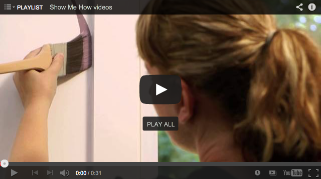
A New Video Series with Painting Tips
I'm so eager to get some paint on the walls of the new house. I'm fine with taking my time…October 9, 2013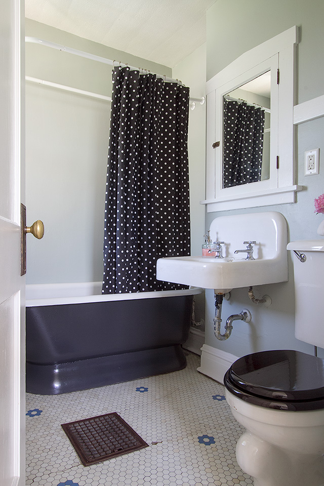
Our Vintage Bathroom
We should have done this years ago. Our house likely had both an unfinished attic and basement when it was…June 3, 2013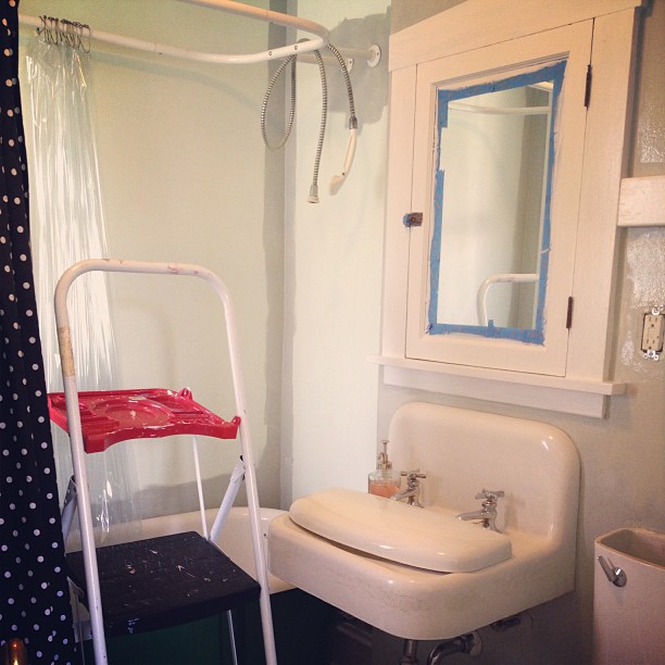
One Week to Listing
(We think.) The house is being photographed for its listing on Tuesday morning, and we should be on the market…May 30, 2013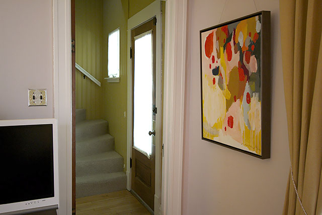
Wood Doors, White Trim
I left the doors unpainted in the front entryway. (Thanks for your feedback.) The door between the living room and…May 15, 2013
Testing Paint Colors for the Bedroom
The walls in our home (the ones that don’t have wallpaper, that is) were all painted creamy white before the house was put on the…
Eleanor Picks Paint Colors
August gets excited when we do something different to his room. “A new blanket? For me!? WOW!!!” He’s two though, and he is not the…
A New Video Series with Painting Tips
I’m so eager to get some paint on the walls of the new house. I’m fine with taking my time to make decorating decisions, to…
Our Vintage Bathroom
We should have done this years ago. Our house likely had both an unfinished attic and basement when it was built in 1910, so this…
One Week to Listing
(We think.) The house is being photographed for its listing on Tuesday morning, and we should be on the market June 6th or 7th. The…
Wood Doors, White Trim
I left the doors unpainted in the front entryway. (Thanks for your feedback.) The door between the living room and the stairway shows its age…