

My Pink Dining Room with the Red Ceiling
Oh hey, remember when I was going to make over my dining room because I was inspired by a moth?…December 16, 2020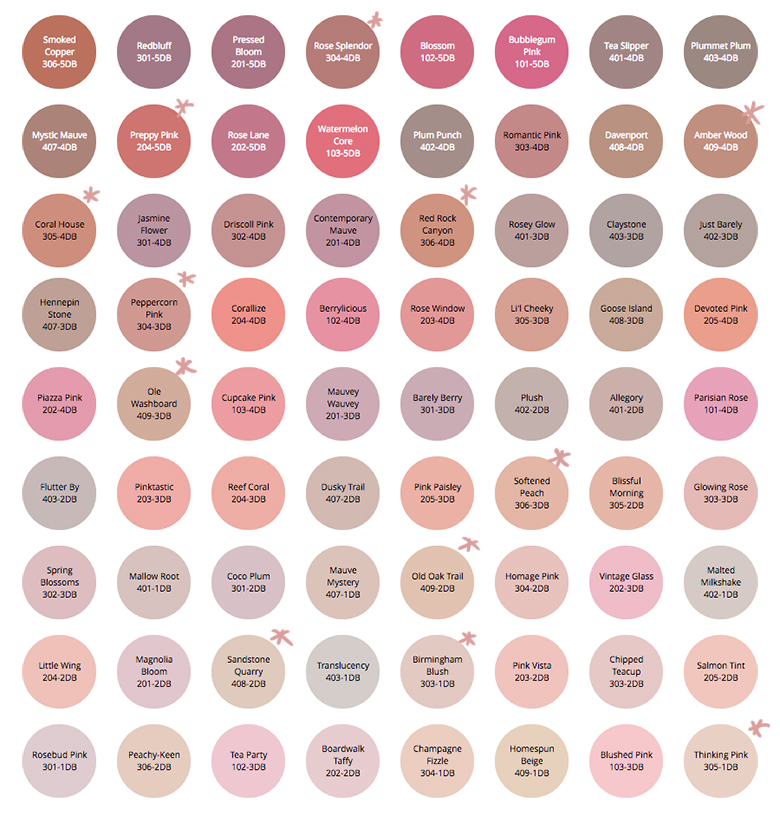
Planning Our Paint Color Palette with the Simply Yours Tool
This post is sponsored by Dutch Boy Paint. We took on several spaces for the latest round of the One…November 21, 2016
Pink in the Library
The day after I got back from my trip, I figured I may as well paint a room. Then I…July 7, 2014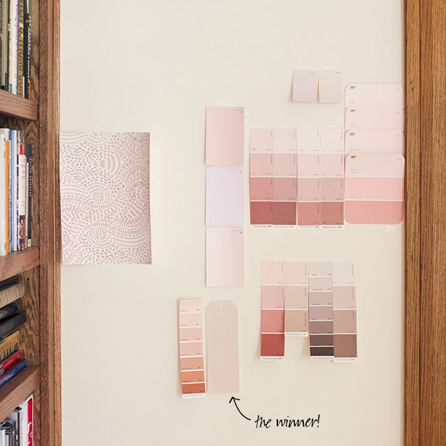
Would You Like a Sample?
I've been feeling a little better (finally, five months into this pregnancy), and so with increased energy and mobility comes…June 4, 2014
My Pink Dining Room with the Red Ceiling
Oh hey, remember when I was going to make over my dining room because I was inspired by a moth? I did it! I need…
Planning Our Paint Color Palette with the Simply Yours Tool
This post is sponsored by Dutch Boy Paint. We took on several spaces for the latest round of the One Room Challenge. The work spanned…
Pink in the Library
The day after I got back from my trip, I figured I may as well paint a room. Then I realized what a dummy I…
Would You Like a Sample?
I’ve been feeling a little better (finally, five months into this pregnancy), and so with increased energy and mobility comes more decorating gusto! I’ve been…