
These are my latest ideas…

The constants throughout all four designs are the ivory curtains (from Crate & Barrel, now discontinued), the lighting fixture (from west elm), the dining table and chairs (vintage, from Jubilee Furniture), and the wood trim and floors in our home. Also, I may edge the curtains with a coordinating solid to pick up on the other elements in each design.
Number One

This is the only one of the four designs that includes wallpaper. In fact, it’s one of the wallpapers I was originally considering, way back in January of last year. That’s a good sign, right? The berries in the wallpaper are raspberry colored, so I’d be able to play off of that a little. The chairs would be upholstered in some pink fabric with a subtle striped texture that I bought on ebay. The ceiling and the wall area above the picture rail would be Benjamin Moore’s “Wild Aster”, which is the same color that’s in the living room.
Number Two
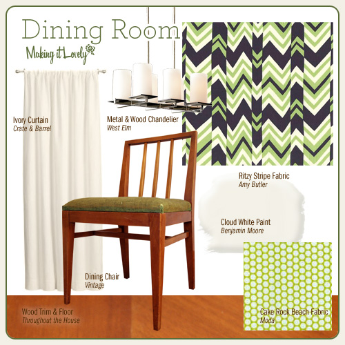
This one has the ritzy stripe fabric that some of you liked and some of you didn’t. That would be on the chairs, and Moda’s Cake Rock Beach (in Leaf Honeycomb) would line back of the hutch. The walls (and probably the ceiling too) would be a simple creamy white.
Number Three

If I go with number three, I’d probably repaint the kitchen. There would be too much yellow in the house otherwise! That’s not a deterrent though – I don’t mind painting at all. The OD Zig Zag Fabric would be used to cover the chair seats, and a patterned paper tablecloth from IKEA would go in the hutch.
Number Four

Both fabrics here are from Anna Maria Horner’s upcoming Drawing Room collection. The top one would be for the chairs and the bottom fabric would cover the back of the hutch. The main walls (up to the picture rail) would probably be creamy white, and the upper portion of the walls and the ceiling would be “Wild Aster” to tie in to the living room.
101 comments
Making it Lovely
Huh. The fabric that I ordered on ebay isn’t textured, it’s just a printed stripe pattern. It’s still pretty though! It actually might be better… the cats like to sleep on the chairs and a textured fabric would probably attract more cat hair.
My wallpaper is supposed to get here today. I want to make sure the fabric looks good with it so that I could start on the chairs!
Anna
#1 is a great choice! I can’t wait to see it!
jane
My order is 1,4,3,2. As always, they are all lovely! For some reason the green is coming across as “dowdy” to me—maybe it would be different in person. I love #1 and feel like you could even throw in the zig-zag rug that you love. Can’t wait to see the finished room!
amelia
they are all nice, but number 3 really wows me. its so warm and inviting!
Danielle
1 & 4 are both lovely!
Making it Lovely
Oh, and you guys overwhelmingly liked #1 too, which is reassuring. :)
Making it Lovely
OK, I’ve reached a decision.
And the winner is… #1!
I’ve loved that wallpaper for this long, so I don’t think I’ll grow tired of it very quickly. And I wanted wallpaper from the start, so I’m really pleased to have finally figured out which paper to use.
I’m so excited!
mel
#1
susan
number 1. number 1 all the way. i adore those birds and the pink color is wonderful.
Melenie
I love number 1.
Fiasco
I do like the birds in #1 but I’ve always felt that you need some red in a dining room. Maybe it stimulates the appetite!
So, #4 it is!
Making it Lovely
Steph322, I hope your living room turns out well! It’s a nice color.
Elena, I use Photoshop to edit everything and isolate the images.
Hmmm… now which one goes best with Murray? ;)
Leanbean
I like #1. The wallpaper is so fun
Chrissy
#1! That wallpaper is gorgeous!
steph322
I like them all, but #4 is my favorite.
I wanted to tell you that you’ve inspired me to paint my living room after seeing your new guest room. ‘Wheat bread’ it is!
you are super talented, keep up the good work!
Erin
Number one calls to me- I looked at it and immediately said, “Oooh!” I love the wallpaper and the pink is so fun. And I’m not even a pink person. In the end, though, the real question is, “Which one goes best with Murray?”
Elena
#4 because it’s nice and bright, but still sophisticated.
Then #3, b/c it’s still really pretty but not as bright.
I LOVE the mockups you posted! How were you able to isolate those images and put them together like that? It would really help me in designing my own house. I’d appreciate any info. Thanks!
phoenix
I love #1 – the wallpaper seals it for me!
Susan
Good luck making a choice. Those are some great combinations!
ann
I like them all but I love #1. I adore that wall paper. Also, this is a great blog. Today is my first visit and I’ll be back often. It’s an inspiration to see your work. :)
my little apartment
number one! there’s something to be said for finding a wallpaper that you have loved for a long time. that’s a hard thing to do– believe me, i know…
Michelle
ooooooooh I lurveeeeee no. 1 …….the birds are gorgeous……..I like the raspberry…..it connects with the beautiful fabric in your shelves….I like No. 4 too but No. 1 is GORGEOUS !!!!!!!!!!!!
Becka
I am loving the fabric of number 4, but all these looks are great. My second choice is number 1, that wallpaper is lovely. Good luck have fun. I always enjoy your website.
Jeanette
I vote for #1. I thought I’d go for the second one since I love green so much, but I fell for that wallpaper. I also think everything just goes so well together.
modernemama
Love that Mibo wallpaper in #1, that’s definitely my favorite mock-up. I’d by cautious with the BM Bronzed Beige in #3 – it needs a lot of natural light. I tried in my hall and it came out dingy.
Marina
#3 is my favorite!!!!
But #1 is very charming!!!
decor8 Holly
I can’t recall what your living room looks like, I just remember pink and red, right? I would go with #1 based on that, things will flow real nicely. And try something fun with those curtains, either a colorful tie back or lacquer your rods in red, or add a border to the bottom or sides like that Drew Barrymore office you liked and blogged recently. Have fun!!
Making it Lovely
You know, the point about number 4 and the Anthropologie chair in my living room is quite valid. I don’t know if they’d complement each other or clash.
I’m leaning heavily toward number 1. Before I had even moved in, I was considering that wallpaper!
Although… super amazingly sweet reader Carol is sending me two yards of the fabric in number 3, but in green. So I could do some sort of mix between designs 2 and 3.
Oh, and Darren – I bought a shipping crate because I need it to ship my furniture and booth items to the National Stationery Show in NYC.
melissa
My favorite is definitely number 4. You know what would be really great is if the Anna Maria Horner fabric (the top one) could be used as wallpaper.
Laura C.
I vote 1. Too much pink? No such thing.
maryja
Number 1 is my favorite – the wallpaper has so much character.
Number 4 is the runner up although I wouldn’t use the fabric you’ve chosen for the hutch. Like the other one you tried, it’s too busy and distracts from the items in the hutch you are trying to highlight.
Mary
I adore the birds in #1, but I’m voting for #4 because it looks like it would create a great dinner party atmosphere.
dangerdorge
#1 But I agree with an earlier comment that I would do the chairs in a red or deeper berry.
Amanda
(sigh) Option number 1 is so pretty it made my head go POP. I love wallpaper….
Chris
Maybe it’s the birds, but No.1 just sings to me. Love all, but it’s my top choice.
Jennifer
I vote #1… I’m a little late on the game, but it’s my favorite! I love the wallpaper.
Beth
I vote for Number 4! I like the idea of tying in the wild aster from your living room. Numbers 2 & 3 weren’t really colorful enough for me.
Sommer
I really really like number 1. It is colorful but subtle. I like the wallpaper print a lot (and I usually hate wallpaper in general) and it all seems like a room I’d want to eat in.
Marnie
Castig my vote for Number 1
After considering all of them, that is the one I can picture lingering over a long leisurely meal with friends and family, swirling red wine in big goblets and letting the conversation flow. It’s interesting without being overstimulating, and comforting without being boring. And the boids! Sweet and quirky.
My second favorite is #4 but I have to say, it seems so similar to a lot of other projects you’ve done that it is bordering on cliche…
Janelle
I love #4!
JayEssJay
What a wonderful way to compare the different decorating schemes! They look like they’re straight from a magazine. Personally I like #1 and #3 best. I think they’re the safest bets, even though I do love the colors in #2.
Darren
Hey Nicole, what are you buying a shipping container for..?
Darren
# 1 or 3, they are all great, I just dont like the green fabric…
Cheers
Darren
http://wwwdartheancomau.blogspot.com/
Julie
#2 is definitely my fave. At first I was worried it would be too much green for a dining room, but since the walls will be the creamy white color, I think it’s a nice balance. And I’m drawn to it because it’s “cooler” than the others – it seems like there are a lot of warm colors going on in the rest of the house, so #2 would provide a nice contrast.
Peachy Keen
While I am a huge fan of both red and green (these are the 2 predominant colours in our house!), and yellow is fab (love your kitchen by the way!) the pink really does it for me here! It just gives the room a real ‘pow’, and is totally rocking my world!
Sherry
Love those idea boards- you never cease to amaze me. Number one had me at hello.
xo,
Sherry
http://www.thisyounghouse.com
Alya
Hi.. I just visited your blog over from Apartment Therapy. I must say it is soo inspiring. And true to ur name, you are making things lovely!
KC
#2
janet
I love them all! My first instinct is 1, 3, 4, 2. But I even like 2! You really can’t go wrong.
sr
1.
AshleyM
I love love love number four! It is beautiful! I was initially concerned, like others, about the clash with Anthropologie chair, but I think it might tie the two rooms together.
Whatever you choose, I am sure will be ‘lovely.’
April
I love number 1.
Nicole RJ
#4 isn’t getting much love, but I love it!It isn’t as mod and geo-focused as the others, but I love the Indian-vibe it has. Both bsy patterns, but they’d be in small amounts and far enough from each other not to compete.
I also really like #1, those birds are so sweet, and the fabric looks very lush – I love textured fabric, anything that makes me want to touch it is great! :D
pve design
numero uno
Jen
#2 – absolutely! The gorgeous sage-y greens will go so beautifully with the rest of the house and be noticeably different from everything else. LOVE!
K T G
I like all of these as combos. It’s hard to picture without the mock-ups, and other details like other rooms you can see from it, and pets, and whatever rug you put in. If we’re going by hutch fabric, the green one and the gold one don’t seem like good choices because they show too much white in themselves. If almost everything in your hutch is white, the shapes won’t stand out well against the white areas of the background. The #4 is, for all its boldness, essentially a solid in that capacity. It is pretty in its own right, but won’t compete with the white items. I think the first one is nicest overall, but I like all the color ways actually, hutch fabric and all, if you found another way to use them in the dining room instead.
Erica Burns
I truly love number 4! The red will be a nice splash of color & not overwhelming, I think, since it is only going to cover the chairs & back of the hutch. I think it will fit nicely with your home without being too much like anything else in your home. I like #1 2nd best.
My vote is #4!
1 is my second choice.
Ann Marie
No. 4 is my favorite, and red in the dining room is spot on. But, I also really like No. 1.
jjzach
I have to go with number 2. I think the Cake Rock beach fabric swayed me.
Paul
Choice 4 is absolutely the best. That fabric you’re looking for in 3 reminds me a lot of this duvet from Pottery Barn:
http://www.potterybarn.com/products/p10986/index.cfm?pkey=cbabdvtptn
I don’t know if that helps any(?) Just remember, my vote is for 4.
Tiffany
I like #1, but I’d do the chairs in red rather than pink …
iloveupstate
I like #3 the best.
Sabrina
Have you considered the other color version of the clacket lane? I like elements of both 1 and 2, and if you might be able to combine the quirky birds with that nifty stripe if you went with the other color of the clacket lane. You could always add a table runner with the bright green, and then change it out with the seasons.
Three is too mustard, and I fear it will look dated in under a year and make your food appear unappetizing.
Four doesn’t seem “dining room” to me. I think it would be great in a reading room, though I’d never talk my housemate into it.
Hayley
My personal preferance is #4, but that’s for my style. I think #1 is best suited for your home. However, with that being said have you ever heard that birds in the house are bad luck? My Nana (Grandma in Aussie English) always said that, so if a calendar had just 1 bird in it she would have to throw it out.
Amy
I think I like 4 the best, or maybe 3. The pink fabric in 1 doesn’t do the wallpaper justice and I don’t care for the zig zag fabric in 2 for a dining room.
trixxie
I really like bits and pieces of each, but I love 4…if it were me, I might reverse the fabrics, put the smaller print on the chair and the larger in the hutch.
I think the birds in 1 will get old quick, the zig zag fabric in 2 doesn’t really scream dining room to me…3 is my second favorite.
lsaspacey
I think I have to defer my opinion until I see the mock-ups, if you do them.
Because I know the yellow fabric will be very hard to find, I guess 1 or 4, but neither really thrills me (sorry).
kerflop
I LOVE #1!
puglyfeet
1 or 3 is my vote
Lauren
i love them all, but i mostly love #3. #4 is my second choice.
whitney
I like them all, but I think I’m kind of in love with #1.
dana welsh
you are so absurdly talented. it seems somewhat unfair that you get all of those talents wrapped up in a lovely self… but thank you for sharing it all.
(and i am no help with decisions – i like them all)
Elise
I’m for #1 all the way. I adore that wallpaper, and also the paint colour. Plus, you already have the chair fabric. Number 3 is my LEAST favourite. It’s too much yellow with very little other colour.
Allison
My favourites are #1 and #4. I find that ziggy green fabric very unsoothing because of all the jagged lines. I love the colour combination of the pink with the grey bird wallpaper. I’m not sure how big an area I’d personally want of such wallpaper, but on a “mood board” it sure looks great.
jade & co.
Oops, I mean all 4 schemes are nicely done.
jade & co.
I vote for #1, although all of 3 schemes are nicely done!
mary.c
They’re all lovely! My order is 2, 3, 4 and 1.
Hilary
I really like 4. Just to throw some more wallpapers into the mix that are really pretty:
http://www.wallcollection.com/gallery/item/14
http://www.wallcollection.com/gallery/item/13
http://www.bobbyberkhome.com/show_product/10031/?utm_source=froogle&utm_medium=datafeed&utm_term=10031
sabrina
Love 1,3 and 4. I think you’re heading in the right direction. It’s more focused now.
Carol
I normally don’t like wallpaper, but I love the one you found! #1 is my favorite, followed by #3–it seems warm and cozy, yet decidedly funky.
sarah
4… or 1, but I like 4 better!
Kylie
I adore the wallpaper in #1, so that gets my vote, along with the fact I really like the pink. Otherwise, I really like #4, the #2 and #3 aren’t doing it for me today…. but it is early!
Caitlin
#3 although I’d hate to see you repaint your kitchen because I’m a HUGE fan of the way it is now!
I’m not a fan of wallpaper so #1 is out. I’m not a fan of the fabric in #2 and the fabrics in #4 compete too much.
Making it Lovely
Actually, no mockups yet! :)
Yeah, the Ruppel painting would have to go in another room.
Esther
I’d go for #3!
Jules
No. 1 seems most like you, and I think you won’t be satisfied until you wallpaper that dining room–which was your original plan a year ago. :)
I presume you already did a wallpaper mock up?
My only concern is the wallpaper taking away from your Amy Ruppel. Would you move the artwork out to another room?
Emily
I would like to preface this by saying that I generally don’t like pink but I am very drawn to #1. Nothing in the other three seems to pull me in.
Other comments seem to think it’s too much pink which you might be able to remedy by changing your choice of paint color a bit. Perhaps to something like the background of the wallpaper.
But either way I’m pro-#1 for sure.
Elissa
I like number 4 the best!
#1 feels like it would be too pink (and I love pink!)… I’m not sure how well that would work in a dining room.
#2 has the ritzy stripe. :/
#3 is too matchy-matchy, everything is in the warm golden tone.
#4 has just the right amount of color, contrast, and clarity. And it still has a bit of pink. :)
Tara
I’m voting #1 b/c the birds rock so hard. Or #4.
Actually, #2 is my most favorite, but green and blue might not be the most appetizing for a dining room. And my grandmother always said never to do a room yellow because you’ll get tired of it. I have no idea if it’s true or not, but it’s ingrained in me!
nikkirose
The birds in #1 are so whimsical and I was drawn to it, but is that too much pink? Stupid question? I thought that I was struggling with the black in #2 but #1 also has black so that’s not it. Maybe those zig zags are just too much with the lines of the dinning set. #4 is fun but I feel like it would compete with your beloved Anthropologie chair in the living room and we can’t have that!
I think I like #3 because it reminds me of your website! YES, that’s it!
AB
#2 for sure!
carolyn
#1
Sarah
ONE!!!!!!
Kate
I really like number three because I just love that mustardy yellow right now. But I love your kitchen the way it is, so I’m voting for number two.
jamie
i’m voting 4. yes. 4
Making it Lovely
Ack! The fabric in number 3 is unavailable!
If anyone knows where I can get some, please let me know. I’d like to have it, even if I don’t use it in the dining room.
Stacy
I like #2.
Melissa M.
I have to vote for #2. That ritzy stripe fabric speaks to me!
Lili
I really love the Anna Maria Horner fabric, but I vote for #1.
Liz
I really like #1 and #2. After going back and forth, I vote for #1. It’s just so…lovely.
Comments are closed.