
I started painting the dark blue walls in Eleanor’s room last night. I’m writing this as I wait for the second coat to dry, and soon I’ll head back up for a third.
The color (Sherwin-Williams Loyal Blue) goes on like Chagall’s America Windows, but it will be darker and more navy after a good 3-4 coats. The ceilings in yesterday’s mockups were all the same color as the walls, but that’s not the plan for the room. I’m trying to decide between aqua and pink, and I will eventually use metallic paint to stencil the ceiling with a star pattern, similar to Osborne & Little’s Coronata Star Wallpaper.
Aqua, I think? The pattern in the mockup is a placeholder — pretend there are stars there. And I “painted” the side table. (Oh, Photoshop. You make it all so easy!)
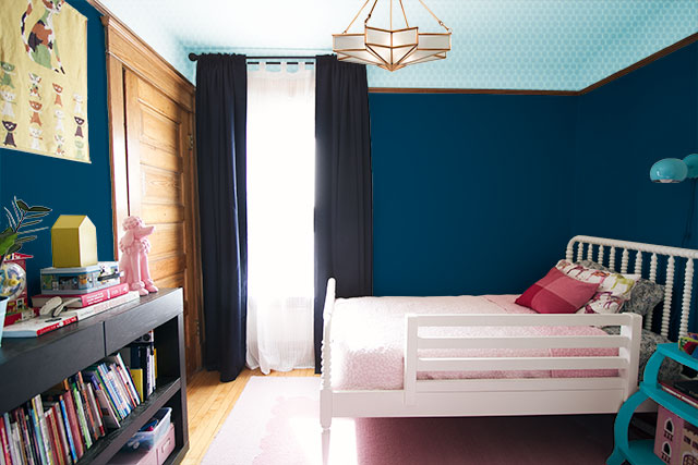
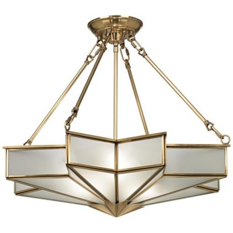
The room needs a big, brassy light fixture. When pinned this one to my lighting board months ago, I liked it but didn’t have any use for it. Now it would be perfect in E’s room, but I’ve waited too long and it has been discontinued. If someone out there knows where I can get one, please let me know.
To complicate things, here’s the other option. A pink ceiling looks awesome with the pink rug and bedding. With a hot pink nightstand instead of turquoise? I’d be out for the pom pom trim, but the sconce is returnable and might be another good opportunity for more brass.
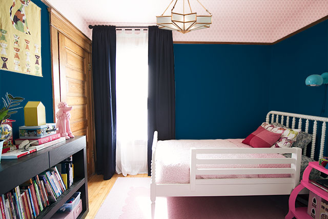
I’m not sure I’m loving that sconce anyway. It’s a candidate for spray paint, but its ultimate fate will hinge on what ceiling light I find for the room.


kara
October 10, 2013 at 2:09 pmwonder how a white ceiling with blue stars would look…
coulter
October 10, 2013 at 2:11 pmaqua!
Melissa
October 10, 2013 at 2:24 pmI agree, aqua!
Laura
October 10, 2013 at 7:02 pmAqua here, too! It’s looking great!
Caitlin@Our Natural Heritage
October 10, 2013 at 2:14 pmI knew you’d be able to make those walls look great! I love the aqua ceiling, but the pink is very nice too :)
Jennifer
October 10, 2013 at 2:14 pmI think the light grey that the wallpaper comes in (W5733-03) would be better than pink or aqua. Definitely not pink.
Melissa
October 10, 2013 at 2:15 pmPink ceiling! I really like how that ties the bedding and rug in with the rest of the room and helps brighten it up a bit as well.
Mariana
October 10, 2013 at 2:18 pmThe pink ceiling looks absolutely lovely! I like it a lot better, actually, to me it’s visually more appealing.
Nicole S.
October 10, 2013 at 2:20 pmAQUA!!!!!
Laura at RatherSquare.com
October 10, 2013 at 2:22 pmI would vote for the aqua. It seems to provide a nice transition between the navy walls and the pink bedding. And I lurve the starry ceiling idea and the lamp! Hope you can still find it somewhere.
Kayla aka Kilo Bravo
October 10, 2013 at 2:23 pmTeam Aqua! Love that light – I really hope you are able to find it somewhere!!
Natasha Lord
October 10, 2013 at 2:26 pmPink. I think the curtains need to be patterned also.
Sarah
October 10, 2013 at 2:27 pmI like the aqua. Aren’t you kind of done with the pink after her last room? I’m confident that you can figure out how to make the rug, bedspread and other pink elements work in a blue toned room even without that ceiling tie in.
Christina
October 10, 2013 at 2:29 pmLove that pink with the dark blue (can’t read those words anymore without hearing E’s “dark blue!!!”). The pink seems to tie in the woodwork to the scheme of the room, while the aqua contrasts it in such away that the color of the wood and the aqua compete instead of compliment each other.
agnes lulu mae miles
October 10, 2013 at 2:31 pmthe aqua!!!!!! love it!
me
October 10, 2013 at 2:31 pmPink! The blue/aqua seems too Ikea’s boy room:/ The pink tempers all the other darker tones…just my 2 centados:)
Chernee's House
October 10, 2013 at 2:34 pmI just love the pink ceiling – to me it just makes the room look brighter and really sits off the bedding as well. I would leave the aqua lamp because a hint of a load color like that just adds to the texture of the room and your vintage style. Really looking forward to how the room develops and BTW love the stenciling idea on the ceiling. I wish I could paint the ceiling in our house!! :)
Best
Chernee
tamara
October 10, 2013 at 2:38 pmso exciting! i vote AQUA, but as others have said, i wonder if a light gray ceiling with aqua stars might not be a winning choice! but whatever you do will be awesome; such a great room in the making! i still like the pom-pom trim, and as you hinted at, the eyeball sconce just doesn’t seem to fit in this space; maybe it’s too small??? that star ceilling fixture is ahhhhmazing. Ebay?!?!?
Lindy
October 10, 2013 at 2:41 pmPink – I like the warmth it brings and how it ties to the floor. I think you could still keep the aqua accents (side table, trim, lamp), since they would all tie to eachother.
SFDC
October 10, 2013 at 2:43 pmI’m on the fence in terms of pink or aqua, but I vote to leave the side table white and paint the bookshelf a fun color instead!
Sandra
October 10, 2013 at 2:45 pmTeam Aqua! I thinks stars belong on a blue background. Also I think having the paint a similar color lets you accessories in different ways down the road easier without having to repaint.
I think some stars or glittery type dots on the curtains would be adorable. I love the light too. Hope you can find it. I do like the idea of a brass light, if you go pink, but the aqua one looks fine (fine as in it’s a kids room and it looks kid-ish, which is perfect). A brass light might be too grown up for your little girl.
Stephanie
October 10, 2013 at 2:46 pmWithout a doubt, Team Pink!
mandy s.
October 10, 2013 at 2:46 pmI love the PINK! It ties the room together and brings a more whimsical, feminine quality to the room. I am not loving the navy curtains and agree that something with a pattern would liven things up. Maybe the pom trim or a ribbon detail or something to bring some lightness to the curtains will help! Can’t wait to see it finished!
Teresa
October 10, 2013 at 2:55 pmAqua, I like the way it compliments the wood tones in the room better than the pink ceiling. how bout a bright pink light fixture on the aqua ceiling? It’d be a fun pop of girly, and help tie in existing pink elements? :)
Mary
October 10, 2013 at 2:58 pmYou’ve made it seem like E reallyyyy loves blue and would love an all blue room. So it makes sense to go with blue. But I do love the pink mock-up.
Monica
October 10, 2013 at 3:00 pmMy vote is for an aqua ceiling and for patterned curtains, too.
Ceci Bean
October 10, 2013 at 3:06 pmI’m surprised that I like the pink better, but I do. I agree with others who have said the curtains should change. And you always pick such lovely patterns, I’d love to see what you’d choose.
• Ginylle •
October 10, 2013 at 3:11 pmI do prefer aqua, no doubt !
Christina
October 10, 2013 at 3:13 pmLove the pink, it brings nice warmth to the room and really compliments the big beautiful wood door.
Boni B
October 10, 2013 at 3:16 pmPink!!! I agree that the curtains need to go patterned and lighter.
Ali
October 10, 2013 at 3:22 pmI vote for aqua. That way, it won’t seem like you’re going overboard when you use pink accessories, and it provides the rationale for a second accent color (like the sconce). Plus, I enjoy seeing little girls’ rooms that show that not everything needs to be super girly (maybe that’s just the inner tomboy and feminist in me talking).
Shelby
October 10, 2013 at 3:28 pmI think the pink ties it all together nicely! The aqua seems a little mismatched?
Dulcie
October 10, 2013 at 3:34 pmLight pink would be great. I fail to see the allure of the light though. It looks like a dated fixture that I would want to rip out immediately after moving into a house.
Karen Lee
October 10, 2013 at 3:50 pmI love the pink! and the light… It goes with the house and room perfectly.
Jane
October 10, 2013 at 3:57 pmLove the aqua and the pink but that bed sheet you posted has the prettiest lavender in it! That would be so charming with the blue.
ryan
October 10, 2013 at 3:57 pmi love the contrast of the pink ceiling against the navy walls AND how it ties into her existing bedding (i’m all for using what’cha got). i love the ceiling light as well. maybe you could find a brassy swing arm lamp to replace the one you bought OR spray paint the one you have to look a bit more brassy? what about painting the curtains to lighten them up a bit? maybe with stripes? hell, i don’t know…just throwing out ideas. :) i’m sure whatever you come up with will be fab per usual.
Jane
October 10, 2013 at 4:02 pmIf you cannot find an exact match here are two ideas to keep with the star theme. The first link is a medallion the second is one of those glass 3D star lights (might not work in a Victorian). Love everything and thank you for being so interactive with your blog fans!!
Medallion:
http://www.rubylane.com/item/586567-RL-000802/Antique-19th-century-Gilt-Brass
Star Light:
http://www.poshtots.com/lighting/lighting-by-style/pendants/star-clear-glass-pendant-in-brass/14/3506/3392/29678/poshproductdetail.aspx
Little Gray Pixel
October 10, 2013 at 4:11 pmLove the aqua! I actually want to do that in my room now.
Carrie T
October 10, 2013 at 4:11 pmPink is my vote! And I’d actually keep with the aqua for the side table!
Leigh
October 10, 2013 at 4:26 pmI would do aqua for me. But my daughter would choose pink.
Check out Honey&Fritz DIY of that wallpaper with less work than a stencil,
Lauren
October 10, 2013 at 4:43 pmDefinitely aqua! The idea of the gold stars on the aqua ceiling just seems magical and reminds me of a few churches I’ve been to in Italy. Some of the old paint had copper in it, and what started out as blue, turned to the most incredible turquoise color as it oxidized. The way the ornate gold and painted decorations stood out against the ceiling was just incredible. I like the pink in the small doses in the rug and bedding.
Laurel
October 10, 2013 at 5:03 pmReading through all the replies, I feel like I’m at the polls hoping my candidate gets more votes! I think the matching floor and ceiling compress the room in the pictures, so my vote is for aqua. Plus, the aqua made those lovely pink accents pop so much more. Can’t wait to see what you decide on.
Laurie
October 10, 2013 at 5:29 pmWell, both look cute but I think I like the aqua better. I’m sure there are some pink and aqua pieces out there somewhere that will help tie it all together but the pink is still cute in the aqua/blue room.
nicole
October 10, 2013 at 5:39 pmBoth colors are nice, but my vote goes to PINK!
Ms. Mitten
October 10, 2013 at 5:45 pmPINK!!
Alex
October 10, 2013 at 6:14 pmAqua!
They’re not the same, but these light options might do the trick:
https://www.luluandgeorgia.com/belvedere-hanging-lamp-large
http://www.circalighting.com/details.aspx?pid=4039
http://www.lightinguniverse.com/flush-mount-ceiling-lights/savoy-house-6-4384-13-178-midtown-vogue-hagen-2-light-flush-mount-ceiling-light_g1066307.html?isku=8204041&linkloc=cataLogProductItemsImage
emily
October 10, 2013 at 6:41 pmboth look fantastic! I love the aqua…seems like the perfect color as a background for gold stars. but, i love the way the pink ties everything together. does your sweet girl have an opinion? she seems to have quite the design opinions…so cute!
Jane
October 10, 2013 at 6:41 pmI think white might offer more versatility than either the pink or aqua.
And in my decorating fantasy, you’d go totally abigail aherne (http://www.pinterest.com/MiddletonDesign/abigail-ahern-style/)
and get a chandelier a la http://www.pbteen.com/products/tear-drop-chandelier/?cm_src=PIPRecentView, and accent with yellow and magenta.
Gloria
October 10, 2013 at 7:22 pmWow! Everyone is so opinionated and clearly not on the fence about which color they like more. Here’s another vote for the PINK! Based on the rendering, it really opens the space up.
lynn
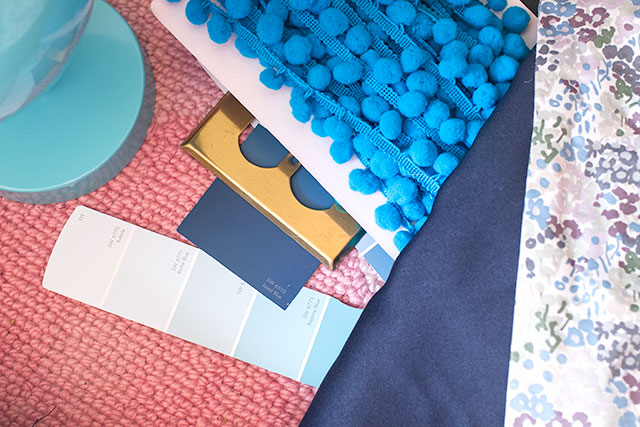
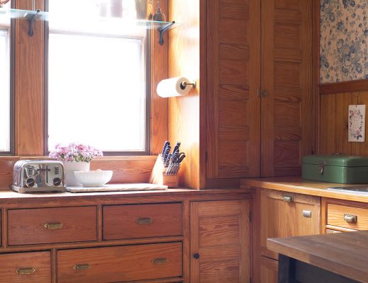
October 10, 2013 at 7:28 pmI may have missed it, but what is the textile on the very right of the first picture on the top? The multi-colored flowered fabric? I am looking for something for my own daughter’s room that ties all those colors together in the same tone and scale.
Can’t wait to see how E’s room will turn out!
robin
October 10, 2013 at 7:29 pmPink, pink! What’s wrong with pink? Think pink, I say and I also vote for patterned curtains. I think the navy weighs the room down.
Kristina
October 10, 2013 at 7:44 pmI vote aqua!!
erica
October 10, 2013 at 7:50 pmAqua! And lighter, patterned curtains to contrast the dark walls!
Celia
October 10, 2013 at 8:14 pmPink and brass sconce. Love the ceiling fixture, hope you’re able to find it.
Emily
October 10, 2013 at 8:17 pmPink hands down!
Laura
October 10, 2013 at 8:23 pmI like the pink too!! I am thinking about wallpaper or stencil on my dining room. Do you have any amount of texture up there? Her room is shaping up so cute! Can’t wait to see the final! LOVE that light
Laura
House Envy
Lara
October 10, 2013 at 9:37 pmAqua all the way! I’m a little obsessed with tone on tone colors right now, but this really does look much more sophisticated and less likely to be something she’s sick of in a year. Plus, if she changes her mind about the walls, the ceiling will still look great with aqua and stars no matter what the wall color is. I’m loving that pom pom trim in your first picture, and am excited to see what its fate will be. I agree the curtains should be lighter, maybe a pattern that will complement the stars? And what wall art will you put up? Framed Eleanor art? Or something whimsical or modern?
trixxie
October 10, 2013 at 9:44 pmI’m actually not feeling either the pink or or aqua with the the wood trim. My thoughts:
1. I say paint the ceiling the same color as the wall and do the stars.
2. Big brassy light fixture and sconce…current sconce is cute but too small.
3. Sorry but those drapes are a design killer and aren’t working w/ any of your options. White drapes w/ pom pom trim (same color that you use on the bookcase)
4. Spray the curtain rod w/ brass paint and lower it.
5. Leave the night table white and paint the bookcase either hot pink or turquoise (I think I’m leaning toward turquoise to offset the rest of the pink in the room).
Amanda
October 11, 2013 at 1:06 pmAnd this is basically what I was going to say. Though I do LOVE the pink ceiling. But I don’t think the end table should be the same; perhaps white or something light. The curtains are a no go in all scenarios; do a light curtain with pom poms as trixxie said.
Alyssa
October 10, 2013 at 10:14 pmPink FOR SURE!!! It keeps it girly and feminine and that side table looks amazing pink too:) you’re right about the sconce, it sort of looks out of place, brass would work much better:) just my opinion though!
Sara S
October 10, 2013 at 11:24 pmPINK!!! And I love the ceiling fixture, but I’d love it even more if the brass was painted a bright glossy fuchsia!
Susan
October 10, 2013 at 11:52 pmI vote pink for the ceiling, a brass sconce, the side table in either a pink or turquoise (ask Eleanor!) and that pretty Pom Pom trim in there somewhere, for sure.
Katie M
October 11, 2013 at 12:42 amWhat about this fixture?
http://www.alibaba.com/product-tp/111488975/Moroccan_Star_Flush_Mount_Ceiling_Light/showimage.html
Also I am feeling the aqua all the way, it really lets the white bed, pink bedding pop.
Laura
October 11, 2013 at 2:00 amHi,
I like the aqua. Here is a link to the light: http://www.houzz.com/photos/1391274/Traditional-Glass-Star-24-3-4-quot–Wide-Antique-Brass-Pendant-Light-traditional-pendant-lighting-
Antonella
October 11, 2013 at 3:39 amI vote for PINK. Feminine and fun. And brass lamps for sure! :-)
Kristin
October 11, 2013 at 7:03 amI vote aqua. The pink in the ceiling and bedding seems to break up the room too much & make a navy sandwich. The aqua seems much more sophisticated…though maybe you don’t want to encourage that this early!
Amelia
October 11, 2013 at 7:59 amAqua! Not loving same color on the bedding and ceiling (Kristin’s sandwich comment above is right on.)
Sarah @ 702 Park Project
October 11, 2013 at 8:05 amI think the pink would make it just girly enough, without being tooooo girly! And I still think some aqua accents would look good with the pink ceiling. Good luck deciding!
Jessica @ Sunday Loves
October 11, 2013 at 8:29 amLove the aqua. While the pink looks nice, I agree about the sandwich problem. I don’t love the sconce either. I think you need something else.
Also, I somewhat agree with Trixxie. The drapes aren’t doing the job. They’re very Pottery Barn boys room look to me. Incidentally, I’d love them in my boys’ room! LOL
I actually think a tailored roman shade with some airy white drapes with pom pom trim would be much better suited for the room.
And yes, as much as I’m not a fan of brass, I think a brass rod will work better with the fixture you’re thinking about! And it’ll work well with the wood!
Jen K
October 11, 2013 at 8:34 amI vote pink. To me it seems more you but maybe it’s supposed to to more Eleanor in which case she should choose!
Shannon @ Fabulously Vintage
October 11, 2013 at 8:38 amPINK!!!!!! :)
Heather
October 11, 2013 at 8:52 amAqua! Love the light fixture too. I would think about different drapes – they look heavy and seem to drag the room down.
stephieZ
October 11, 2013 at 8:59 amI say aqua…and the curtains need to be changed out. They look too heavy.
Emily
October 11, 2013 at 9:06 amSeriously, you can’t go wrong. Both adorable. Use both! I agree to change out the curtains. A fun pattern with pink in it and make the ceilings and accent turquoise, pink rug. Just my thoughts. It’ll be great.
http://www.ikea.com/us/en/catalog/products/10217278/
or
https://www.fabric.com/buy/0306526/michael-miller-technicolor-tile-luna-pink-blue
Emma
October 11, 2013 at 9:59 amBoth ceiling colors are so cute!
I’m curious why you are using both dark blue curtains and a dark blue wall color. I wonder if a curtain in a contrasting color (white, pink, turquoise) would pop from the walls more and make the room less dark?
merlin513
October 11, 2013 at 10:20 amMy vote is for aqua, what does Eleanor think?
Aryn
October 11, 2013 at 11:05 amWhat about gold ceiling, pink stars?
Heather
October 11, 2013 at 11:07 ampink ceiling 100%. But keep the aqua pom trim and sconce!
Natalie
October 11, 2013 at 11:47 amI was leaning toward pink, but I think I actually prefer the aqua. It’s the pink duvet that’s throwing me. I think the pink ceiling makes the duvet work in the room, but overall I prefer the aqua ceiling. Maybe with a white duvet? (Same pillows, though, because they are all awesome!)
Dee in BC
October 11, 2013 at 12:31 pmGo Pink!
Rachel H.
October 11, 2013 at 1:23 pmDefinitely pink! I’m not even a big fan of pink, but I think it looks best with the dark blue walls.
Ashley
October 11, 2013 at 1:24 pmI say Pink!
Tiffany
October 11, 2013 at 1:52 pmI liked the aqua until I saw the pink ceiling with the pink rug combo. LURVE!
So I say pink!
Holly
October 11, 2013 at 3:26 pmI actually really love the aqua! It opens up the space more than the pink does.
Leng
October 11, 2013 at 3:58 pmOh my heck – YES to the pink! Looks amazing :)
Amanda
October 11, 2013 at 7:38 pmI vote pink. I think it’ll balance out the dark blue, make it a little more girly, and will look great with the bedding.
I agree with the previous comments about the curtains – it doesn’t seem to work with either scenario.
Erin
October 11, 2013 at 8:42 pmThat’s funny, I just saw this post about bras light fixtures on this site: http://howaboutorange.blogspot.com/2013/09/a-light-fixture-for-parlor.html?m=1 pinkhelps warm up the room a little I think.
Catherine
October 11, 2013 at 10:04 pmHa! Can you post a final vote count? I like the pink for contrast, and it balances out with the lighter floor. I have navy blackout curtains in my older son’s room (he’s a terrible sleeper so I’ll try anything), and we got them from Amazon. They have other colors, too: http://www.amazon.com/Thermal-Insulated-Blackout-Curtain-Set-PINK/dp/B001A60SXW/ref=sr_1_1?s=home-garden&ie=UTF8&qid=1381546951&sr=1-1&keywords=blackout+curtains+kids
HDog
October 11, 2013 at 10:39 pmNicole, dude, go with the aqua or the gold like someone else suggested. You don’t want a pink ceiling and pink rug. And the rug is great and (already bought?) so….
Sandy
October 12, 2013 at 9:20 amI love the contrast of the pink with the blue walls!
Elizabeth
October 12, 2013 at 12:02 pmI think your vote is split about 50/50, which should tell you that you can’t go too far wrong either choice!
But my two cents is this: I don’t like the aqua ceiling with the pink bedding/rug. If you’re planning to switch up the soft furnishings, you can find something that plays well with a soft aqua. And I’m going to add another vote for changing the curtains. I recall that there were practical reasons for choosing them, but surely you can find another solution (a roller shade with paler curtains?).
Alicen
October 12, 2013 at 3:55 pmI like the blue ceiling and accent table, and think that bringing some aqua onto the bed in a pillow or throw would help make the pink bedspread not seem so out of place. The aqua seems to work better with the chartreuse accents you have around the room. I have to agree with some of the people above about the curtains and the sconce. I think it is the shape of the sconce, not its color, that is throwing me. And, usually I’m all about hanging the curtains high, but it seems to throw an odd line in with the picture rail. I like the idea of a roman shade, perhaps in an awesome patterned fabric with pink, blue, aqua, and maybe even some chartreuse and/or red.
Haley J.
October 12, 2013 at 10:19 pmPink ceiling all the way. The aqua looks too much like an aquarium. I like that the pink warms up the blue and also adds a touch of femininity without screaming “GIRLY!” Definitely go with a brass sconce in that situation. Brass is a glorious accent for navy.
Kris
October 12, 2013 at 11:25 pmPink on the ceiling, but aqua on the table.
stefani
October 13, 2013 at 4:32 amNot pink because Eleanor says “yuck” on pink. What about white ceiling with gold stars with white curtains with pom poms. Or high gloss or metallic ceilings which I just saw featured.. Aqua if we must but the curtains really don’t work in any scenario. Keep furniture white at least until everything is settled.. The lighting options don’t seem to work together but love the brass light hope you find it. The cat photo needs to find a new home as the yellow/green is really throwing me off. Switch out rug . Clouds, night sky, stars, cozy
mia
October 13, 2013 at 3:24 pmI’ve been following you for years so I trust your eye. But I am throughly confused with this room. Curious to see how this turns out!
caitlin
October 14, 2013 at 1:47 ampiiiiink. its way more sophisticated.
Michelle
October 15, 2013 at 9:44 amHave you checked out Shades of Light? These have a similar feel to the fixture you picked out, though they are smaller:
http://www.shadesoflight.com/moravian-star-ceiling-light.html
http://www.shadesoflight.com/clear-glass_prism_pentagon-ceiling-light.html
Sumati
October 15, 2013 at 12:55 pmJust saw this fixture and thought of you! http://www.ballarddesigns.com/bd/245459?SourceCode=PRICEGR&cm_mmc=mer-_-cse-_-pricegrabber-_-prod-feed&mr:referralID=d74ff051-35c2-11e3-bae4-001b2166c2c0&redirect=y
Dark Blue in Eleanor’s Room | Making it Lovely
October 16, 2013 at 12:36 pm[…] as I imagined they would, softening up the room without drawing too much attention to themselves. A lot of comments were calling for patterned curtains, but there is already pattern on the bed, there will be stars on the ceiling, art on the walls, […]
Andrea
October 17, 2013 at 9:31 amI just saw this light fixture on a blog today and thought of you. It’s not a pendant but it is star shaped and brass: http://www.circalighting.com/details.aspx?pid=2745
Betsy Johnson
October 21, 2013 at 9:23 amabsolutely AQUA. overall, a smarter color palette. And goes nicely with the pink. Going wit only pink and navy is too simple, too amateur.
brooke
November 3, 2013 at 4:55 pmI saw this light at Ballard designs too! Have a great week!
Brooke