

An Everyday
August seems so much like a toddler now, and Eleanor, a child. I love them so much, but moreover, I…April 12, 2012
Bird’s Nest Fern
I'd always wanted one of these ceramic planters, so when they popped up for sale on Fab.com awhile back, I…April 11, 2012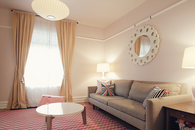
All the Trimmings
The living room's trim is now white. Our house feels lighter, and all is right. Oh, wait… now the need…March 13, 2012
Living Room Trim Progress
I spent yesterday filling nail holes with wood putty, sanding, caulking gaps, washing, taping off the floor, priming, and painting.…February 20, 2012
Painting the Trim in the Living Room
I've been meaning to get around to painting the trim in the living room for quite some time now. It…February 13, 2012
The New Side Table
Yes, yes, yes. The new table looks awesome. I got mine for a song (15% off, plus some store credit),…January 4, 2012
An Everyday
August seems so much like a toddler now, and Eleanor, a child. I love them so much, but moreover, I really like them. I took…
Bird’s Nest Fern
I’d always wanted one of these ceramic planters, so when they popped up for sale on Fab.com awhile back, I bought a small black one.…
All the Trimmings
The living room’s trim is now white. Our house feels lighter, and all is right. Oh, wait… now the need to paint the dining room…
Living Room Trim Progress
I spent yesterday filling nail holes with wood putty, sanding, caulking gaps, washing, taping off the floor, priming, and painting. I have one more coat…
Painting the Trim in the Living Room
I’ve been meaning to get around to painting the trim in the living room for quite some time now. It was on my 30 Before…
The New Side Table
Yes, yes, yes. The new table looks awesome. I got mine for a song (15% off, plus some store credit), but a couple of people…