
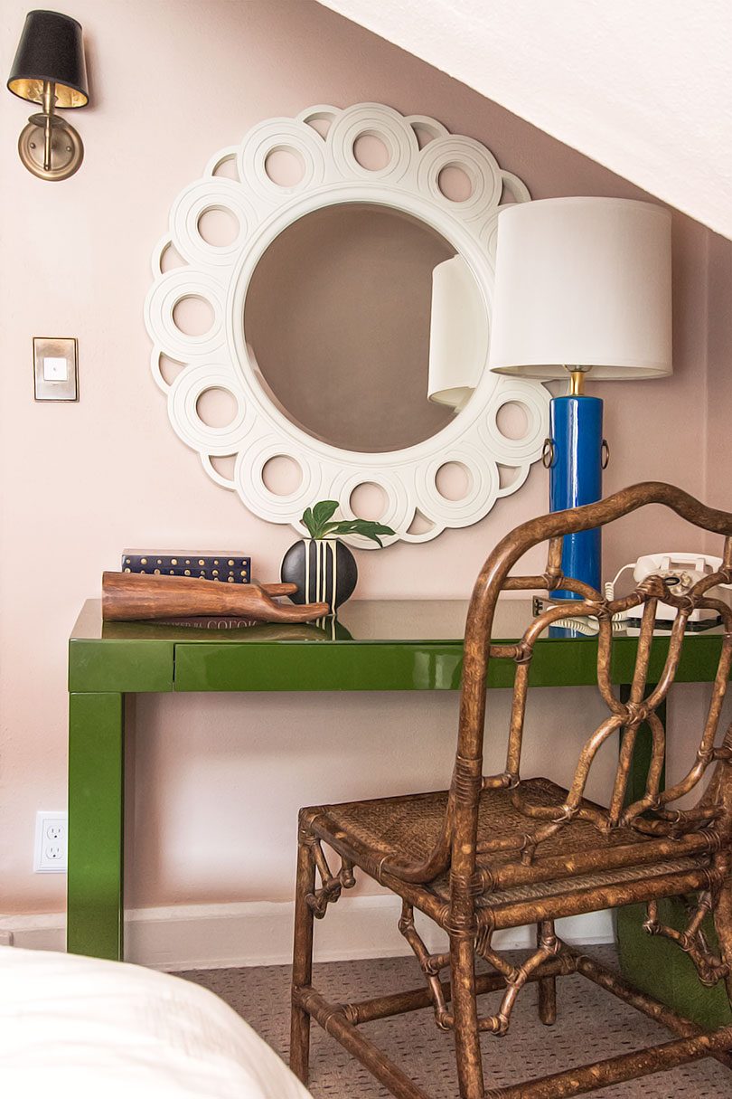
Mossy Olive Green
I was thinking about that fantastic shade of green where mossy green meets olive, and I remembered that we had…September 19, 2017
The Guest Room, Painted Pink
This post is sponsored by Dutch Boy® Paints. Why did I hesitate to paint the guest room anything other than…July 18, 2017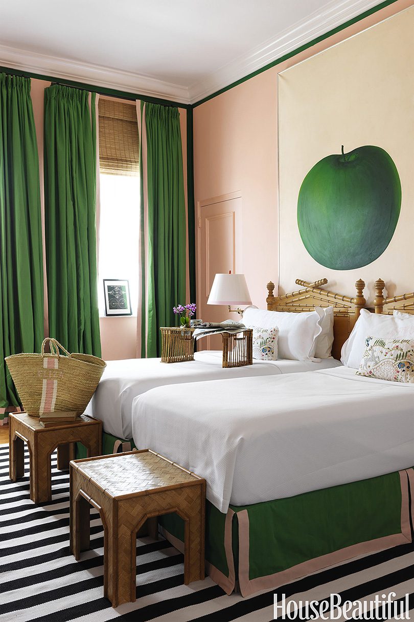
Lambrequins and Bedskirts, Oh My
What's old is new again. I'm pretty excited about a couple of traditional/granny details I'm bringing into the guest room.…June 26, 2017
Right Color, Wrong Space
I was going for drama and bold color in the guest room, but it's just so damn dark in there.…June 14, 2017
Guest Room Color Scheming
I recently worked on the guest room as part of a styling shoot. It's super cute as it is, but…June 7, 2017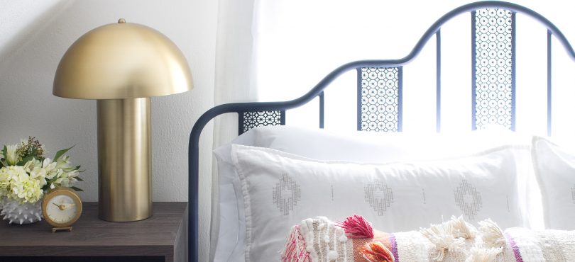
Walter von Nessen (and Inspired) Mushroom Lamps
I used a pair of mushroom lamps recently in our guest room. I like the 60s/70s style they bring to…May 22, 2017
Mossy Olive Green
I was thinking about that fantastic shade of green where mossy green meets olive, and I remembered that we had a green Parsons desk from…
The Guest Room, Painted Pink
This post is sponsored by Dutch Boy® Paints. Why did I hesitate to paint the guest room anything other than pink? The walls were white…
Lambrequins and Bedskirts, Oh My
What’s old is new again. I’m pretty excited about a couple of traditional/granny details I’m bringing into the guest room. The window in there is…
Right Color, Wrong Space
I was going for drama and bold color in the guest room, but it’s just so damn dark in there. I had almost a gallon…
Guest Room Color Scheming
I recently worked on the guest room as part of a styling shoot. It’s super cute as it is, but I’d like to make a…
Walter von Nessen (and Inspired) Mushroom Lamps
I used a pair of mushroom lamps recently in our guest room. I like the 60s/70s style they bring to the space, taking it a…