
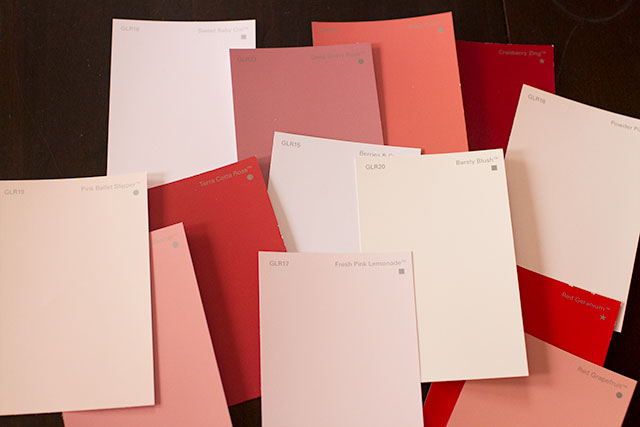
Glidden Paint Review & A Giveaway
I write for Glidden® over at My Colortopia and I've been using their paint for a few projects around the…August 20, 2015
DIY Abstract Art Clock and Serving Tray
This is a sponsored post by NESTLE Coffee-mate. All reviews and opinions expressed in this post are unbiased and based…July 27, 2015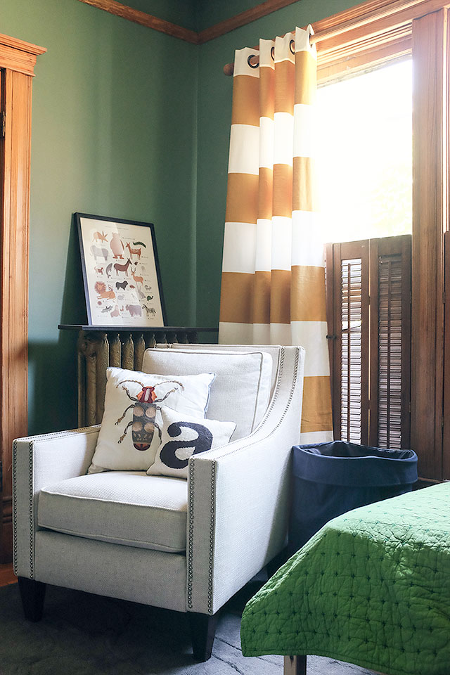
August’s Room, After Stripping the Wallpaper
Last time I mentioned August's room, we were starting to strip the wallpaper. That was right before a crew came…July 8, 2015
DIY Striped Armoire Surprise
Sponsored by ScotchBlue™ Painter’s Tape. I spotted an armoire on Jubilee Furniture's blog not long after Calvin had been born.…January 8, 2015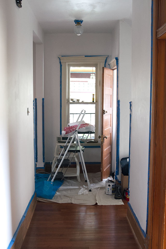
The Hallway! She is Being Painted!
Right. So, we hired painters to come in and do it for us. I actually really like painting — I…September 8, 2014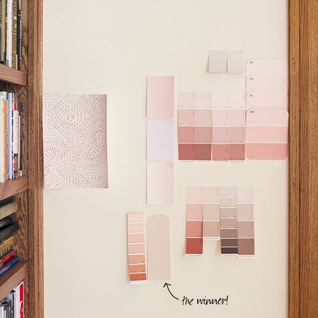
Would You Like a Sample?
I've been feeling a little better (finally, five months into this pregnancy), and so with increased energy and mobility comes…June 4, 2014
Glidden Paint Review & A Giveaway
I write for Glidden® over at My Colortopia and I’ve been using their paint for a few projects around the house recently, so today I’m…
DIY Abstract Art Clock and Serving Tray
This is a sponsored post by NESTLE Coffee-mate. All reviews and opinions expressed in this post are unbiased and based on my personal view. I…
August’s Room, After Stripping the Wallpaper
Last time I mentioned August’s room, we were starting to strip the wallpaper. That was right before a crew came out to photograph the house,…
DIY Striped Armoire Surprise
Sponsored by ScotchBlue™ Painter’s Tape. I spotted an armoire on Jubilee Furniture’s blog not long after Calvin had been born. I’d been looking for something…
The Hallway! She is Being Painted!
Right. So, we hired painters to come in and do it for us. I actually really like painting — I find it relaxing! But this…
Would You Like a Sample?
I’ve been feeling a little better (finally, five months into this pregnancy), and so with increased energy and mobility comes more decorating gusto! I’ve been…