

My Son’s Finished Room
This post is sponsored by Dutch Boy® Paints. Red and light blue — those were the only parameters I was…August 22, 2017
The Guest Room, Painted Pink
This post is sponsored by Dutch Boy® Paints. Why did I hesitate to paint the guest room anything other than…July 18, 2017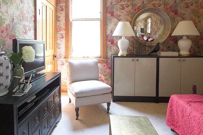
The Snug
This post is sponsored by Overstock. Someone had referred to our wallpapered back room as a 'snug' in the comments…July 12, 2017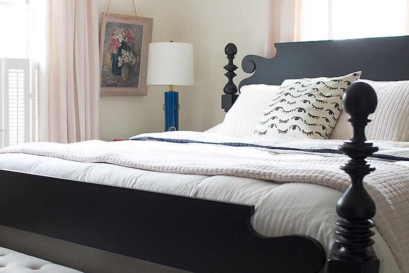
Better Sleep (and a Giveaway!)
This post is sponsored by Sleep Number®. I'm a more patient mom with enough sleep. A more creative designer, a…July 10, 2017
The Wallpapered Back Room
This post is sponsored by Overstock.com. Celebrate big savings on a huge assortment of items for your home during Overstock.com’s…June 30, 2017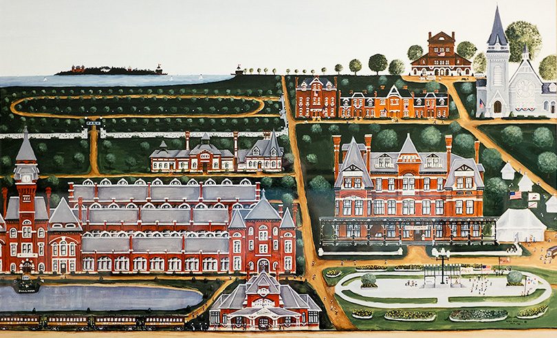
Pullman and the South Side Soapbox
This post is sponsored by method. I had visited the headquarters of method in San Francisco years ago and gotten…June 28, 2017
My Son’s Finished Room
This post is sponsored by Dutch Boy® Paints. Red and light blue — those were the only parameters I was given by my six-year-old. You…
The Guest Room, Painted Pink
This post is sponsored by Dutch Boy® Paints. Why did I hesitate to paint the guest room anything other than pink? The walls were white…
The Snug
This post is sponsored by Overstock. Someone had referred to our wallpapered back room as a ‘snug’ in the comments — the English term for…
Better Sleep (and a Giveaway!)
This post is sponsored by Sleep Number®. I’m a more patient mom with enough sleep. A more creative designer, a better partner, a better everything.…
The Wallpapered Back Room
This post is sponsored by Overstock.com. Celebrate big savings on a huge assortment of items for your home during Overstock.com’s Independence Day Sale, now through…
Pullman and the South Side Soapbox
This post is sponsored by method. I had visited the headquarters of method in San Francisco years ago and gotten to know the company then,…