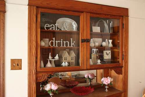
I started setting up the dining room, now that all of the kitchen stuff is out of there. I’m most excited (and most daunted) by the built in buffet.
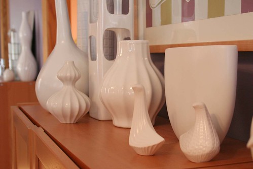
Many of you already know that I have a kajilion white vases (some of you have been asking where they are!). I haven’t really found a good place to put them in the house. I had used our low bookshelves in the old apartment like a mantle, but now those are in Brandon’s office.
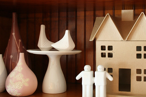
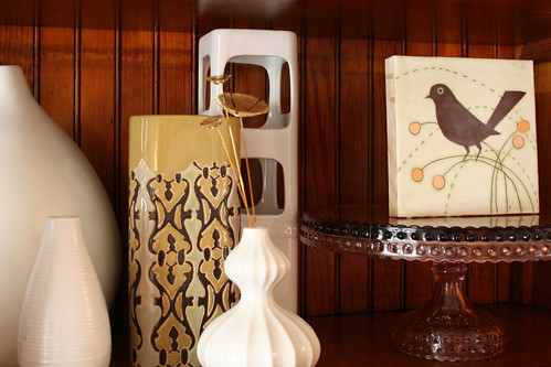
Well, I thought I may as well try to make them work in the dining room. I couldn’t use the really tall vases, but I was able to fit most of the smaller ones in. I have to be honest though – I’m not crazy about the whole look. I like the mix of sizes that I used to have going on, but now with just the smaller pieces it seems a bit meh. Plus I can’t decide if the look is charmingly eclectic, or just cluttered. I love everything in there, but I’m leaning towards cluttered.
My other thought was to maybe just embrace the mish-mash of items and keep going with it. Throw in some more pattern, make a paper garland to hang from the shelves, add a bunch of little felt pom-pons… my crafty nature is showing! I do like the idea, but maybe not for my own home.
I will be putting up wallpaper in the dining room eventually, so I like the idea of having all of the pattern on the walls and keeping the display simple and mostly white. Something is also really appealing about just having plates in there. It would be so much cleaner, visually. Er, then again… sometimes more is more.
See? I’m flip-flopping. I’ll live with it for a while – It’s easy enough to change around.



dai
May 31, 2007 at 6:41 amWell I think so far it’s a great display, esp. with the “eat & drink”!! :)
Jamie Meares
May 31, 2007 at 8:12 amcan you remind us of the wallpaper that you’re putting up?
Nicole
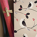
May 31, 2007 at 8:43 amI’m not sure yet. These were some of the ones I was considering: wallpaper contenders
Amy
May 31, 2007 at 10:53 amI love the eat & drink sign, but I agree with you that the overall display could be cleaner and more unified.
Can you fit more of the taller vases on the buffet counter? It would be nice if they were reflected in the mirror.
Peggy
May 31, 2007 at 11:55 amI had an old built-in in my dining room, and it was daunting filling it. Like you, I don’t like clutter. Your display is looking cute, but a little to cluttered.
The trick might be to unify disparate objects by sticking to one color, i.e., white. Or to line up very simple objects all in the same theme, like Martha Stewart does. What I used to do was put a ton of things on the shelves, then edit about half out.
What is the cute white couple? Wax? From your wedding maybe?
drey
May 31, 2007 at 5:19 pmhmmm what about painting the interior and frame a brighter colour that will make your items pop more? what about turquoise? (i love your little bird ones!)
deerseason87
June 1, 2007 at 5:42 pmLeave the natural wood, please!!! It’s such a beautiful, rich tone. Painting it would be way too country shabby. And I think the clean white pieces look great agains the warm brown, but if I were you I would keep it really simple and just have the vases (that fit), and not the house and wooden letters and things. Then you would also have room for some dishes, which would be visually neat and also practical storage.
Audrey
June 2, 2007 at 8:34 amI agree that there are probably too many items on display. The problem is that the glass in the hutch requires that the items be larger than what you have here in order to see them.
I love the wallpaper choices — what a challenge to pick just one!
casapinka
June 7, 2007 at 8:51 amSometimes more is more – what a great saying!
Making it Lovely | Transforming the so-so. » Blog Archive » Arranging a Collection
October 13, 2010 at 12:14 pm[…] love having the built-in hutch to display everything. I wasn’t so sure about it when we moved in, but I’ve since embraced it. I’m still undecided about the beadboard (paint it or leave […]
Kelly
July 26, 2012 at 1:20 pmHa ha! I have those people salt and pepper shakers!