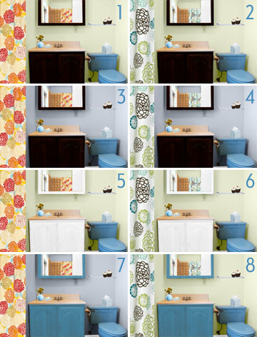
Thank you everyone for your feedback! I’ve narrowed the choices down to just two: the Zinnia Shower Curtain and the Graphic Fabric Shower Curtain.
I’ve made some mock-ups in Photoshop, and you can view larger versions of everything on flickr. Oh, and it may be hard to tell – that’s dark brown (not black) in the first few options.
What do you think?


Anonymous
July 11, 2007 at 10:06 pmdefinitely 6. nice and clean.
lookwhaticando
July 11, 2007 at 10:22 pm#4 or #8 they are all amazing. xo
lookwhaticando
July 11, 2007 at 10:23 pmYou know what I changed my mind….#6 hands down….xo
mi2
July 11, 2007 at 10:26 pm2 or 6!
I like the cleaner look, too! ^_^
Megan
July 11, 2007 at 10:45 pmI love 8, but 6 is nice, too. It makes me want to redo our bathroom. Too bad it’s a rental!
Laurie G. (morningk)
July 11, 2007 at 11:26 pmI love all the even-# ones, especially 4, 8 and 2. You have such a knack for design!!
Anna Beth
July 11, 2007 at 11:44 pm4 or 6 but leaning towards 6. 4 is really good though.
pluspuls
July 12, 2007 at 12:43 am6, definitely.
Jany
July 12, 2007 at 12:51 amI’ll go for #4 ! Definitely.
Elizabeth
July 12, 2007 at 1:09 amI’m going to break the trend and say #3.
My second choice is #6. But I just really love that purple wall color – what about #5 or #6 with the wall color from 3 & 4?
Melissa
July 12, 2007 at 1:40 am#’s 2 and 8 are my favs. Love the green walls. Hmm, now #6 is looking pretty good too. Wow, that’s going to be a tough decision there!
Malin
July 12, 2007 at 2:28 am#5. Why? Beacause it’s the warmest and lightest and brightest one. I like my bathroom to be a place that makes me happy in the morning when I am tired and grumpy :) #1 is pretty cool though, with the black. Ok, one of those two.
Hannah Wilson
July 12, 2007 at 3:34 amdefinitely 2 or 6.. I think a less feminine shower curtain would be a nice gesture for your lovah.. also it looks fantastic with the dark brown or white vanity. Whichever.. sophisticated or bright! Both look great… personally I prefer the dark brown.
Alissa
July 12, 2007 at 3:46 amI love 2 and 6 — I’m having a really difficult time deciding between the two. The white feels airier, but white wood in the bathroom is so commonplace that the dark brown would be a refreshing choice.
Is the green wall color based on a specifc paint, or do you plan to match a paint to what you created here? I ask because I’m looking to do a green in our spare bedroom that would be a wee bit darker than this.
Sarah
July 12, 2007 at 5:09 amI like 1 and 3.
Sarah
July 12, 2007 at 5:11 am#6…or 8 (if you can’t beat ’em join ’em, right?).
Love the green wall. The zinnias on the white background work with the toilet instead of fighting for all the attention. And the white wood work is crisp and clean!
Thank you so much for showing your process and progress. Makes me anxious to get into a new home.
drey
July 12, 2007 at 5:11 amno 6 FOR SURE. the white cabinet makes it al bright and fresh along with the light green walls.
erin
July 12, 2007 at 5:16 ami vote for 6 and if not, then 4! actually, i think that the curtain in the even number photos just works better with your blue toilet so maybe hang it up and see what you think.
Claire
July 12, 2007 at 5:49 amI like #6.
Mrs. Limestone
July 12, 2007 at 5:56 amI like how #4 looks in the photo but I think the lighter shades would “feel” better if you’re standing in the room. So’d Im going with #6.
Anna van Schurman
July 12, 2007 at 6:24 amI like #8. It makes the toilet seem deliberate. I have a maroon and pink tile bathroom that for generations has been painted light pink, which is totally wrong, IMO. We painted it chocolate brown with a brown shower curtain, towels, rug, etc. Go bold and deliberate!
lucy
July 12, 2007 at 6:26 am5!!!
Anonymous
July 12, 2007 at 6:31 am#2, downplays the toilet, while fitting it into a nice modern scheme.
lsaspacey
July 12, 2007 at 6:48 amInteresting how #2 has a larger fan club on Flickr than it does here. That’s my first choice. Since you didn’t mention replacing your brown-based tiles I think the dark brown is the way to go.
Does this mean you are going to stain the existing pieces or paint them dark brown? I think a dark, wenge-like stain would look incredible, while still showing off the wood grain.
Only a Paper Moon
July 12, 2007 at 6:59 amIm thinking #4, since the colors in the shower curtain tie in with the wall and toilet color. And the dark brown, subdues the brightness of the toilet. The thing with #2 ia that the toilet pops out, same with #6. I just think #4 is more cohesive
Jessica
July 12, 2007 at 7:07 amI like #2, #5, or #8 :)
Nichole
July 12, 2007 at 7:41 amNumber 4 is definitely the winner. The blue wall makes the room look put together and the brown stain makes the room look more sophisticated that the white.
Anonymous
July 12, 2007 at 7:48 amI have a really random question but I hope you’ll answer it. I just saw a flickr slideshow of your old apartment and I flipped at the sight of the towels in your bathroom: “Good, Clean, Fun” Where can I get my hands on those?! (pardon the pun) Can you help?
Julieta
July 12, 2007 at 7:49 am2 or 4
Meggan
July 12, 2007 at 7:55 amDe-lurking to say I love number 6. I feel like that one is the most cohesive of the bunch. Six for the win!
Anonymous
July 12, 2007 at 7:56 ammy vote is #2
lorenzstudio
July 12, 2007 at 7:56 am#6 is so cheery!
Anonymous
July 12, 2007 at 7:57 amI’ve been checking out your blog lately (obviously) and it is really inspiring, seriously. I think number 6 or 8 are great!!!
mary
July 12, 2007 at 7:59 am6! And the cupcakes are a nice touch :)
raya
July 12, 2007 at 8:00 amI love the idea of making mock ups in Photoshop! I should do that for my bathroom – ours is shaped just like yours, except I think its more narrow as I dont even know how I could take a photo of both the sink and the toilet in there – even with a wide angle. Have fun choosing!
sandy
July 12, 2007 at 8:02 amMy first choices were 2 or 5 but when I saw so many liked 6, I decided I liked that to. I love all your mock-ups – I need to figure out how to do that!
Meghan Hazelwood
July 12, 2007 at 8:03 am2 or 6! Green always looks fresh in a bathroom!
Mary Beth
July 12, 2007 at 8:09 am2 or 6, leaning strongly toward 2…
uncle beefy
July 12, 2007 at 8:16 am(Okay, I’m having some computer trouble apparently so if I end up commenting multiple times…please forgive me!)
While I love #6, I think #2 is the front-runner. lsaspacey made a great point about the tiles…and if they’re staying the #2 still maintains a fresh quality while tying all the elements of the room together creating a more cohesive look.
And I am happy to see that the Graphic Fabric is a final contender as that was my favorite!
You’re doing a bang up job on the house! Keep up the great work!
the antibride
July 12, 2007 at 8:37 ami vote for 5!! the green wall looks very nice and illuminates the room… as does the white cabinets…
katiedid
July 12, 2007 at 8:43 am#2!!! Definately! The wall color is great with the curtain and the dark wood picks up on the dark brown in the curtain. AND the turquoise Toilet looks great with paint and curtain. FAB!
Anonymous
July 12, 2007 at 8:46 am#6 is the best way to go.
Jamie Meares
July 12, 2007 at 8:50 amok, not 1. not 2. eek, i just want to make the toilet white!
i vote for 4, or 6, or 8. i like in 8 how you did the mirror in blue. the toilet is really a force to be reckened with isn’t it? how much is a new toilet??
i’m worried that the zinnia curtain is going to look too yellowy when you get it. i like the other one b/c of the bright whiteness. it seems more you.
Jamie Meares
July 12, 2007 at 8:52 amone more thing. i feel weird about the light blue accessories. the tissue box looks odd on the bright blue toilet.
Valerie
July 12, 2007 at 9:02 amdef. # 4: the brown cabinet and the blue walls de-emphasize the turquoise toilet. Also: are those cupcakes on the wall?
T
July 12, 2007 at 9:17 amI like 8 the most, but 4 is nice too. I think that the white blends in too much with the walls. Also, much prefer shower curtain on right.
Rosie
July 12, 2007 at 9:33 amI vote for 2 or 6
varin
July 12, 2007 at 10:22 amI like the even numbered ones better than the odd. Work with the turquoise rather than fight it! ;)
Cristina
July 12, 2007 at 11:16 amI like 4. The dark cabinet with the dark in the curtain is nice and the colour on the walls makes the toilet stand out less.
Jen M
July 12, 2007 at 11:52 amI’m liking 4 or 6.
sherri
July 12, 2007 at 12:00 pm#2 – no contest.
Veronica
July 12, 2007 at 12:21 pm2, 4, or 6
Susan
July 12, 2007 at 1:40 pmOne or Three…
To me, you need to pick an odd. The even number mock-ups don’t tie the countertop in at all. The odd numbers looked at those it was meant like that all along.
Anonymous
July 12, 2007 at 1:42 pm#2 or #6 – ALL of your mockups look fantastic!
girl meets glamour
July 12, 2007 at 2:24 pm# 2 or 6 is what I’m leaning towards, love the wall color…and these mock ups too :)
Arianne
July 12, 2007 at 2:45 pmi think the dark brown mirror and vanity are a must, so among those #2 or #3 are pretty awesome. :)
Anonymous
July 12, 2007 at 3:52 pmdefinitely number 4!
by the way,i love reading your blog. it gives me tons of ideas. who knows if they’ll ever happen, i’m still stuck renting :(
Mary
July 12, 2007 at 3:59 pmPlease – for all that is good and holy – do NOT paint the vanity blue! Please! Just resist it! There is absolutely no need to be that matchy-matchy. It will also cause your friends to question your sanity if you embrace the turquoise to that degree.
I’m leaning towards 5 & 6 just because I like bright white cabinetry in my bathrooms. I would choose #5 if the wall color was warmer, but all in all I think #6 is the winner.
And by the way, I’m sure that I saw on some DIY show that there is a product out there that allows you to PAINT TILES! So maybe you can do something about that horrific tub surround, afterall. :)
Anna
July 12, 2007 at 4:08 pmHi. I like 2 or 6 too. Funny because I thought I liked the other shower curtain.
Anonymous
July 12, 2007 at 5:43 pm8!
paola
July 12, 2007 at 6:09 pm4 definitely. Contemporary and relaxing, makes best use of the toilet and has the nicest shower curtain.
You are also a photoshop genius. Do you use some sort of program?
sarah *
July 12, 2007 at 7:15 pm5! I think the white goes best with the toilet & I like it paired with the warmer tones in that shower curtain.
Donna
July 12, 2007 at 7:28 pm#6 looks best, imho! Good luck and can’t wait to see the results.
I love your library too!
Anonymous
July 12, 2007 at 8:23 pmI like 4– it seems more modern and clean. 6 seems a little country to me.
Monica Yvette
July 12, 2007 at 8:57 pmI like #3, but what really matters is what you like right? So many choices. I see your dilemma here.
Anonymous
July 12, 2007 at 9:11 pm#4, definitely #4!
lauren
July 12, 2007 at 10:29 pmI like 5; the contrast of warm shower curtain –> neutral white cabinet –> cool-colored toilet pleases me.
Marion
July 13, 2007 at 7:47 amDefinitely #5 !
Nicole | Making it Lovely
July 13, 2007 at 8:28 amWOW!! I’m still not 100% sure, but everyone has helped me narrow it down. I’ll post again with the version I choose.
Let me answer a few questions that came up though…
=========================
* Alissa: I don’t have a specific paint color in mind yet – that color was just what I came up with in Photoshop.
* lsaspacey: I’ll be painting the wood, even if I go with the dark brown. The wood is in terrible condition and I think paint will best freshen it up.
* Anon: The “Good, Clean, Fun” towels were from Target’s Swell line a few years ago. I should look for those again (I know they’re around here somewhere)!
* Valerie: Yep, they’re cupcakes! I’ve been wanting them for a while now, and I figured they would be cute little storage in the bathroom.
* Mary: I think I’ve seen some stuff that will paint over tiles too. I just don’t know if I want to put that much effort into what will (hopefully) be a temporary fix!
* paola: Thanks. I just use Photoshop.
=========================
Thank you, everyone!
xoxo,
n.
Kate
July 13, 2007 at 1:52 pmI like #4 the best. The blue wall mellows the toilet color and the shower curtain with the dark vanity and mirror is very calming. I dig calming bathrooms. The best for long, relaxing baths.
Tonia Conger
July 13, 2007 at 3:24 pmSIX!
Vivian Cheng
July 13, 2007 at 3:48 pmI like 2, 4 and 6. But as every designer’s nightmare, my potato-head suggestion would be white cabinets with the wall colour from #4. ;)
Lovely work all around though!
abethh
July 15, 2007 at 7:13 am2 pulls everything together and makes the blue toilet/tub go away…
it’s so neat that you did those mock-ups.
such a talented girl…she caulks, she hammers, she makes pretty pictures.
Go for 2!!
Sarah
July 15, 2007 at 10:53 amOh Boy,,,,i totally think Number 2 is the winner. To me it comes across as fresh and sophisticated and modern without being too cute. The colors are serene and calming….kinda spa-like.
Erin Frost
July 15, 2007 at 3:34 pmGO FOR #7! Unfortunately, I have your bathroom. But we have the matching turquoise sink as a bonus (wll send pictures if you need some emotional support). The toilet will always be a crazy beacon of turquoise unless you tame it and balance out the room a bit. I bought the zinnia curtain, bathmats and towels to just take it over the top. But your more restained version works.
The Paris Apartment
July 15, 2007 at 6:30 pmi love #4…what a great idea and to photoshop and play with it like that…where have i been??
Francy
July 15, 2007 at 10:07 pm4 or 8
Ana
July 16, 2007 at 6:10 am2 and 4, I think those combinations really play down the sink color.
Kaelinsaurus
July 16, 2007 at 7:31 amDefinitely #4. I like the dark brown cabinets best.
stacymae@excite.com
July 27, 2007 at 12:04 pmI love #1!!
Jenn Ski
July 28, 2007 at 10:57 am#6!
Tallulah Jean
August 14, 2007 at 10:05 amI have a question about your mad Photoshop skillz when doing these renderings. I also use Photoshop when I’m considering a decorating change and generally do an okay job, except when I’m changing the color of something, especially walls. I can never manage it in a way that that looks realistic–my efforts are always at odds with the lighting of the picture or something, and it never looks natural.
What I usually have tried is making a selection of the part I want to change and putting a color overlay it, then bringing down the opacity till I can see the details of the object through it–but doing that always changes the color till it’s not what I wanted. Your renderings look so nice and clean and realistic in comparison! What method do you use for coloring?
Anne
September 8, 2007 at 1:11 pmI really like the white cupboard- so fresh!- would like to paint my kitchen cupboards but have been discouraged by contractors. Is there a certain paint and finish you would recommend? Did you sand and prime first?
Nicole | Making it Lovely
September 8, 2007 at 5:19 pmTallulah Jean, I use the color replacement brush, then play around with the dodge and burn tools.
Anne, we did sand and prime first, and used a semi-gloss finish. The glossier the paint, the more mistakes will show, so try to have a smooth surface to start with, and then paint in smooth even strokes. Good luck!
Making it Lovely | Transforming the so-so. » Blog Archive » Blue Bathroom, Finished!
April 18, 2010 at 3:59 pm[…] yeah. I went with option #6, with the white vanity (Bathroom Redo [Renderings]). I was going to go for option #2 with the dark brown, but I changed my mind once we switched to […]