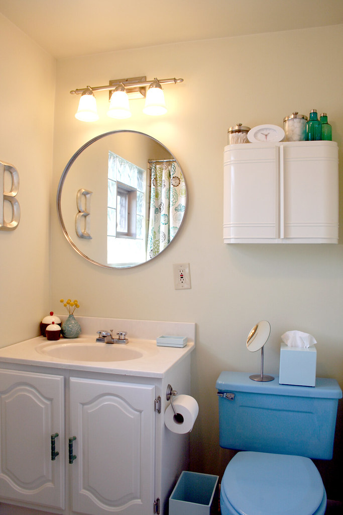
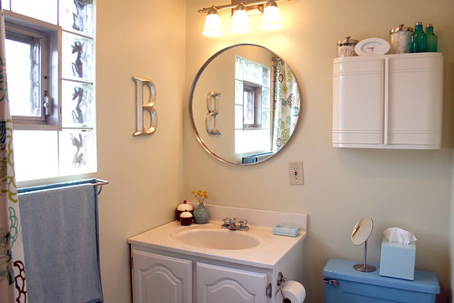
Huzzah! Hooray! The bathroom is finished!
Most of the items are sourced in my last post, so check there if you want to know where everything came from.
So, yeah. I went with option #6, with the white vanity (Bathroom Redo [Renderings]). I was going to go for option #2 with the dark brown, but I changed my mind once we switched to the new, white medicine cabinet.
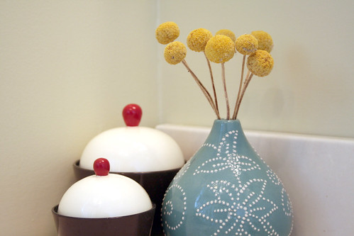
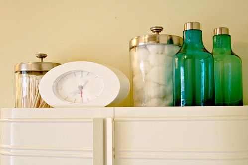
There are little vingnettes here and there, to distract you into thinking that the bathroom was not once an ugly, confused mess.
I actually think the bathroom is kinda cute now! And we did the whole thing for only a few hundred dollars, which was of course the goal. We also painted twice, which was not the goal (haha), to arrive at the lovely green we have now.
I even painted and brought the teal/turquoise color over by way of plastic bins to the storage area:
That’s “my side”. It wasn’t too bad before, but I thought “hey, why not double my work?” because that is how I roll. The frames that we had hung in our previous bathroom are up there now. They’re just ads from a British magazine (for Marks + Spencer), but I love them! I think they’re perfect over by my makeup and girly things.
Oh, and we hung a silver letter ‘B’.
‘B’ for Balch, ‘B’ for Blue, ‘B’ for Bathroom, ‘B’ for Better!



Making it Lovely
August 13, 2007 at 5:49 pm(Hi Trisha!)
Well, “a few hundred” = $300. Still not bad though, I think.
This is the bathroom on the second floor, by the bedrooms. There is a full bath on the first floor (from when the house was only a single story), but this is the one where we shower and get ready.
Toothbrushes are in the new medicine cabinet.
cbenn
August 13, 2007 at 4:01 pmVery cute. And I do adore the blue toilet. Also a big fan of the medicine cabinet – has the perfect look for the room.
Trisha
August 13, 2007 at 4:11 pmits gorgeous..i LOVE the cupcakes!
(ps this is trisha aka karatekatkniter from lj)
Sarah
August 13, 2007 at 4:59 pmBlue toilet and all, this is an adorable bathroom! Is it your main? I can not wait to move into a new house. Thank you again, so much for sharing.
drey
August 13, 2007 at 5:41 pmturned out so awesome! i’m glad you picked no. 6. i really really like the simple round mirror you picked and the lighting to go with it. adds such … pizazz! the blue toilet now doesn’t look too.. um.. blue! :P can’t believe you did all that for $200.
where do you store the toothbrushes? under the counter?
krissy
August 13, 2007 at 6:24 pmwow, it looks really pretty. i love how clean it looks with the white cabinet & silver accents.
and to think…i was rooting for the chocolate brown vanity!
jaime
August 13, 2007 at 7:51 pmWow Nicole – it’s so awesome. It doesn’t even look like the same space. Congratulations!
Donna Vitan
August 13, 2007 at 8:43 pmI absolutely love, love, LOVE how your bathroom turned out. It’s very lovely and I wish I can do the same.
jenni
August 13, 2007 at 9:25 pmLooks awesome! I love that medicine cabinet!
Malin
August 14, 2007 at 12:22 amThat turned out really good! Great work. I like the colors and cabinet especially. And the decorations of course, they are so important. I myself have lost speed and come to a stand still with my own bathroom. This gave me a little inspiration back though, thank you :)
The Litter Box House
August 14, 2007 at 6:09 amWow, it took me forever to figure out that you didn’t get a new bathroom vanity, you just painted it white! I certainly feel like a dork. Now I can understand why you were able to keep to a $300 budget…
Great job on the bathroom. Such a huge improvement. You certainly have a right to be proud.
Do you have plans for the floor? It really seems to detract from all your work. It just SCREAMS of the 70s…
priscilla
August 14, 2007 at 6:54 amIs the medicine cabinet also Ikea? I didn’t see it on your previous post.Thanks, everything looks great.
Peggy
August 14, 2007 at 7:01 amWow. That really is B for Better! It looks fantastic. What fun it was watching it develop. Thanks for sharing with us!
I really love the white cabinet. And the vanity looks so much better painted white.
You also use the cutest accessories.
What’s next?
Bethany
August 14, 2007 at 7:43 amIt totally works! Looks great… in the last photo the floor actually looks GOOD :) I guess it’s the complementry colours (blue… orange…).
Also love that you took one photo wilst standing in the shower :)
becoming-home
August 14, 2007 at 8:56 amSo beautiful! The blue toilet now looks like you chose it on purpose to match your palette :)
One question though, is the color in all the pictures the same wall color? It looks whitish in the first pictures but much more yellowish green in “your” area..?
Making it Lovely
August 14, 2007 at 12:54 pmHere’s the floor plan.
paola
August 14, 2007 at 11:19 amI take it all back. The vanity looks great white and I love the wall colour. And the you’ve now got a ‘feature toilet! Too funny.
Strangely, given how much I like the things in real life, the only things not floating my boat are the cupcakes. Probably because they’re not edible.
Nicole | Making it Lovely
August 14, 2007 at 12:25 pmWe’re leaving the floor (and the tile in the shower which is the same). We’ll redo the whole thing eventually – this is just a temporary fix (I hope!).
Priscilla, the medicine cabinet is from IKEA. It’s “ASPUDDEN”, but it isn’t on their site.
The wall color is the same in all of the photos, but the lighting is different. We have compact flourescent bulbs in the hallway area (doing our part, and all that), but incandescent in the bathroom itself.
Tallulah Jean
August 14, 2007 at 12:40 pmHey, where are the shelves in relation to the sink and toilet and all? I’d love some more storage in my bathroom, so I’d like to see a shot of how it works with everything else. :)
Ashley
August 14, 2007 at 1:47 pmThe blue toilet is too cute!
Brandie
August 14, 2007 at 4:13 pmLovely work! I’m glad you went with the white cabinet – that was my vote. Your countertop doesn’t even look peachy anymore!
Emily
August 14, 2007 at 4:45 pmI think those frames are chic! I love the prints; they look like original art. Very New York City, nice work.
Jillian Frances
August 15, 2007 at 8:02 amI can’t believe how well this turned out. You’ve really given me hope that someday our horrific bathroom might not be so bad without spending a small fortune.
Mrs. Limestone
August 15, 2007 at 8:32 amReally impressive in light of the blue toilet you had to work around. Love the framed advertisements!
Making it Lovely
August 15, 2007 at 11:14 amThe smaller one was $40.
Kristin
August 15, 2007 at 10:03 amIt’s absolutely stunning! I agree that the flooring actually works with the blue! Could be the photos, but I like it. I also really love the framed advertisements, the silver B, the mirror, and (of course) the medicine cabinet.
So glad you shared this with us – it’s great! Looking forward to future projects.
lsaspacey
August 15, 2007 at 10:33 amHere’s the larger version of the bathroom cabinet for $50. Nicole, what does the smaller one cost?
Sarah
August 15, 2007 at 1:54 pmNice!! The blue toilet fits right in.
:)
lsaspacey
August 15, 2007 at 7:28 pmNicole, have you tried to deep clean the tile? When I cleaned mine I was amazed (and sickened) by how much lighter it got. I just used Comet bleach and a scrub brush.
However, has similar tile to yours in their bathroom and they did posts on their more intensive process.
lsaspacey
August 15, 2007 at 7:30 pmSorry, that first link (has similar)is supposed to go with the blog name House-made.
delight
August 16, 2007 at 5:27 amjust came across your site. first off love the design. secondly the blue bathroom is adorable. a blue toilette, so unique. I also like the photographs you choose.
Little Grey Donkey
August 16, 2007 at 8:40 amGorgeous! What a transformation for under $300.
Lindsey
August 20, 2007 at 3:14 pmWhat a great job! It’s adorable!!!
Irvina
August 22, 2007 at 4:49 pmI love those images of the chicks in their skivvies! I want to put some in my bathroom!
jenn ski
May 17, 2008 at 8:21 pmWhat is the name of that cute yellow plant you have in that blue vase. I want to use them in my wedding center pieces.
Thanks,
Jenn Ski
Making it Lovely
May 30, 2008 at 9:44 amThey’re Billy Buttons (a.k.a. Billy Balls). The technical name is Craspedia, and I bought a bunch of them dried from The Flower Mart.
Bathroom Renovations Contractor
June 26, 2008 at 2:00 pmYou did a lovely job, Nicole. I love how you accessorized with the “vignettes”. And you seem to have found space for everything. Space for stuff is often something lacking in many bathrooms.
zeniamai
September 23, 2008 at 1:20 amI hope our bathroom will turn out as cute as yours…
Courtney
October 23, 2008 at 10:32 amOf all things, I love that little blue vase. Where did you get it? Alhtough, it has been a while, so I probably wouldn’t be able to find it anymore.
Making it Lovely
October 23, 2008 at 10:36 amThe vase was from Crate & Barrel.
CJ
April 1, 2009 at 1:31 ami so love the storage area! i feel so envious! :)
Making it Lovely | Transforming the so-so. » Blog Archive » Big Money, Big Money, No Whammy!
June 4, 2009 at 4:30 pm[…] did do a minor update about a year and a half ago with paint and accessories for about […]
HomeSweetHome
June 8, 2009 at 2:19 pmLove what you did!! I especially love the big “B”. May I ask you where you found that?
MODsquad
June 11, 2009 at 9:33 amHi there… I’d love to know where you got your while medicine cabinet. I tried clicking on ‘last post’ to see where all your items where from but the page is not there. Thanks so much!
Making it Lovely | Transforming the so-so. » Blog Archive » Jonathan Adler, I Could Kiss You
September 29, 2009 at 9:19 am[…] which everyone knows is free money. And because our bathtub and toilet were blue I was trying to make them work. But pink? My favorite color? We have another bathroom that we haven’t done anything to, […]
Mikaela
November 14, 2009 at 7:21 amWe had a blue toilet at my mum’s house, before they renovated. Absolutely gorgeous! =P
Making it Lovely | Transforming the so-so. » Blog Archive » Honor Roll
April 16, 2010 at 3:40 pm[…] know it’s just a temporary look (much like my inexpensive bathroom fix), but I think a lot of people are urging Kim to make her bathroom redo a permanent […]
ivette
March 3, 2011 at 10:59 amso, so nice! Where did find that cool letter B? thanks
Kasie
July 7, 2011 at 11:06 amWhere did you get the silver B initial? I can’t seem to find one that I like anywhere.
Making it Lovely
July 7, 2011 at 11:08 amIt was a gift. I think Ballard Designs often has them, or stores like Home Goods.
Pink Loves Blue | Making it Lovely
May 6, 2013 at 5:21 pm[…] good! I blame the the upstairs bathroom with its turquoise blue fixtures. Six years of living with them, and the color has charmed […]
Our Organized Bathroom Storage Area | Making it Lovely
May 23, 2013 at 12:09 pm[…] upstairs has storage directly outside of it. It wasn’t bad, since the system I put in place six years ago is still working for us, but it needed a little attention. Do you think we should add doors? There […]
Improvements Made to the House | Making it Lovely
May 29, 2013 at 3:11 am[…] the second floor bathroom with a mini […]