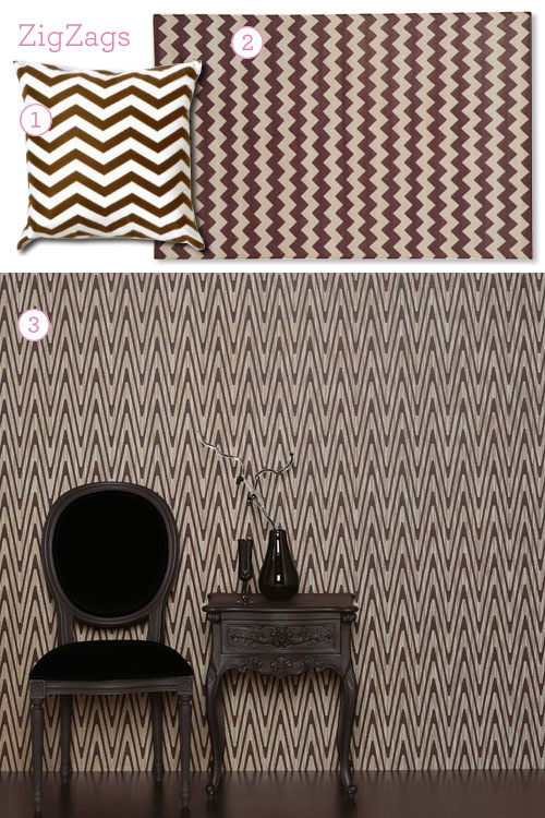
- ZigZag Pillow, Design Public
- ZigZag Brown & White Rug, Madeline Weinrib
- Mimas Wallpaper, Romo
I’ve ordered a sample of that wallpaper, which is my new favorite. Not too feminine, not too masculine, dark but not overwhelming, no flocking or foil, graphic but timeless… it may just be perfect.
I have, of course, created a mockup.
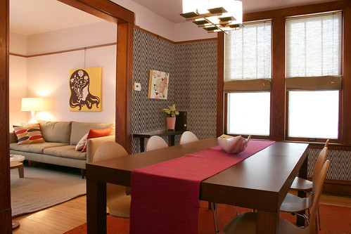
It looks even better when you look at the larger version.
It looks great, doesn’t it? I’m just hoping it will work with the color of the wood trim. If not, then I may just have to comfort myself with the pillow.



Lili
January 28, 2008 at 4:37 pmThe large version! Fabulous!
I hope its not too dark and yes, you need to highlight the wood in your house. Its unique.
laura
January 28, 2008 at 5:17 pmI love this wallpaper Nicole!!
modernemama
January 28, 2008 at 5:41 pmLove it! Why is all the cool stuff coming out of the UK now? When I lived there – nothing.
Jules
January 28, 2008 at 5:51 pmLove it!
Question: Did you remove the pattern from the rug in photo-shop, or is it laying upside down? Am I losing my mind?
Jane Flanagan
January 28, 2008 at 5:59 pmI did a similar zig-zag post a while back: http://seenandsaid.blogspot.com/2007/12/zig-zaggin.html
I love love love this wallpaper. Please use it!!
whatever DeeDee Wants
January 28, 2008 at 6:57 pmI love all of those zig zags:)
paola
January 28, 2008 at 7:11 pmOh yes! Love it. How on earth did you photoshop that in? I love how you got the zig zags to look like they’re going round a corner. It really makes the Amy Ruppel painting pop too, whereas before it just blended a bit too much into the floral.
jamie
January 28, 2008 at 7:38 pmthat’s hot. that’s the one.
Nicole
January 28, 2008 at 9:24 pmI love that wallpaper!!!
amy purple
January 28, 2008 at 10:39 pmIt looks really nice. How difficult is hanging up wallpaper? I thought about doing a tiny bit just below our windows in the bedroom, but I’m afraid it wouldn’t turn out so well.
Marissa
January 28, 2008 at 10:50 pmWonderful! I much prefer the zigzags to the vintage floral… not that it’s up to me ;)
Elissa
January 28, 2008 at 11:37 pmOoooh, wow. I wouldn’t have never thought that zig-zag wallpaper would look so beautiful! Is it only available in brown/white? I think a deep red/white would work in the room quite well.
Making it Lovely
January 28, 2008 at 11:37 pmYay, I’m glad everyone else is liking it too! I think it may be the one…
Jules, I did remove the pattern from the rug. I think a solid might work better, so I just Photoshopped the white parts out for the mockup, and then added a texture overlay to blend it.
Paola, I skewed the angles to match up to the walls. I’m glad you noticed. :)
Amy, I don’t know! I’ve never hung wallpaper! I hope it isn’t too hard. Let me know if you want
me to practice on your wallssome help.Elissa, it comes in other colors but they’re not all listed on the site. Red would be nice.
Maggie Sumner
January 28, 2008 at 11:40 pmI love the zig-zags so much more than the previous floral. Perfect!
lsaspacey
January 29, 2008 at 12:04 amI love it too! So how does it look on the more challenging wall with the built-ins? That’s where you’ll know if it really works.
zee
January 29, 2008 at 4:20 amI think that Romo wallpaper is the one! It’s bold without being fussy and looks like it’ll really work in your home. I’m doolally about zigzags at the moment too (and starting to obsess about argyle patterns too). If anyone sees a nice black and white chevron pillow (or fabric!) anywhere please let me know!!
Mandy Ford
January 29, 2008 at 7:57 amLove it! Really seems to go better with your overall decor than the flowered paper did.
Kelly
January 29, 2008 at 8:03 amLove the wallpaper, it’s perfect. I can’t wait to see it up!!
Kris
January 29, 2008 at 10:34 amFantastic!
Bethany
January 29, 2008 at 3:44 pmI don’t normally comment…. but
YES YES YES!!!!!!!!
that zig zag is the one…
nikkirose
January 29, 2008 at 4:54 pmWanted to say: I only discovered your blog a few weeks ago and am hooked. Decorating + cheerful, simple graphic design = my two favorite things!
I LOVE this wallpaper for your dining room. I think it ties it in with the living room beautifully and I can’t imagine tiring of it.
You sense of style inspires me.
pve design
January 30, 2008 at 12:49 pmtres chic the zig zag – love the graphic lines, clean and fresh.
go for it!
Doug
February 1, 2008 at 7:28 amZig-Zags look pretty cool, but my only concern comes from my being a bit of a sot. That pattern looks very cool until the moment I’d come home way too late from the pub. ;) I do like how you’ve kept it under the picture rail. Are you still thinking of keeping the pale pink above?
marina
February 3, 2008 at 2:51 pmOh, my God!
This wallpaper is just perfect!
i´m addicted to your blog! rsss
Beth
February 4, 2008 at 12:10 pmWow — I think I’m the only one who doesn’t really like the wallpaper! At least not with the wood/pink pairing. But it’s not my house, so go for it! :)
Sara
February 4, 2008 at 8:59 pmI think it’s fantastic, go for it!!
girlmeetsglamour
February 8, 2008 at 9:41 amLove this post!!! I so covet that Weinrib rug!
~Kate
Making it Lovely » Blog Archive » Paint & Fabric Instead of Wallpaper?
March 11, 2008 at 2:59 pm[…] chevron wallpaper from Romo would have been “the one”, had I decided to keep the west elm table. The […]
Herb
October 9, 2008 at 9:42 amAmazing design skills and great furniture. I wish my house looked like this