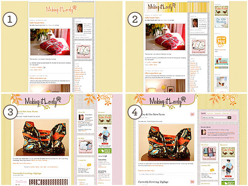
Not being one content to leave well enough alone, and less than a month after moving to WordPress, I’ve redesigned the site.
Well, it’s not a really a redesign… what I did was more for functionality. Of course, I had to make things a little prettier while I was at it. ;)
Making it Lovely has gone through four redesigns so far; two with Blogger and two with WordPress.

Version 1 was a very simple two-column Blogger blog. For version 2, I added an additional column to the right side of the page and switched out the header. Version 3 was for the big switch to WordPress (blogged about here), and it was based on the default Kubrick theme.
For version 4, I worked off of the WP Premium theme from WP Remix (which I first saw on Kitty’s blog).
I heavily hacked and modified everything, and I still have some work to do, but the main elements are in place. There’s a bit more breathing room at the top now that the columns don’t stretch all the way up, and I’m most excited about the nifty tabbed navigation in the sidebar.
WordPress rocks my socks off.


Nic
February 3, 2008 at 6:12 pmIt looks awesome!
Elizabeth @ Elizabeth Anne Designs
February 3, 2008 at 6:40 pmLooks awesome! I love the layout. WordPress is great, once you learn how to modify it’s pretty easy!
Carla
February 3, 2008 at 6:48 pmYour site looks great! My site is really needing an update.
Kylie
February 3, 2008 at 6:51 pmIt looks fabulous, except the ‘Making it Lovely’ headfing on mine is way over the right and cut off a bit.
Loving your blog though!!
Making it Lovely
February 3, 2008 at 6:53 pmKylie, really? What browser are you using?
Anyone else having any problems?
Bethany
February 3, 2008 at 8:15 pmI see the same problem with the header being way over to the right.
Caitlin
February 3, 2008 at 8:26 pmI love it!
The sidebars look very cohesive now, and I love how you added the nifty Subscribe tab on the top bar! ^_^
Sherry
February 3, 2008 at 8:52 pmHey Nicole,
First off, muchos muchos gracias for visiting our humble blog and adding it to your sidebar. We’re blushing. We’re huge fans of your site, and are always super inspired by how legit it looks. Which brings us to the redesign…
To put it in your words, it rocks our socks off. Keep up the fabulous blogging and the gorge site design and we’ll keep salivating and trying to make ours look half as good.
xo,
Sherry
http://www.thisyounghouse.com
Kylie
February 3, 2008 at 9:47 pmAh ha, it’s all perfect now!! Just beautiful. Maybe my screen was just having it’s Monday caniption!
Making it Lovely
February 3, 2008 at 9:49 pmOh, good! I was looking into the problem and noticed that I was off by 4 pixels in one spot. I fixed that and added a special class to the header in the css.
I’m glad it’s working now!
Lili
February 3, 2008 at 10:42 pmI love it!
Lori
February 3, 2008 at 10:51 pmI love the redesign and the colors used! Looking great!
vee
February 4, 2008 at 6:41 amlooks awesome, love the new design!
Sommer
February 4, 2008 at 9:58 amThe changes look great! I love how changing even little things can alter the way a page feels. One doesn’t need a total redesign to make a lasting impression.
The same could be said for how we decorate our rooms!
pve design
February 4, 2008 at 11:51 amwish you were here to help me!
looks great and you make it all look so easy!
PJ
February 4, 2008 at 12:34 pmIt’s a lovely design, and it’s great to be able to view the evolution of the design from the first blogger version.
ashley!
February 4, 2008 at 3:03 pmhi nicole!
i stumbled upon your blog about a month ago, and i love it! so much in fact that it inspired me to start a blog of my own for my little business. obviously not as amazing as yours, but i try ;)
many thanks!
kerflop
February 4, 2008 at 5:58 pmIt’s looking absolutely fab, Nicole.
You know, I’ve decided. You should offer virtual interior design advice. Like whoorl.com’s Hair Thursdays. My house is in desperate need of some Makin’ it Lovely mojo.
mary.c
February 5, 2008 at 10:32 amI love it! Everything looks great!
Julie
February 6, 2008 at 5:05 pmVery fancy! It looks great!
Leah
February 8, 2008 at 3:30 pmLooks amazing. I liked seeing the transformation from the start, it’s nice seeing how it’s developed.
Kristin
February 8, 2008 at 4:47 pmIt looks great! Love the masthead!
Wicker
February 12, 2008 at 3:42 amYour blog looks so cool.
I am jus starting off on the Net and don’t have a blog yet – it seems so complicated to get it set up and looking right.
:sigh: so much to learn, so little time
Our New Home(page)
February 16, 2008 at 1:07 pm[…] the new page. We owe a lot to Making It Lovely, our go-to site for blogspiration. When we saw her recent redesign, lightning struck and we said “we’re do-it-yourselfers, we can do that.” Then we […]
Jenn
February 24, 2010 at 12:00 amI just switched to wordpress and am SOOOO lost! I’m sure it will just take some getting used to, but it’s hard to figure out how, not to mention WHERE, to edit the html! It’s like I can’t even find it to begin with! Did you have to buy your layout to work off of, or do free versions have all the html and I’m just blind? :)
Jenn
February 24, 2010 at 12:01 amI should say, I can find where it’s supposed to be, but it’s very limited like not everything is there. No matter what “theme” I choose to start with. I have a newfound respect for you!