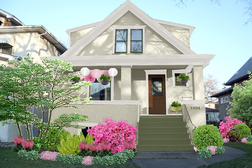
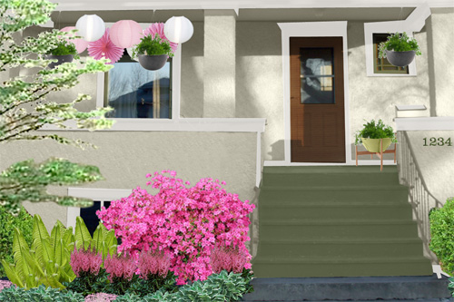
It’s much better than the current look, don’t you think? Here’s a detail:
You can look at the whole thing in a larger size here.
The Photoshop File
In case anyone’s feeling creative/bored, you can download a file for the mockup. Feel free to play around with it… I loved seeing what everyone came up with last time!
[download#5#image]


Amber
February 18, 2009 at 3:27 pmI need you to come to Indiana. My home could really use your insight. My floor plan does nothing for our family. I’m not kidding…I need your help.
Taylor
February 18, 2009 at 3:29 pmThe white is going to be really hard to maintain.
Making it Lovely
February 18, 2009 at 3:31 pmThe trim is cream and the house is green (not white), but yeah it may get dirty pretty quickly… I’ll probably play around with some other color schemes in the Photoshop file.
Molly
February 18, 2009 at 3:41 pmSo impressive! It looks fantastic! I like it with the green door instead of the wood…
Amanda
February 18, 2009 at 3:51 pmI opened up this picture and seriously let out an audible gasp. It’s SO bright and pretty!
Emily
February 18, 2009 at 3:54 pmOur house is white and it doesn’t seem to be getting too dirty. But it’s stucco so that might make a difference.
I love your mock up. I want to sit on your porch and drink lemonade and chat with the neighbors while kids play in the street. It’s greatness.
Megan
February 18, 2009 at 3:57 pmThe mock-up looks lovely! The only little detail I might quibble with is the color of the address numbers. Please make sure that they stand out from the color of the stucco. Not only will this make things easier for visitors and delivery people, but it is vital for emergency service workers such as firemen and policemen.
Katie
February 18, 2009 at 4:02 pmI really like what you have done. It looks like a very peaceful house. Very pretty!
Amber R.
February 18, 2009 at 4:04 pmLovely! The green and pink foliage really make that paint POP!
Allison
February 18, 2009 at 4:05 pmOh I think you definitely need some dark trim in there to balance out the door.
Anna @ D16
February 18, 2009 at 4:05 pmI just downloaded the psd, and I think the taupe version is the best! Love it.
Alex.
February 18, 2009 at 4:46 pmOh I’ve been meaning to take a photo of the outside of our house and do the same thing! You’ve inspired me to hurry up and get to it.
I really like the colour scheme you’ve posted here. I know nothing about maintenance with the paler colours because your climate is completely different to mine, but it does look so nice and fresh!
Little Paper Dog
February 18, 2009 at 5:06 pmLast summer I put together a mock-up in photoshop to convince my husband that we should transplant some bushes in our front yard. It worked!
Ashley
February 18, 2009 at 5:13 pmthis makes me smile endlessly! i want this look as well, but i also need a house haha.
annie
February 18, 2009 at 5:36 pmthis is so lovely. i played around with the colors a little and i enjoyed a nutral grey with a light trim very much. your house is so cute i’m sure any color would look adorable.
TWB
February 18, 2009 at 5:41 pmI adore white houses and this one is simply adorable.
Sarah
February 18, 2009 at 5:51 pmOhh! I love your makeover idea. Have you sen the show Curb Appeal? It’s on cable but also on Hulu for us non-cable people. It’s good, but you’ve done an excellent job without the hired designer!
Bethany
February 18, 2009 at 6:12 pmI still think you should paint the door pink.
Lorie
February 18, 2009 at 6:54 pmI love it! Love the pink flowers and REALLY love the lanterns.
wide open spaces
February 18, 2009 at 7:22 pmthat’s fantastic. what program did you do that with?? LOVE IT.
Joi
February 18, 2009 at 7:38 pmI love it so much!!!!!
Riley
February 18, 2009 at 7:47 pmwe have a white house and it’s really not that hard to maintain, still looks crisp after two years, so i’m sure your cream would be fine
Marian
February 18, 2009 at 7:54 pmWhat a gorgeous color scheme and a breath of fresh (spring) air in February!
brooke
February 18, 2009 at 8:19 pmI preferred the taupe… or maybe even a 70% gray. I’d just make the door and house number more cheery like the landscape…
http://www.flickr.com/photos/31437140@N00/3291988420/
Oh, and one of those tall pointy trees behind the azalea in the side yard. To break up the roof lines of the neighboring houses.
cheers!
lucky
February 18, 2009 at 10:45 pmlove it! but why do i keep wanting that door to be black / pink/ or spring green…
dwellings and decor
February 18, 2009 at 11:44 pmI played around with your PSD file and I must say that is quite impressive! My thoughts on the design is that I am not crazy about the pink lanterns but it would be fun for a party. I also think I like the dark brown gutters. It has a nice balance with the brown front door. Nice work!
Laura
February 19, 2009 at 4:06 amVery pretty garden, but to my taste the house is ghostly pale and needs a bit more contrast. Could be cultural though – here in the UK I’m used to brick and stone buildings.
lindsay
February 19, 2009 at 5:20 amoh it looks so bright and pretty. A very inviting look!
M
February 19, 2009 at 6:05 amLove it! But do yourself a favor and pay someone to do it for your. I love doing everything myself, but I know the horrors of trying to paint the exterior of a house!
Terri
February 19, 2009 at 7:00 amI love this too but please keep in mind blooming times. I doubt that your azalea and your astilbe will ever both be blooming in full swing at the same time. Of course, I’m up North so it could be different for you… Lovely though, of course!
Beth
February 19, 2009 at 7:08 amMy parents have had two stucco houses, one much darker than the other, but neither really had a dirt problem.
I love the look of the house, but would get rid of the brown door. That’s my 2 cents. :-)
Redmaiko
February 19, 2009 at 8:24 amOoo! That is gorgeous! Much better than brown trim. Maybe make the door a different color? Magenta would be cool, but I suppose you don’t want to overdo it! ;)
bungalowbliss
February 19, 2009 at 8:35 amThis looks so nice and fresh! I need to do a similar exercise with my place, which I’ll be painting in the spring. I like the lanterns and how they both tie to the flowers and give a hint to what’s inside. So nice!
Tanya
February 19, 2009 at 9:11 amOh my gosh I love this one! It is so soft and lovely. Granted, the azalea bushes would only look like that for a month or two. But still…
Laura at Emmy Lu
February 19, 2009 at 9:15 amWow, this looks incredible! I love the color scheme and how it flows out to your lawn as well with the plant selections. Beautiful!
Lane
February 19, 2009 at 9:22 amI just love it. I have to say that there may not be a thing I would change. You can get away with the brown/wood door because of all the earth tones going on. It makes for a nice focal point and, really, all I want to do is knock on the door because it is so obvious that the people inside are going to be friendly! And, call me crazy, but I think your house number color choice works because you don’t want them to stand out to everybody who looks at your home, but they’re offset enough that they’ll stick out to anyone looking for them. Don’t you think?
Erika
February 19, 2009 at 10:19 amOh how lovely!!! I especially like the exterior paint color choices.
amanda
February 19, 2009 at 11:54 amIt’s beautiful. Now my green thumb is getting antsy for spring & planting!
Gina
February 19, 2009 at 12:18 pmI love love love this! It’s amazing what you can do with photoshop.
Elissa
February 19, 2009 at 12:27 pmI like the green though I wish it was a shade darker to give it more depth. It looks kind of washed out, but it may not look that way in real life. Also I’d love to see another color added to the mix. Maybe keep the window trim cream, but add another color for accent.
Natalie
February 19, 2009 at 1:05 pmOooh pretty pretty!
I think your house looks great now, but that color scheme you tried out would look lovely :)
Erica
February 19, 2009 at 1:16 pmI recently started reading your blog and you are too cute. I love all of your ideas and comfy looking house!
The colors you’ve posted here look so fresh and really soften the exterior of your house. Have you thought about changed the color of the front door as well? I think the brown looks great but maybe a punch of color would be fun and inviting. Good luck with your exterior makeover!
Kelly Fallis
February 20, 2009 at 12:54 amWhat About…
1. Replace the rod iron railings on the staircase with a wooden one – dowels, a chunky hand rail and square posts 2. Your paint choices look great but suggest
-the current trim (brown) be changed to that grey shade on the palette you picked BUT
…the window trim match the house colour so it blends nicely
…and making the front door a dramatic focal point…something to greatly contrast the grey tones of the new paint job – if you’re daring go red! if you like the pink flowers the red will work well
3. The proposed landscaping looks great but the hanging plants and laterns and the additional plant on a stool on the porch is overkill. Why not forego the hanging things on porches and opt for a clean look? One great full (and tall urn that just skims the below the window to the right of the front door) will look amazing… as would a great front door mat or runner from the top of the stairs.
4. The mailbox and numbers would be better suited on the left side of the front door no? Get great numbering that corresponds with a fabulous new mailbox- great designs out there; have fun with it
5. The one thing that’s not evident in any of the pictures/sketches is lighting…and we need to see especially at night! Not sure where the wiring is but sconce-type fixtures flanking the front door would be great aas would a ceiling fixture over near the (living room presumably) window!
Then it’s just a matter of dressing the porch with 2 great outdoors chairs, an area rug, coffee and end table, great decor…already sounds like a fine place to scope neighbourly activites or enjoy a glass of vino at sunset!
Just some further food for thought from the Remote Stylist!
lesley
February 20, 2009 at 11:04 amCUTE. I agree with whoever said pink door. What a happy door that would be.
Rachel B.
February 20, 2009 at 1:57 pmI love Oak Park to begin with, and I would love it even more if I passed by this wonderful house!
Lori M.
February 20, 2009 at 11:07 pmTake a look at this website to play with different exterior textures for your home. They have a stucco board, shingles, plank siding, etc.
http://www.jameshardiecolorplus.com/design_your_exterior.cfm
It’s really durable, made from fiber cement and they can do custom colours – we’re redoing our dormers in the product, and we’ll paint the rest of the house to match.
drey
February 23, 2009 at 6:43 pmi love the colour scheme :) love the hot spots of colour too, without it will look bland.
mary
February 24, 2009 at 8:14 pmOh my gosh. This looks FANTASTIC! You can do it!
Amanda
March 1, 2009 at 4:22 pmI know this is OT, but I’ve been thinking of buying Photoshop so I can do all this cool stuff, but I’m not sure what version to buy. What is it that you use?
erin lang norris
March 9, 2009 at 2:08 pmWOW and I thought your house was cute before! This mock up is phenomenal! So so pretty.
Making it Lovely » Blog Archive » The Great Green Outdoors
March 28, 2009 at 2:02 am[…] to change the front porch, and lately I’m finding myself drawn to all things green. Ideally, I’d like the whole house to be green! That may be a bit out of reach right now, but I can at least use the color in other […]
Urban Nest » Blog Archive » A Fresh Coat
May 19, 2009 at 4:14 pm[…] hard to decide on one complete look. Check out the transformation Nicole Balch of Making it Lovely created on her own home. It was so inspiring, I decided to do some experimenting of my own. Take a […]
Making it Lovely | Transforming the so-so. » Blog Archive » Big Money, Big Money, No Whammy!
June 4, 2009 at 6:38 pm[…] At the very least, we need to paint the trim. We also would like to resurface the dormers to match the stucco on the rest of the house, change the color, and add some landscaping. Basically, I want our house to look like this: […]
erin
August 19, 2010 at 2:25 amhi there,
love your blog, read every post. gotta say that pink bush in the front is divine!! is that for realz?!!!