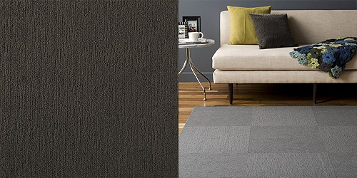
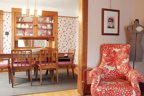
Remember this? Our dining room FLOR is finally down (Feelin Groovy in Pewter).
I think it looks a little too blue.
We’re keeping it because I haven’t found anything better*, it was cheap, and we need a rug in the space. I like the bare wood floor, but our dog Murray would disagree. He has no traction and has already suffered the consequences of slipping badly (he’s fully recovered now). Oh, and he likes to eat his treats while standing on a carpet (he’s odd). When we had the bare floors he would go from the kitchen through the dining room and end up in the living room on the zigzag rug. We can’t have that, now can we?
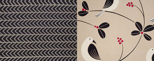
* OK, there was one rug that I liked better: JORUN from IKEA. But it only comes in 5’x8′ and I don’t think two of them together would be as seamless as I’d like. Plus I don’t think it would be wise to add yet another pattern to the main area of our home… even though it would look excellent with the wallpaper.





Lindsay
August 20, 2009 at 11:24 amToo funny… just got a ‘Feeling Groovy’ Flor rug too! Ours is a bit more bold – with squares of teal, light teal, and red-violet. So far, we love it. Can’t beat the price, and we like the fact you can just swap out one tile if it gets stained (which, with kids and pets, it’s bound to!)
kat
August 20, 2009 at 11:34 amMaybe stencil something in a different warmer shade of grey on that rug??? Or get a few more tiles in a different color and make the dark grey an outside border???
ivy meloni
August 20, 2009 at 11:44 amtotally off-topic, but do you know the color name and brand paint on the wall behind your couch? im in love! The colors in your house are just perfect.
Making it Lovely
August 20, 2009 at 1:09 pmIvy, the living room paint color is ‘Wild Aster’ by Benjamin Moore.
tiff
August 20, 2009 at 12:04 pmi love the rug & think it looks great. :) my dog likes to take mouthfuls of food from the kitchen over to the dining room carpet & eat them there. my mom’s dog does the same thing. oddballs! lol
Twitted by houseblogs
August 20, 2009 at 12:11 pm[…] This post was Twitted by houseblogs […]
Bunny
August 20, 2009 at 1:12 pmThe artwork that is hanging behind the orange print chair…how’s it hung? I see the ribbon/cord – can you show more so I can see how you did this?
JLR
August 20, 2009 at 1:38 pmIt is kind of ‘plain’ in there. I think the pattern would be nice – but you’re right about putting 2 together…
Oh how I LOVE the orange chair!
Mackenzi
August 20, 2009 at 2:06 pmLayer the rugs! I love that look, you won’t waste what you already bought, and poof! Get the look you REALLY wanted. And, besides, that JORUN is clearly the soul mate for your wallpaper! :)
Kristin
August 20, 2009 at 2:32 pmI think that having your FLOR tiles in Graphite it might look a little more grounded in that room and still match the pretty wallpaper, or the stencil idea though I am not sure how well it would wear. -I ask the same as Bunny- A post about your picture rails and the things you have used to hang your art would be a great post!
Amanda Nicole
August 20, 2009 at 2:34 pmOoo, most excellent with the wallpaper! But I agree, it might be a tad too much :)
Ryan
August 20, 2009 at 2:46 pmMy dog also takes his treats from the kitchen to the living room rug. Between that and him laying in his favorite spot, I think I’ll need to shampoo that every 6 months. He also only will play on the rug because of the slippery wood floors so I’ve though of adding a rug to the dining room too. But then it’s just so much rug!
Bunny- nichole has a picture rail in the living room and the artwork is all hung from that. Click on any of her other living room posts to see a wider shot.
Jacci
August 20, 2009 at 2:58 pmHmmm… I agree. It’s very nice looking, but I can see what you’re saying. It reads as a little too pastel to really ground the room like you were probably wanting.
I know you mentioned no more pattern, but do you think the room could take a stripe? Stripes always seem to balance out florals and swirlies to me. Something like this – http://www.flor.com/service/flor/shop/item/Shiny-Happy-Stripe/1373002500-100267.html with the stripes all going one way??? I know that you tried the one IKEA rug, but maybe the thinner stripes all going one direction would seem less frenzied?
You have impeccable taste – you’ll get it :) And when you do, it’ll be SPOT ON.
XO,
Jacci
Jasmine
August 20, 2009 at 3:01 pmi don’t think it looks too blue. i like it. but that rug from ikea is amaaaazing. i think i’m going to get one for our living room! thanks for the idea. i wish you could just come over and help us decorate our house. :) we both LOVE what you guys have done with your house.
abby
August 20, 2009 at 3:17 pmMy dog does the same thing! He especially loves new rugs.
I love the rug! I have been considering the feelin groovy in multiple shades of green! How is the quality? I noticed that some of the cheaper flor tiles like fedora are thin and flimsy.
virginia @ where you hang your hat
August 20, 2009 at 3:32 pmOh yes, those do look pretty together.
alison
August 20, 2009 at 3:43 pmI’ve always wanted to hear more about how you handle all your pets in regards to your design style, etc. I know you have Murray and a few cats too.
Robin
August 20, 2009 at 5:13 pmHey Nicole,
I have personal experience with the JORUN rug, and it always reads as navy in person. So go to the store and check it out in person (with good, bright light, near a window if possible) before you buy it. Hope that helps!
<3 robin
Lisa Golightly
August 20, 2009 at 5:16 pmha! our dog travels through the house to eat his dinner, mouthful by mouthful to eat on the living room carpet!
Shaina
August 20, 2009 at 5:23 pmI think the rug looks great, but I do feel you on the gray looking blue. We just painted our dining room 2 shades of gray and they definitely have a blue undertone to them. And on the carpet and dogs, my parents dog is the same way. She will only eat her treats on a carpeted surface.
Sarah
August 20, 2009 at 6:26 pmI really like your choice of Flor tiles, although I do agree that the Ikea rug would look great with your wallpaper. We have a Flor rug in a brown houndstooth pattern in our living room and I thought I’d chime in with the fact that the Flor tiles are removable and washable, which is great for kids and is something to consider once your baby gets older and starts throwing her food on the floor!
shaina
August 20, 2009 at 7:46 pmmy husband and i both agree that its great as is! it contrasts perfectly with the pink.
sooo terrific!
Jessica
August 20, 2009 at 8:56 pmI absolutely love that wallpaper. It’s gorgeous!
Martina
August 20, 2009 at 10:53 pmMy dog prefers to eat on carpet too. We have very few rugs in our house (and no carpet) but her food bowl is by the door mat so she’s happy.
Uyek
August 20, 2009 at 11:24 pmCould/would you stencil a JORUN-like graphic onto your FLOR rug?
If you are worried about too much pattern, you could always dial down the contrast.
christina in nh
August 20, 2009 at 11:31 pmohhhh man that ikea rug is fantastic! i don’t know if it was the angle of the lens or the lighting in the shot or what, but the flor rug just looks like one big blue rectangle to me. there doesn’t seem to be enough contrast between squares to keep it from looking remnant-y from the wrong angle, ya know? but i would put your other flor rug in like, every room of my house haha. ^_~
Yvonne
August 21, 2009 at 3:46 amThat JORUN rug looks amazing with that wallpaper, and can one ever have enough print? I think it’s more you as to the plain rug. Although I really like the FLOR rug. Maybe you should get the JORUN anyway and swap when you feel like it :o)
Donita
August 21, 2009 at 8:14 amTotally off subject…….but, I love your dress form. Any helpful hints on where to find a used one? I have been looking for sometime now, do not want the BRIGHT BLUE ones that are sold at fabric stores. Yours is perfect. I need one, for taking pictures of my handmade vintage aprons. ;-)
greengirl
August 21, 2009 at 9:45 amYou know – our dog always eats her treats on our living room rug rather than the hardwood – must be a dog thing! BTW – I think your Flor tiles are terrific – they are not reading too blue in the photo, but live and in person that may be a different story – maybe they just need a “boost” – a little something to frame and define them… cut some other Flor tiles into quarters to create a patterned/textured border…
maybe this for color and pattern:
http://www.flor.com/service/flor/shop/item/Striped-Poodle/1413302500-7740.html
or this for a saturated impact color:
http://www.flor.com/service/flor/shop/item/Feelin-Groovy/1391302500-100569.html
or THIS (similar flavor as the Jorun?):
http://www.flor.com/service/flor/shop/item/Channel-Surfing/1372702500-7077.html
shown as a border here:
http://www.flor.com/service/flor/shop/rug/Funny-Bones-Rug-Kit/R180000009-98336.html
Have fun, whatever you do – I think a little pattern might just be the ticket!
ChanelD
August 21, 2009 at 10:39 amWhere did you get the superhero pic in the living room? Is that you?
ChanelD
kristin
August 21, 2009 at 1:54 pmobviously, you live with it- but i like the colors of the dining room w/ flor within the photograph! and the way you covered your chairs. i remember that from way back, but it’s cool.
as for your pup- i thought that most dogs liked to eat their treats on carpet? i’m not a dog *person* but i think that the 5 dogs that i have spent the most time with will run from the kitchen and head to a room with carpet to snack. so maybe your dog is totally normal :)
Suzanne
August 21, 2009 at 10:51 pmHi Nicole:)
I love your taste! Your dining area looks great. I really do like the new rug. As you have shown pictures throughout your home, I wonder, where do you put everything?? There is absolutely NO clutter! Any suggestions appreciated:)
Courtney
August 22, 2009 at 1:16 amMy dog does the exact same thing!!! Honestly, I think the FLOR tiles look a bit like a commercial space (think of a low-rise berber-type durable carpet). Your home is so much better than that!
Erin
August 22, 2009 at 12:35 pmIt does make the space look too cool. Is there another color of FLOR tile that might work a bit better?
Jane
August 23, 2009 at 5:21 pmThat’s what dogs do. They always choose to eat on a rug (as opposed to a hard surface) if the choice is available. I have no idea why.
Maybe it’s connected to a cat’s need to up-chuck a hairball on the same rug – even if a perfectly good tile floor is right next to it.
Heather in Washington State, USA
August 24, 2009 at 1:09 amI think the color coordinates well with that sewing bust (whatever they call those things) you have in the living room behind the orange chair. I think it’s a great foundation, and you chose well. Let it grow on you…
Christina
August 24, 2009 at 1:22 amLove the zig zag rug with the wallpaper. hmm…. good luck deciding.
Oh,you know your mustard room that you ahve the curtain dilemma in? What about this fabrics in ‘spice boule’
http://www.purlsoho.com/purl/products/fabricdetail/6135
hope it helps :O)
Christina
French furniture
August 24, 2009 at 9:05 amI love the orange chair, it’s a fresh and original design, and the fabric is fabulous!
bungalowbliss
August 24, 2009 at 9:18 amI actually gasped a little when I saw the IKEA rug paired with the wallpaper. That is heaven in a 3″ x 7″ box on my monitor. Is there really no way to make a pair of them completely seamless? I love the two patterns together.
vintage simple
August 24, 2009 at 9:28 amYeah, our dog likes to have traction for eating her treats – and throwing up. part of the reason we keep as few rugs as possible around our house. Heh.
Yours looks lovely – I really like the charcoal color of those FLOR tiles in the space.
-maria
greengirl
August 24, 2009 at 10:14 amI like the gray Flor tiles – it grounds the table nicely, and does not appear too blue in the pic – although in person may be a different story. I think what the gray tiles need is a border to frame and further ground the rug.. How about cutting this Flor tile into a border:
http://www.flor.com/service/flor/shop/item/Channel-Surfing/1372702500-7077.html
Like this (minus the skulls!):
http://www.flor.com/service/flor/shop/rug/Funny-Bones-Rug-Kit/R180000009-98336.html?bcreset=1
The scale and amount of pattern may be just the thing to define the rug, and give it more presence! Then Murray will really know where his treat area is! ;-)
Your house is lovely and a wonderful reflection of your great instincts! Thanks for sharing it with all of us!
kasey at thriftylittleblog
August 26, 2009 at 1:32 pmI don’t see the floor as too blue, but that could just be my computer. I think it would look amazing with a rug similar to the IKEA above!
alivicwil
August 27, 2009 at 3:01 amI quite like the new flooring.
I don’t think it’s too blue at all.
And every time I see your Anthropologie chair (that’s right, isn’t it?) all I can think is “I *love* that chair!”
Amy
August 27, 2009 at 6:36 pmWell, I like the rug in your dining room but I don’t live there so my opinion probably doesn’t count for much lol. And my dog insists on eating on the rug too, so bizarre.
Renee
August 27, 2009 at 10:06 pmI agree that the grey reads really blue with your warm pinks, taupe, and wood tones. The suggestions to punch it up with b/w stripes sound good, but have you considered a warmer neutral, between a grey and a taupe? Maybe scatter a few tiles of the bold pink from the wall paper to tie it into the color palette a little better.
I love your blog and really enjoy seeing your home evolve. I don’t know that I could ever get my husband to accept pink into our main color scheme, but you do it so flawlessly, that he might not even notice that you use a lot of pink… I love it! Keep up the great work, and I hope you find a solution you are happy with.
rebekka
August 28, 2009 at 8:36 pmBeautiful…I’ve been wanting FLOR tiles forever!
HereBeDragons
August 29, 2009 at 3:03 pmI love that red chair
sweet fine day/Jenna
August 30, 2009 at 6:24 pmI was keen on that Ikea rug too – really thought I found the perfect rug, but then saw it in person and it’s definitely not as nice. It’s not as dark and rich in person and definitely skews blue, but the most noticeably thing about it was that it looked really drab and I thought it would bring the room down. Back to the drawing board!
Jen
September 2, 2009 at 4:55 amJust so you know, you will probably be cursing the rug once your little one starts eating…especially when she starts feeding herself. THe dog will prove to be better than a vacuum but not when it comes to bananas, corn and pears.I swear the floor around the high chair has a magnet on it…no matter what you put down food will find a way off!
Hanna
September 9, 2009 at 11:28 amToo funny – my dog will only eat on carpet too. She has one of those small $3 rugs from IKEA by her bowl, so she won’t carry food around the apartment.
natalika
November 19, 2009 at 5:19 amOff topic but…
… I just found your AP house tour and got smitten with those signs in your hutch (“eat” & “drink”)… may I ask where you found them?!
They’re so beautiful, I must have them! :)